Customers often ask me how to use fixed/baseline control limits. This type of limit is sometimes referred to as historical control limit. Instead of allowing the software to calculate limits based on the data, sometimes you want to use fixed control limits. These fixed control limits are typically created from an established process that is already in control. You can use these limits with new data to see how your new data compares to the limits from your historical process.
There are four different ways of entering fixed control limits in Control Chart Builder in JMP. They can be entered via a column property, set control limits, or get limits. A fourth limited method of using historical limits is via the excluded row state method. This blog post details each of these methods.
Example
In my blog post "Generating control limits using Control Chart Builder," I introduced a printing process. Let’s review. Variations in the printing process can cause distortion in the line, including skew, thickness, and length problems. This example considers the length of the line. The line is considered good if it has a printed length of 16 cm +/- 0.2 cm. Any longer, and the sentence may run off of the page. Any shorter, and there would be a lot of wasted space on the page.
The blog post detailed creating a control chart for this data. The limits summary for the control chart is given below in Figure 1. Figure 1: Limits summary
We want to use these baseline limits with new data.
1. Column Property
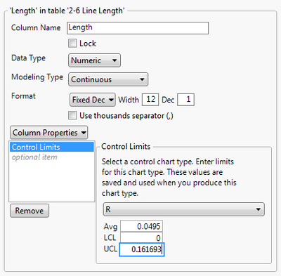
One method of using fixed limits is with a control limits column property. Open your table that contains your new data. Select the Length column and click Cols->Column Info. Click on the Column Properties drop down and choose Control Limits. Enter 15.99825 for Avg, 15.90519 for LSL, and 16.09131 for UCL. These are the calculated limits from Figure 1.
Click on the XBar drop down and choose R. Now enter the fixed limits for the R chart. Enter 0.0495 for Avg, 0 for the LCL, and 0.161693 for UCL. These are the calculated limits from Figure 1. Click OK. You have just entered fixed control limits for XBar and R charts for the Length column.
Create your control chart by going to Analyze->Quality and Process->Control Chart Builder. Drag Length to Y and Run to the subgroup role.
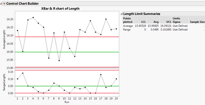
 Figure 4: Control chart with fixed control limitsRather than calculating limits from the data, JMP used the fixed limits defined in the column properties. Note that the Limits Sigma says “User Defined” in the Limit Summaries table. We see that many points fall outside of the limits. Furthermore, the averages are higher than those of the baseline process. This process is different from the original process that we used to calculate the baseline control limits.
2. Set Control Limits
Another method of fixing the control limits is using the set control limits command. (Note that if you tried the above method of using column properties to set control limits, you will want to delete those column properties prior to continuing with this example. To delete the column properties, return to the data table. Select the Length column. Go to Cols->Column Info. Make sure the Control Limits Column Property is highlighted and click Remove. See Figure 2 above.) In my opinion, set control limits is the easiest method to use. I do not have to remember to define any column properties beforehand, and I only need my data table.
Create your control chart using the steps provided in the Column Property section of this blog post. Right-click in the top chart and select Limits->Set Control Limits. Enter your baseline limits and press OK. Do the same for the R chart. Figure 5: Set Control Limits dialog for the XBar chart
 Figure 6: Set Control Limits dialog for R chartYou are presented with the same graph as in Figure 4.
3. Get Limits
The Get Limits method is by far the most flexible method. If you have fixed limits for many different processes, you should use the Get Limits method. If you have different fixed control limits for each phase, you should use the Get Limits method. To use the Get Limits method, you need a data table that defines your limits.
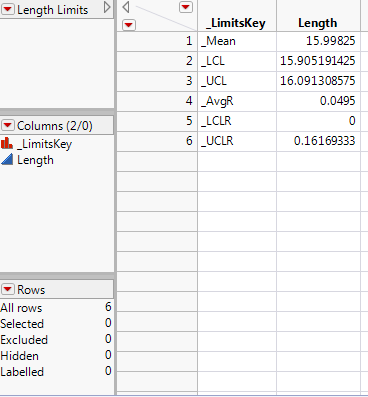
A limits data table contains a minimum of two columns. One column must be called _LimitsKey. This column contains keywords that are used to define the limits. Additionally, you need one column for each process that defines the values for each of these keywords. These additional columns must have the same column name as the process of interest.
The keywords needed to define limits for the XBar chart are _Mean (for the average), _LCL (for the lower control limit), and _UCL (for the upper control limit). The keywords needed to define limits for the R chart are _AvgR (for the average), _LCLR (for the lower control limit), and _UCLR (for the upper control limit).
These limit data tables can be created by the old control chart platforms in JMP, or you can create them yourself using File->New->Data Table. In the future, Control Chart Builder will also be able to create these limit data tables. Create your control chart by following the steps given in the Column Property section of this blog. Click on the red triangle next to Control Chart Builder and choose Get Limits. Pick the Length Limits.jmp data table. You are presented with the same graph as in Figure 4.
4. Excluded Row States
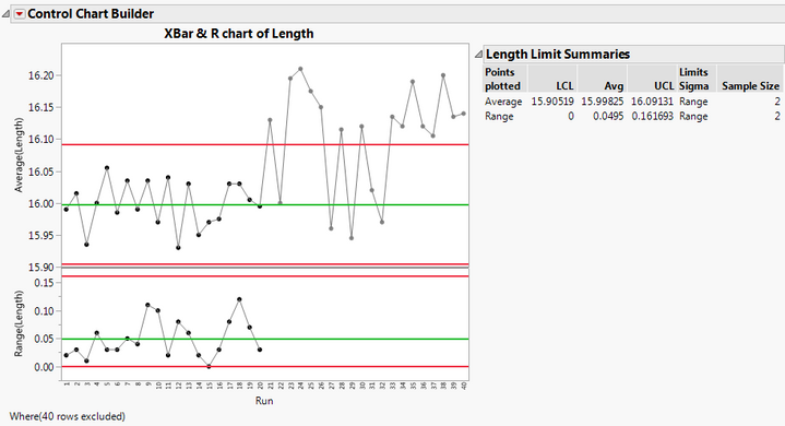
The excluded row state method can be used when your new and old data reside in the same data table. This method can only be used if your historical data and your new data all have equal subgroup sizes. In your combined data table, make sure the new observations have the excluded row state property. To do this, select the new rows. Select Rows->Exclude/Unexclude. Create your control chart as described in the Column Property section. JMP uses only the unexcluded rows(historical data) to create the control limits. The new data (excluded data) is still plotted on the graph (dimmed), but these data were not used in any of the calculations.

One advantage of this method is that you can see both the baseline data and the new data in the same graph. This may help you determine differences.
Conclusion
JMP provides four different methods of defining fixed/baseline control limits. The column property method requires you to define limits for each control chart as column properties in the data table. Set Control Limits is the easiest method and allows you to define control limits with a right mouse click in each control chart. Get Limits is the most flexible method and requires a separate data table that defines the limits for each process. Get Limits should be used if there are many processes and if there are phase variables. The excluded row state method can be used when your data resides in the same table and your subgroup sizes are equal. Since the historical and new data are plotted in the same graph with the excluded method, comparisons are more straightforward with this method.
References
JMP Software: Statistical Process Control Course Notes