- New to JMP? Let the Data Analysis Director guide you through selecting an analysis task, an analysis goal, and a data type. Available now in the JMP Marketplace!
- See how to install JMP Marketplace extensions to customize and enhance JMP.
JMPer Cable
A technical blog for JMP users of all levels, full of how-to's, tips and tricks, and detailed information on JMP features- JMP User Community
- :
- Blogs
- :
- JMPer Cable
- :
- Beyond ROC curves: Exploring probability thresholds and error trade-offs in pred...
- Subscribe to RSS Feed
- Mark as New
- Mark as Read
- Bookmark
- Subscribe
- Printer Friendly Page
- Report Inappropriate Content
The Model Classification Explorer Add-In provides a unified dashboard to visualize model cutoffs and error trade-offs simultaneously. You can interactively change a model threshold and immediately see the results propagated in performance measures, confusion matrices, and ROC curves. The add-in also implements custom red triangle options to view lift curves, cumulative gains curves, and to calculate an optimal threshold based on classification costs.
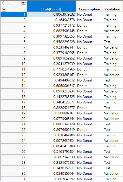
Let’s walk through an example with the attached data table. It’s Friday donut day at the office, and you want to predict how many out of 100 employees will eat a donut. You gather data on whether each person consumed a donut as well as a number of predictors and you fit a model to estimate probabilities of consumption. Now you want to explore the tradeoffs associated with each model cutoff point. The idea is to select a cut-off to minimize donut waste on future Fridays. There are three columns:
- Prob[Donut] is the probability of an individual consuming a donut.
- Consumption is the actual outcome of whether or not someone ate the donut.
- We have an optional validation column
Data
After download and installation of the add-in, open the Donuts Blog Example.jmp data table. The data is formatted such that there is one numerical, continuous column that models the probability of the targeted outcome, in this case our Prob[Donut] column. This column can be created in JMP by saving a fitted model for a binary outcome with “Save Probability Formula.” The other required column is the actual outcome state as character and nominal, in our case the Consumption column. You can optionally add a validation column that will add additional output in the platform based on the validation category. If you use JMP Pro, you can do this easily be going to Analyze -> Predictive Modelling -> Add Validation Column. The validation column can have two or three categories and needs to be made up of numeric values. 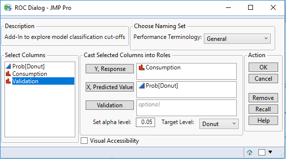
Launching
Step 1: Cast the Prob[Donut] to X and the Consumption to Y. These two columns are required.
Step 2: Set your target level to “Donut,” as that’s what the model is predicting.
Step 3: Set your alpha level for the statistical analysis, which is left to 0.05 on default.
Step 4: You have the option in the top right to choose the Performance Terminology based on a given application field, which is a purely visual option for the labels of the different measures. In this case, we’ll leave it on “General.”
Step 5: The visual accessibility check box is a feature to change graphical output to be able to interpret results without needing to distinguish colors on the graphs, which we’ll leave off for now.
Step 6: With all these initial parameters set, click “OK” to launch the platform. Depending on the size of your dataset and whether or not you used a validation column, this may take a few seconds to launch.
Results – Generated Data Table
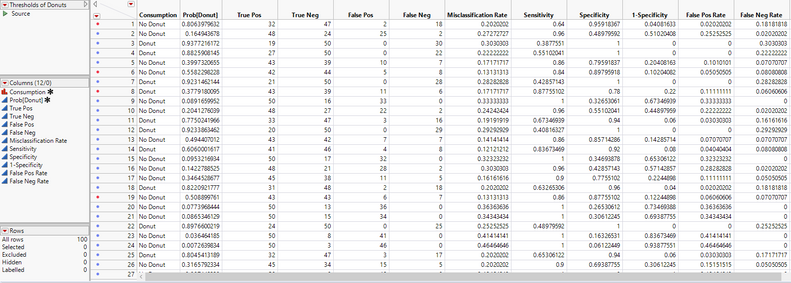
In addition to the platform, a new data table will also launch. This data table takes the Prob[Donut] and Consumption columns, and for each person’s probability of eating a donut, it creates counts for true positives, true negatives, and false positives, and false negatives by looping through all the people and comparing the current person’s actual consumption and consumption probability to the other individuals.
From these counts, a sensitivity, or true positive rate, column is created, which is the ability of the model to correctly identify those who have actually consumed a donut. Specificity, or the true negative rate, is ability of the model to correctly identify individuals who have not consumed a donut.
The misclassification rate is the sum of false positives + false negatives over the total number of observations in that row.
If you used a validation column, there will be an individual table opened in the background for each validation category along with one table with all the subsets joined together.
Results – Report Window
Back to the platform. The first graph we see is a standard ROC curve, graphing Sensitivity against 1 - Specificity along with the area under the curve with a 95% Wald confidence interval. To the right, we have a cluster graph showing visually the distribution of the binary classification outcomes. The y-axis shows the modeled categories and the x-axis is the model score. The vertical slider is at the current threshold. Red points are points where the model incorrectly predicted donut consumption whereas blue points are correctly predicted.
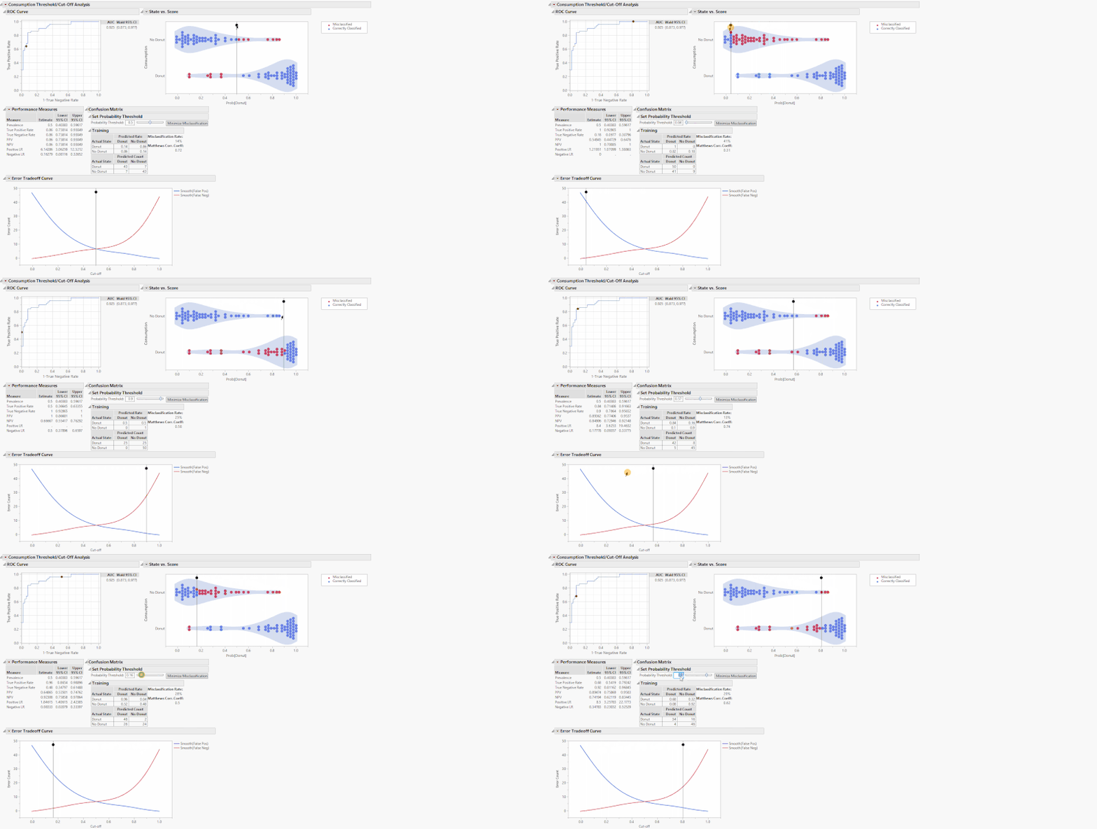
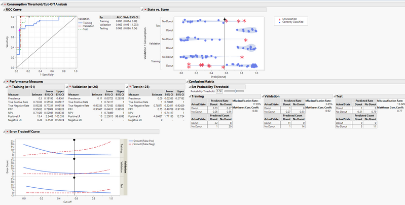
These tables and graphs are all great on their own, but the real value comes with the interactive aspect. The performance measures of a classification model are based on a threshold or cut-off. When you change the threshold, the performance metrics change. On the State vs. Score and Error Tradeoff Curve, there are drag markers on the horizontal lines indicating the model threshold. Grab and move either of these lines to change the threshold and update the performance measures.
Alternatively, use the slider or editable number box under the outline box “Set Probability Threshold” above the confusion matrices to change the threshold. These drag markers and sliders are all synchronized, and when you move one, the others move as well. What these sliders are doing is setting the new probability threshold, the point that determines the binary classification of whether the model predicts that you will consume a donut. Increasing the cutoff will set a more stringent threshold for the model to predict the donut consumption and vice-versa. For example, if you set the threshold to 0.8, that means for the model to predict that you will consume a donut, you must have a Prob[Donut] > 0.8, otherwise it will predict that you will not consume a donut.
Additional Features
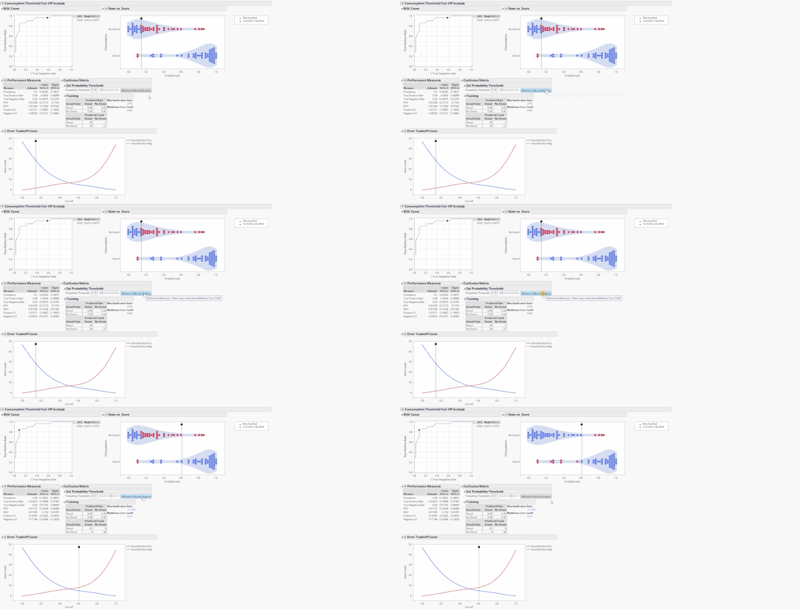
The “Minimize Misclassification” button sets the optimal cutoff that minimizes the sum of false positives and false negatives. In turn, it also maximizes MCC.
In the custom “Threshold/Cut-off Analysis” red triangle at the top, you have the ability to display a Lift Curve, in addition to a Cumulative Gains Curve if you’re a Pro user, to the bottom of the output. These options are also available for each Validation category under the performance measures red triangle when using a Validation column.
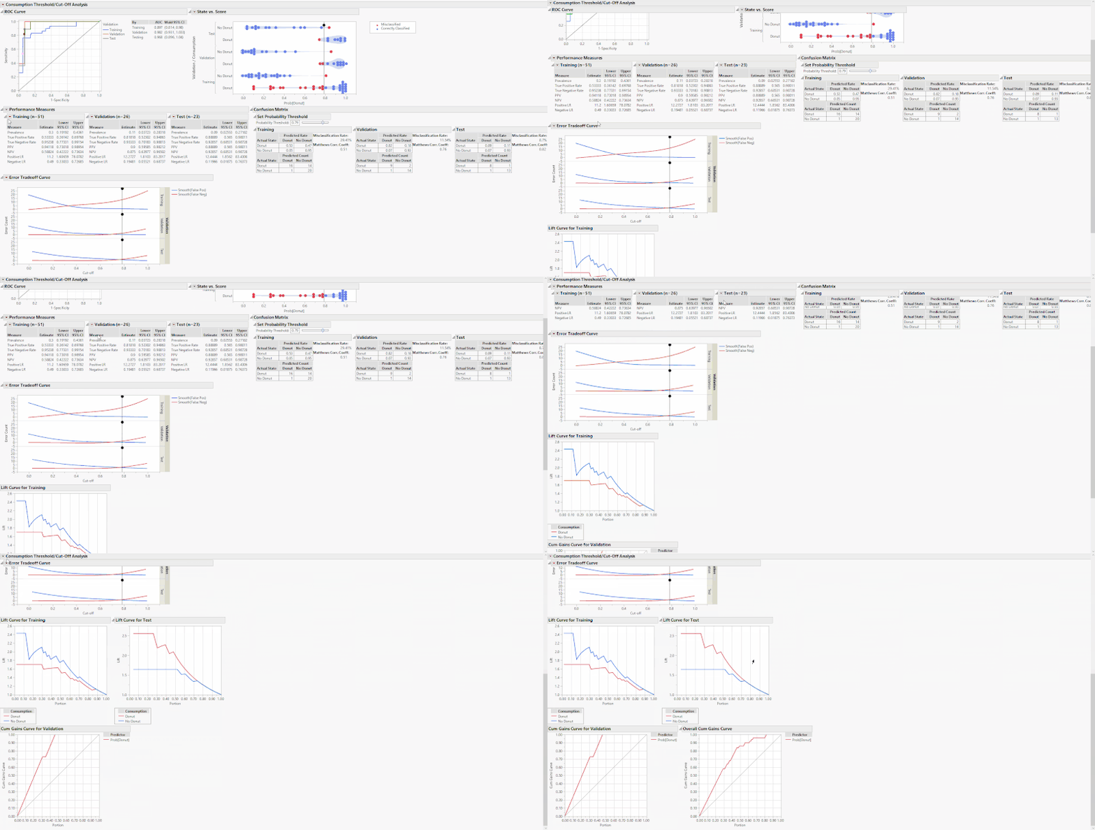
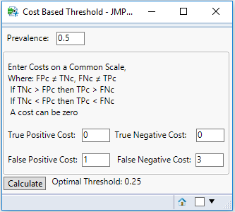
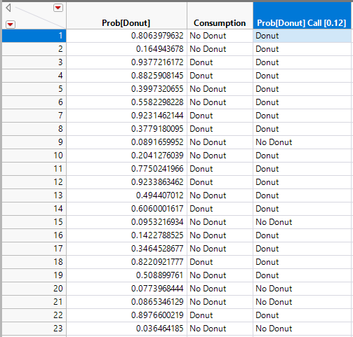
You will also see the menu option “Cost Based Threshold,” which opens a new window that calculates an optimal threshold based on classification costs. For example, say you have a donut consumption prevalence of 0.5, a TP and TN classification cost of 0, a FP cost of 1, and a FN cost of 3. In this example, it is three times more costly for you to have a false negative donut classification as it is to have a false positive, possibly people would get three times more upset about there being a shortage of donuts rather than surplus. With these costs, the optimal threshold is 0.25, which you can manually enter into the number edit box.
Conclusion
This add-in is an extremely powerful tool to evaluate cutoffs in any classification model, whether it’s predicting donut consumption or defect rates in manufacturing. By having all the graphics and tables in one highly interactive platform, data visualization and model threshold setting are straightforward.
What type of models are you evaluating with this add-in? Let me know in the comments below if you have any suggestions!
You must be a registered user to add a comment. If you've already registered, sign in. Otherwise, register and sign in.
- © 2026 JMP Statistical Discovery LLC. All Rights Reserved.
- Terms of Use
- Privacy Statement
- Contact Us
