- New to JMP? Let the Data Analysis Director guide you through selecting an analysis task, an analysis goal, and a data type. Available now in the JMP Marketplace!
- See how to install JMP Marketplace extensions to customize and enhance JMP.
JMP Blog
A blog for anyone curious about data visualization, design of experiments, statistics, predictive modeling, and more- JMP User Community
- :
- Blogs
- :
- JMP Blog
- :
- Crisis in Craven? An update on the UK happiness survey
- Subscribe to RSS Feed
- Mark as New
- Mark as Read
- Bookmark
- Subscribe
- Printer Friendly Page
- Report Inappropriate Content

My mum and dad have lived in Craven for the last four decades. They told me that people in their village are fairly unhappy that the friendly local inn has just been turned into a gastropub by new owners. Heartbreaking. But I don't think that fully explains the survey results.
If you have read my blog post from last year, you will not have been surprised by this apparent change in the well-being of the residents of this part of the Yorkshire Dales. I showed that the high score for Craven was most likely an anomaly due to the small number of people from this area that were surveyed.
I created another view of the Life Satisfaction data (from 2011/12 to 2017/18) that might help you to grasp what is going on. It is a bubble plot, with each bubble being one of the regions of the UK. The bubbles are sized according to sample size, that is, the number of people surveyed. The bubbles are also positioned on the x-axis according to sample size and this suggested three clusters that I have coloured orange (<300), grey (300-600) and blue (>600).
This interactive report is published on JMP Public. To fully appreciate this visualisation you should view this on a device with a larger screen. Click the play button at the bottom or move the [Year] slider to see how the Life Satisfaction score has changed from the 2011/12 survey to the most recent 2017/18 survey. The score is the average of the answer to the question: “Overall, how satisfied are you with your life nowadays? Where 0 is 'not at all satisfied' and 10 is 'completely satisfied'.” I have highlighted Craven, Hertsmere and West Lothian because we talked about them in the blog post last year. I have also highlighted Rushmoor, Hampshire, because it has the highest Happiness and Life Satisfaction scores in the most recent survey. You can click on other bubbles to see which regions they are. You can also change the speed and bubble size using the sliders.
Overall, you can see a general upwards movement reflecting that Life Satisfaction has increased over this period. Now look at how wildly the small orange bubbles move up and down compared to the steadier rise of the big blue bubbles. You can see how the estimates become more variable as samples get smaller, as any statistician would expect. The extreme results for Craven, Hertsmere or Rushmoor are not worthy of reporting: The sample sizes are so small and the estimates are so variable that you will inevitably see extreme values in some years.
I noticed some other curious things in the data. Click on some of the bubbles in the grey cluster. You should find that they are, for the most part, London boroughs. It looks like the sampling plan ensured that similar numbers of people were surveyed in each part of London.
Is it just me or does it look like people in London are less satisfied with life compared to others in the UK? I began to wonder if “ruralness” was an important factor here. It looks like the smaller, orange bubbles -- presumably the more rural areas -- are generally higher up on the Life Satisfaction scale.
I fit something called a random coefficients mixed model to the complete data. The model tells us that the average Life Satisfaction for the UK was 7.47 in 2011/12 and has increased at an average rate of 0.050 each year (with 95% confidence intervals of +/- 0.02 and +/- 0.004, respectively). It can also tell us about the trends for each region.
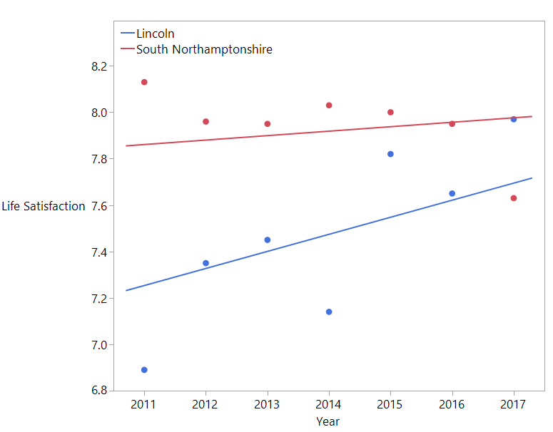
Here, you can see the data (points) and the model fit (lines) for South Northamptonshire[2] and Lincoln.

The starting Life Satisfaction in 2011/12, or the “intercept,” varies between regions. The rate of increase, or the “slope,” also varies between regions. Some, like South Northamptonshire, started higher and have improved little (high intercept, low slope).[3] Others, like Lincoln, started lower and have improved more (low intercept, high slope).
I then mapped this across the UK.[4] You can find this in JMP Public, too. Hover over any region to find the name and statistic.
The darkest purple regions of the UK generally correspond to the lightest orange. That is, these “always-satisfied” regions start with the highest Life Satisfaction and have the lowest improvement rate. Conversely the regions with low intercepts (light purple) seem to correspond to high improvement rates (dark orange). These “catching-up” regions started with lower Life Satisfaction but have been improving more rapidly in the years since.
What is interesting to me is that the always-satisfied are mostly rural areas like Craven, the Scottish Highlands and the English Lake District. The catching-up are more urban areas like South Wales, the West Midlands, Glasgow and Manchester. If I had the data to hand, I could maybe make this clearer by also mapping some measure of ruralness, like population density, as my colleague @XanGregg did in a recent blog post.
The catching-up areas are mostly parts of the country where there used to be a lot of heavy industry. In current political discourse, these are sometimes called the “left behind” places because, after those industries declined, quality of life has stagnated relative to the rest of the country. It looks like they may have been behind in 2011, in terms of Life Satisfaction, but have been narrowing the gap in recent years. That was a bit of a surprise to me.
I would want to look at this and the other well-being measures more carefully before using it to guide public policy. However, it shows that you can find interesting and useful insights from this data. This data was collected with care and at considerable expense. I was therefore disappointed when the latest survey results were released and all the media reports I found once again focussed on who was at the top and who was at the bottom and why these places are so good/bad. Strangely, they made no mention of Craven this time.
Let me know if you have any comments or ideas for analysing this data.
Notes
[1] The data is publicly available under the Open Government Licence.
[2] What a name! Weirdly there is no North Northamptonshire. There is also no North Southamptonshire or South Southamptonshire, in case you were wondering.
[3] You may have noticed that the model fit does not follow the apparent downward trend for South Northamptonshire. This is because it is using the data from all regions to give the most reliable estimates of slope and intercept for each region. It is less influenced by individual deviations from the overall trend. This is good because we know that the yearly estimates for each region are somewhat unreliable.
[4] I downloaded shape files for this (contains OS data © Crown copyright and database right 2017).
You must be a registered user to add a comment. If you've already registered, sign in. Otherwise, register and sign in.
- © 2026 JMP Statistical Discovery LLC. All Rights Reserved.
- Terms of Use
- Privacy Statement
- Contact Us
