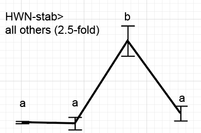
I know that, a while back, Jeff P, explained a longer work-around for this, but I think it would be great to have a GraphBuilder option in which Tukey's letters (to denote differences between plotted means) could be overlaid over columns/icons in the plot itself. Normally, I just paste the JMP plot into Adobe Illustrator and manually add them (see attached image), but this can be pretty time consuming for a complex figure. I could envision it as an option on the left side (near where you define error terms and things of that nature). I guess you would need to somehow define the treatment you are interested in, which may be incompatible with certain graphics, so I can kind of see why this may not currently exist (i.e., there are soooo many plots that could be generated, only a fraction of which would make sense to use with Tukey's letters over the data points).