cancel
Showing results for 
Show  only  | Search instead for 
Did you mean: 
Choose Language Hide Translation Bar

Quick add pairwise comparisons to graphs

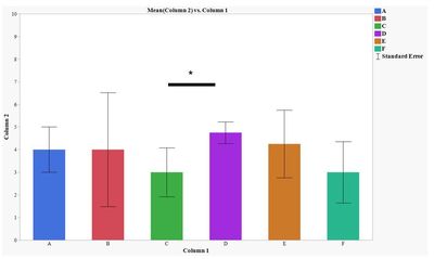
It would be helpful if there was a shortcut in Graph builder where you can import pairwise comparisons to be displayed on the graph. Currently we have to export the JMP bar graph to PowerPoint and manually add the lines that indicate significance between groups.

We do use JMPs Fit Y by X tool to do the stat comparisons and JMP graph builder to create the "base" graph. We would just appreciate if these capabilities were linked
 

Capture.JPG

6 Comments
SamGardner
Staff
Status changed to: Needs Info

Interesting idea!  Some questions about this:


In your plot, the groups are ordered naturally (standard alphanumeric ordering that JMP uses).  Typically, for a compact overlay of mean comparisons groupings, you would order groups by their group mean.  Would that be acceptable, or would you need to specify a different order?  e.g.

SamGardner_0-1654102939756.png


Are you wanting to just do pairwise (unadjusted) comparisons or would you want to do this for other multiple comparison methods?  The typical statistical approach to multiple comparisons is to show the groups that do not differ, rather than the groups that do differ.  In your example, with 6 groups, there are 15 mean comparisons that could be made, and if you don't use the "group the similar" approach, you could have a lot (up to 15) pairs not similar and need 15 indicators on the graph.  

If possible, could you share more examples of how you present the data, when there are more differences between groups and no differences between groups?  

Mariscience
Level I

Agreed, Graphpad has a similar feature that would be useful to have in JMP. Lines or brackets can be added automatically with certain types of analysis methods (T tests, one sample t test and Wilcoxon test, and one-way and two-way ANOVA).  https://www.graphpad.com/guides/prism/latest/user-guide/simple_pairwise_comparisons.htm


samanthamann
Level II

@SamGardner In some instances, we stick with the alpha numeric ordering that JMP naturally does. In other cases, I use the Value Order tool in column properties to adjust ordering manually using the up and down arrows. 


Most of my data sets are small and non-parametric, so I use Wilcoxon each pair comparison test. I guess we are a-typical in that we like to show which groups significantly differ from each other because our data typically has fewer differences between groups and more similarities.  In instances where there are more differences than similarities, we would show the similarities graphically.


To @Mariscience's point, the GraphPad graph below shows an example where there are many comparisons + many significant differences. In a case like this, I will choose which comparisons I would like to plot (noting somewhere which I have left off and why) using the GraphPad tool also shown below. I could also exclude some bars/ groups that are not as relevant. 

samanthamann_0-1654109573714.png

samanthamann_1-1654109776733.png


To be clear... I like JMPs graphing, analysis, and data table set up and functionality much more than GraphPad. That is why I would LOVE to see these features incorporated into JMP.


SamGardner
Staff
Status changed to: New

Thank you @samanthamann , that was very helpful, I think I understand what you are looking for.  Will move this back to "open for voting".  

Status changed to: Acknowledged

Hi @samanthamann, thank you for your suggestion! We have captured your request and will take it under consideration.

JmpLearner1
Level I

Hello, 


Is there an update regarding this feature? I found the following post that helped me add the significance labels, couldn't manage to add the brackets. 


I was wondering since this has been posted in 2022, maybe it has been developed? 


Thank you!