cancel
Showing results for 
Show  only  | Search instead for 
Did you mean: 
Choose Language Hide Translation Bar
0 Kudos

Plotting packed distribution with equal width and no jitter

When using violin plots (density), there is an option to have equal widths per variable.


However, we are unable to plot the dot distribution with the same shape as it does not respect the width of each variable.
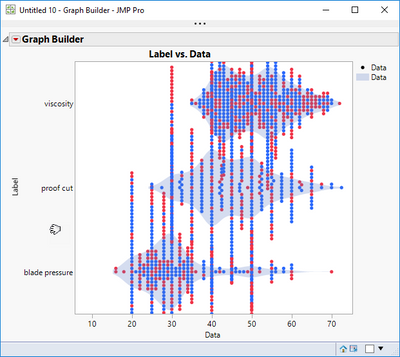
FN_2-1597167975171.png


// Start of script;
Names Default To Here( 1 );
Clear Log();

dt = Open( "$SAMPLE_DATA/Bands Data.JMP" );

Data Table( "Bands Data" ) << Stack(
	columns( :proof cut, :viscosity, :blade pressure ),
	Source Label Column( "Label" ),
	Stacked Data Column( "Data" ),
	Drop All Other Columns( 1 )
);

Graph Builder(
	Size( 534, 456 ),
	Show Control Panel( 0 ),
	Variables( X( :Data ), Y( :Label ) ),
	Elements(
		Points( X, Y, Legend( 5 ), Jitter( "Packed" ), Jitter Limit( 0 ) ),
		Contour( X, Y, Legend( 6 ), Violin Scaling( "Equal Width" ) )
	)
)

It should be straight forward to achieve something like this but for a number of variables.
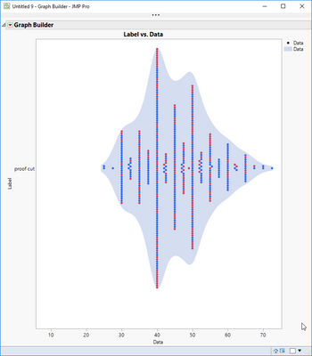
FN_1-1597167768642.png


2 Comments
Ryan_Gilmore
Community Manager
Status changed to: Archived
We are archiving this request. If this is still important please comment with additional details and we will reopen. Thank you!
FN
Level VI

This functionality is needed to reproduce SHAP plots, a functionality introduced in JMP 17 Pro but without that standard visualization output.


https://community.jmp.com/t5/JMP-Add-Ins/Predictor-Explainer-AutoML-and-Explainable-AI-in-JMP-Python...


Splitting the data table and concatenation of variables is lot of work for a visualization that gets cluttered otherwise.