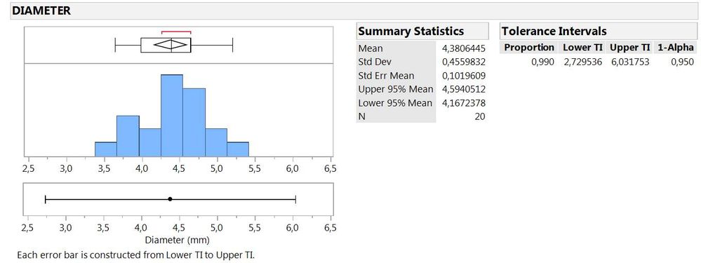
It would be nice if Tolerance Intervals calculated in the Distribution Platform came with a visualization (e.g.) on top of the Histogram. The graph below gives an example. There, I added the Graph Builder visualization of a Tolerance Interval below the Distribution Histogram. I left out Spec-Limits there, but if so specified in the column properties, they should be shown there, as well.
Similar to other features in Distribution I image it would be possible to show or hide this visualization via the red triangle menu.
There are further ideas presented in the Wish List in connection with Tolerance Intervals, e.g.
https://community.jmp.com/t5/JMP-Wish-List/Setting-Confidence-and-Proportion-to-Cover-for-Tolerance/...
https://community.jmp.com/t5/JMP-Wish-List/3-Sigma-Intervals-and-Tolerance-Intervals-in-Graph-Builde...
https://community.jmp.com/t5/JMP-Wish-List/Statistical-rationales-for-sample-sizes/idi-p/52052