What inspired this wish list request?
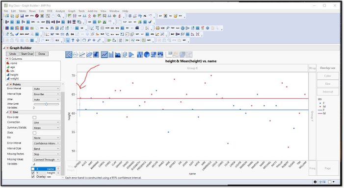
I use line charts a lot without using the X element, so that the line goes all the way across the chart and shows some summary value, usually the mean. I started to try and put in the CI error bands to show if they overlap but found that the current behavior of JMP does not work as I expected. Here you can see the error bands are just a sliver on the left side of the chart.

What is the improvement you would like to see?
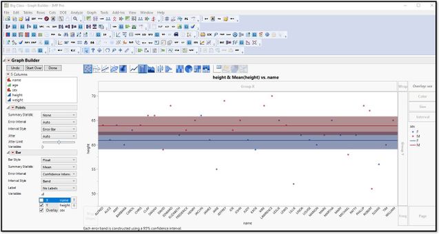
I would like to see the error bands go all the way across line element.

I could make it look like this by using the bar chart element and making the width of the bar and band=100 but it shouldn’t be that hard in my mind.
Why is this idea important?
This would standardize the expected behavior in JMP for the user as well as provide a quick and easy way to show overall summary values with some time of interval band, which is a standard thing to report out on across all industries.