cancel
Showing results for 
Show  only  | Search instead for 
Did you mean: 
JMP Wish List

We want to hear your ideas for improving JMP software.

  1. Search: Please search for an existing idea first before submitting a new idea.
  2. Submit: Post your new idea using the Suggest an Idea button. Please submit one actionable idea per post rather than a single post with multiple ideas.
  3. Kudo & Comment Kudo ideas you like, and comment to add to an idea.
  4. Subscribe: Follow the status of ideas you like. Refer to status definitions to understand where an idea is in its lifecycle. (You are automatically subscribed to ideas you've submitted or commented on.)

We consider several factors when looking for what ideas to add to JMP. This includes what will have the greatest benefit to our customers based on scope, needs and current resources. Product ideas help us decide what features to work on next. Additionally, we often look to ideas for inspiration on how to add value to developments already in our pipeline or enhancements to new or existing features.

Choose Language Hide Translation Bar

Geographic Maps with Bars

Add the ability to have Bar indicators for locations on a geographic map.  Powerful view, especially with animation showing changes over time or periods.  Attached an example of the view.  Currently cannot get there fullly with current Graph Builder or Bubble Plot Maps.
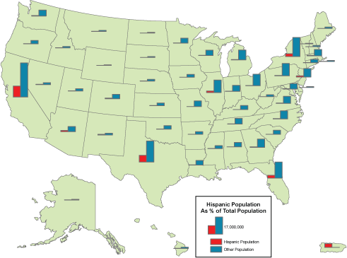
hisp_bars.gif

3 Comments
nascif_jmp
Level VI

I was able to cook something very close using a mix of new features. Here are the steps:

0) Open a dataset with per state data, such as "US Demographics.jmp" from the JMP Sample Library. Note that it also has latitude and longitude for the centroids of each state.

1) Create the desired, per state bar chart in Graph Builder;

2) Move "State" from the role "X" to the role "Page";

3) Use the GB "Make Into Data Table" command to turn the graph into a data table. You should have 50 rows and two columns named "State" and "Graph"

4) RMB on the State column header, tag it as a "Link ID" (we are going to use it for a virtual join)

5) Save this table to the file system;

6) On the original dataset, RMB on the State column header, tag it as a Link Reference to the previous table.

7) RMB on the new, linked "Graph" column and tag its "User for Marker" property.

7) Create a new GB, drop "State" in "Map Shape" role

8) Add a "Points" Plot as an overlay (drag the icon from the toolbar over the map)

You can use one of the variables for the color background, a nice way to provide context for the graphs.

If you want a clean look as the one in the original image:

9) Assign a measure to the color role; 

10) RMB on the legend, set transparency to 0.


The end result should look like this. 

I hope you will find this helpful!


Map with graph markersMap with graph markers

nascif_jmp
Level VI

JMP CookBook entry with full script now available here.

XanGregg
Staff

You can approximate the bars (or any custom drawing) on a map with the new Marker Expressions.

crimem_map_bars.png


Open("$SAMPLE_DATA/Crime.jmp");
Graph Builder(
	Size( 528, 450 ),
	Show Control Panel( 0 ),
	Variables( Shape( :State ) ),
	Elements(
		Points(
			Legend( 3 ),
			Set Shape Expression(
				Expr(
					Local({width = 3, y scale = 0.03, y offset = 2},
					Transparency( 0.6 );
					Fill Color( "blue" );
					Rect( -width, :robbery * y scale - y offset, 0, 0 - y offset, 1 );
					Fill Color( "green" );
					Rect( 0, :assault * y scale - y offset, width, 0 - y offset, 1 );
					)
				)
			)
		)
	)
)