Solution
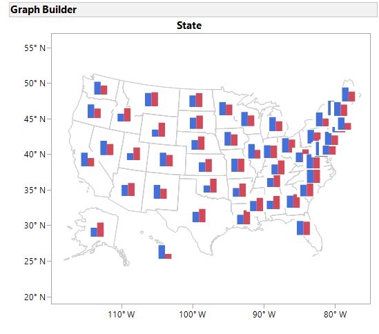
Context is everything! So just as one might want to embed tiny line charts in a text block as sparklines to show them in the context of a discussion, someone might want to embed tiny bar charts in a map to compare variables in the context of their location. Someone like our own @scwise, who added this suggestion in a wish list entry.
The solution can be implemented using two recent JMP features - virtual joins and the ability to use images in table cells as markers. Combined with the Graph Builder's ability to create a data table with graph elements from a composite graph, we have all the pieces needed to solve this puzzle. The final result looks like this:
 US Elections 2008: Obama vs McCain
Details below:
dt1 = Open("$SAMPLE_DATA/US Election 2008.jmp");
// Create per state graphs
gb1 = Graph Builder(
	Variables( Y( :Obama ), Y( :McCain, Position( 1 ) ), Page( :State ) ),
	Elements( Bar( Y( 1 ), Y( 2 ), Legend( 8 ), Summary Statistic( "Max" ) ) ),
	SendToReport(
		Dispatch(
			{},
			"",
			ScaleBox( 2 ),
			{Min( -0.657608695652174 ), Max( 0.657608695652174 ), Inc( 0.25 ),
			Minor Ticks( 0 )}
		),
		Dispatch(
			{},
			"",
			ScaleBox( 3 ),
			{Min( -0.657608695652174 ), Max( 0.657608695652174 ), Inc( 0.25 ),
			Minor Ticks( 0 )}
		),
		Dispatch( {}, "400", LegendBox, {Set Title( "" )} )
	)
);
// Save graphs as images to data table
dt2 = gb1 << Make into Data Table;
// Tip: save table to enable virtual join
dt2 << Save("$TEMP/ElectionPerStateGraph.jmp");
// Set virtual join between tables
dt2:State << Set Property("Link ID", 1);
dt1:State << Set Property(
			"Link Reference",
			Reference Table( "$TEMP/ElectionPerStateGraph.jmp" ));
// Use virtually joined graph column as source for markers
col = Column(dt1, "Graph[State]");
col << UseForMarker( 1 );
// Create map with a points overlay using graph markers
dt1 << Graph Builder(
	Size( 534, 456 ),
	Show Control Panel( 0 ),
	Variables( Shape( :State ) ),
	Elements( Map Shapes( Legend( 2 ) ), Points( Legend( 3 ) ) )
);