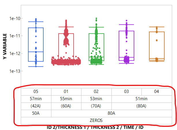
As a heavy user of JMP, I often work with multiple variables displayed on the same axis in Graph Builder. For example, when axis titles are like ID 2 / THICKNESS 1 / THICKNESS 2 / TIME / ID, due to multiple variables being stacked or grouped, it becomes visually difficult to interpret which tick label belongs to which variable.
I would like the ability to color both the tick label font and the tick label area (the region between the axis title and the plot) based on the variable. This would greatly improve readability and help users quickly distinguish between variables in complex visualizations.