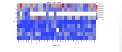
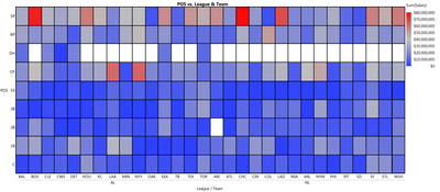
I would like to be able to create a bordered heatmap in Graph Builder. I find that this helps with refering to the X and Y axis level that the cell in the heat map is for, and what a more refined look.
Here is an example output from JMP:

Here is what is the look I want:

I have also attached the data file I used to make thi graph.
MLB 2018 Salarys By (Team, POS).jmp