- Subscribe to RSS Feed
- Mark as New
- Mark as Read
- Bookmark
- Subscribe
- Printer Friendly Page
- Report Inappropriate Content
JMP On Air
- JMP User Community
- :
- JMP On Air
- :
- Monologue: Worst or Wise Graph Wednesday
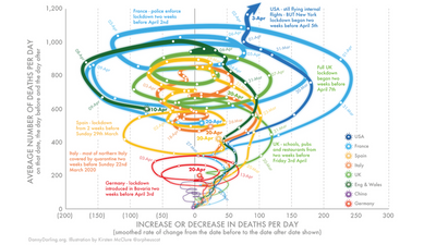
A friend sent Julian a new kind of graph (below). Julian discusses how to make this kind of graph in jmp in order to determine if it's a Worst Graph, or a Wise Graph. Spoiler Alert: It's a Worst Graph.

I love that graph and have been playing around with them since your segment with variety of data. But I agree that it is the worst - it requires a load of interpretation and explanation, which inherently defeats the purpose of a summary graph like this. But hey ... I mean, just LOOK at that graph! :D
That's exactly it, @andersonmj2! If it requires all that explanation to be useful, and doesn't scale well with lots of data, *and* there is a well understood graph type that displays the same data well, and scales well, I just can't see a use for it. But, yes, as my friend said, it's got some moxie.
- Mark as Read
- Mark as New
- Bookmark
- Get Direct Link
- Report Inappropriate Content
wow! @julian at first I was worried your friend's wondrous commentary would prove out in your explanation -- but my concerns were allayed once you showed the "U" shaped graph in time order on the left, and the corresponding (@#!%^@??) graph on the right in the moving average vs. difference space. you know what? the whole recent talk by Nick Desbarats's on "Statistically Speaking" on 05/13/20 really rings true here and reflects yours and @andersonmj2 's commentary.
Here's one from his slides I snipped and copy here for relevance:
Poor tornado plot!
- I will play the avocatus diaboli for you. Let's see if we can win this case :)
@julian
Just imagine that there is a 2D plot on the left and a 3D plot on the right. Now, one has to predict how the 3D plot could look like. Impossible! But is this a watertight argument against a 3D plot ;)
Should we ask: Is it possible to predict the left plot (time series) from the right one (tornado plot)?
-> beter not, because the answer is: No, not in general. *)
But even then, it's not a proof that the right plot has no benefit, right?
Could be that the right plot is just another 2D projection of a 3D picture. So, could be that one cannot predict the left plot
- but likely there is still some kind of usefulness in the right plot.
Concerning usefulness:
The x axis is just the time derivative of the value in the time series. So, there should be no additional information in the Tornado plot which is not available in the time series. Looks bad fo the Tornado plot!
But @XanGregg showed in his plenary talk in 2015 that showing the same information slightly differently can reveal thing which were hidden before. So, good chance that the Tornado Plot can be useful.
More to come?
*) If there are points @ x=0, one never knows if it is just a single point or if there are multiple points over many days and weeks - because mankind managed to keep the value stable for some while. So, definitely, the Tornado plot is very bad in showing the length of stable periods.
- © 2026 JMP Statistical Discovery LLC. All Rights Reserved.
- Terms of Use
- Privacy Statement
- Contact Us
