- New to JMP? Let the Data Analysis Director guide you through selecting an analysis task, an analysis goal, and a data type. Available now in the JMP Marketplace!
- See how to install JMP Marketplace extensions to customize and enhance JMP.
- Subscribe to RSS Feed
- Mark as New
- Mark as Read
- Bookmark
- Subscribe
- Printer Friendly Page
- Report Inappropriate Content
JMP On Air
- JMP User Community
- :
- JMP On Air
- :
- Creating Drill-Down Graphs in Graph Builder
Learn how to create drill down graphs to reveal additional levels of detail in the data.
Interesting in learning more about graphlets? See this article by John Sall: What’s the point? Just pointing at something tells you about what you are pointing at
Attached is the data set I used and here is a link to the production volume data: https://www.ttb.gov/beer/statistics
Full Transcript (Automatically Generated)
All right.
Hello, everyone. My name is Wendy se. And I am the technical lead for North Central. And I'm excited to show you how you can create drill down graphs and jmp, which is a new feature in jmp 15. First, this guy, since we're going to be utilizing some brewery data, I thought I would show you where is North Central. North Central encompasses these states, basically the middle of the US, and I support this geography along with my two teammates, Andy Spence and Kathleen watts. I also wanted to highlight to you some of our favorite breweries in the Minneapolis area. So if you ever come by, please check these out.
All right, now, let's go take a look at The drill down graph that we're going to create together.
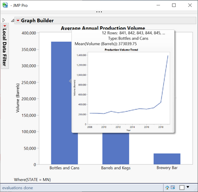
This drill down graph will allow us and others that we share this data table with, to explore brewery trends in the US. I'm going to hover over the state of Minnesota and you can see that I can drill in to Minnesota. And I can see what the average annual production volume by type and how that breaks out. And then I can also do another drill in where I'm hovering over production volume produced for brewery consumption. And I can see a trend what that looked like over the last several years. All right, let's see how we can build this together. So we're going to build this Using graph builder and the way that we're going to do this is we're going to build each one of the three layers individually. And then we will nest the scripts within each other kind of like a Russian doll. So let's go ahead and build that first layer. So the first layer that we looked at was a map of the US. So I'm dragging state into the map zone which brings up the shape of each state. And then I'm dragging volume not interrupt to I don't know if you're sharing anymore. No. See?
How does that look? Perfect. Okay, when did I stop sharing? Oh, just just a little bit before there, you're fine. Okay. So now I've got a A map of the US and each state is colored by the volume of beer and barrels.
Because I have a lot of states with some of these lower volumes, to create some differentiation in the map, I'm going to change the gradient scale to be quantiles instead of linear. Alright, so that's layer one. Now let's go build layer two. I'm going to open up graph builder again, and layer two. Right, we looked at the breakout of the volume by type, some dragging type to the x axis, and volume to the y axis.
And since I want a bar graph, I'm going to change this visualization to a bar. The next thing I want to do is to order these bars in descending order.
So I'm right clicking on the X axis, doing order by volume descending, which gives me a nice sort.
So that is layer two. Now let's build the final layer. So again, I'm going to open up another instance of graph builder. And I'm going to build that trend graph. So I have volume which is on the Y by the year. I'm going to change I'm going to overlay by state so that we have a separate line for each state.
And then I'm going to change this graph type to a line graph. One nice thing to do In this particular case is to get rid of the legend on the right. So I'm going to go to the red hotspot and uncheck legend. Click Done. Okay, so now we built the three layers.
And what we're going to do is nest them within each other. So I'm going to grab the code that creates this particular graft. So I'm going to start with the third layer and nest within the second and then take the second and nest within the first. So I'm going down to save script Copy to Clipboard. I'm going to go to the second layer and I can essentially right click on any one of these graphs, or these bars. Go to hover label and paste graph. What once I do that, I hover over one of these bars and I can see that I'm getting a graph Now, our third and last step of nesting is to take this particular script and copy it and then paste it into the first layer. So again, I can right click anywhere in this graph, go to hover label, and say paste graphic. And now we can test this. So if I hover over the state of Colorado, for example, you can drill into Colorado.
And I see that brewery production for burry bars pretty low in this state over the last 12 years. If I hover over bottles and cans, you can click in there and see the production volume trends over the last 12 years for Colorado.
So our last step really is to save this to the data table. So I'm going to go to that first. layer and I'm going to go all the way to the bottom and save script to the data table.
We can call this. And now, if I were to save this data table and send it to someone, they could also explore this data using the drill downs I've created.
So, I thought it might take us go backwards a little bit and talk about where I got this data. So I got this data from our Department of Treasury. And because the federal government taxes are states based on how much beer they brew, you can go to this website It's all recorded here. And the government records how much production by state there's been for consumption on premises consumption, and bottles and cans, and then finally barrels in kegs. So this is where I grabbed the data. And I actually imported it into jmp using the PDF document.
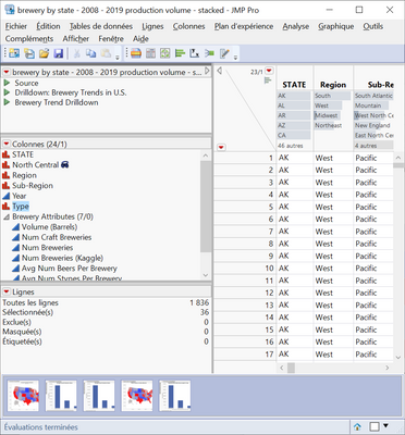
Because there's a PDF import wizard and jmp, and then I reshaped the data. So if you look at the number of rows I have in this data table, I've got 1800 rows. So it's a very tall data set, I had to take the years that went across in the columns and stuck them.
So there are 36 rows for each state in this data table. And this allows me to do the various drill downs ending in that tree. graph that I had. So I have 12 years and I have three types per year, which gives me the 36 rows per state. So hopefully you found this helpful and are eager to try this with your own data. I encourage you to look at the post following this. Following this presentation and take a look at this blog post that our founder wrote, which will give you a little bit more information about creating graph drill downs, and customizing graphs further.
Julian, I'll send it back to you
Hello Wendy (@wendytseng), I love it. I'm newcomer in the company and have to admit I did not used such features in my previous job (focusing on DOEs). By the way my previous company is located in Chaska, MN (I was located in France not in the "land of 10000 lakes") and I've been in some breweries in Excelsior as well as twin cities ! Thanks to your nice talk I'm know able to do such fancy graphs.
However on the third lawer all states appear and when I click on your script there is all states as well .... is there something special in my settings I should care about ? thank you for the help. Emmanuel
Hi, @Emmanuel_Romeu ! I'm so glad you downloaded the table and are utilizing the data. I am also glad to hear that you have been to our state! The Excelsior area is a fantastic place to visit! I am not too far.
Can you take a screenshot of what you are seeing and tell me which script you are utilizing?
By the way - I am always looking for collaborators on building out a rich brewery data set so if you have methods/sources of acquiring this type of data please let me know!
Hello @wendytseng
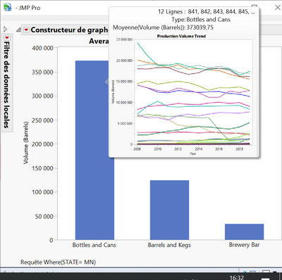
I tried both scripts "Drilldown ... in US" and "Brewery Trend Drilldown" and both returns me the same graphs (see below) when I go through MN as instance
The reason why I'm suspecting something wrong in my settings ...
Emmanuel
Hello @wendytseng ,
I've got it !!!
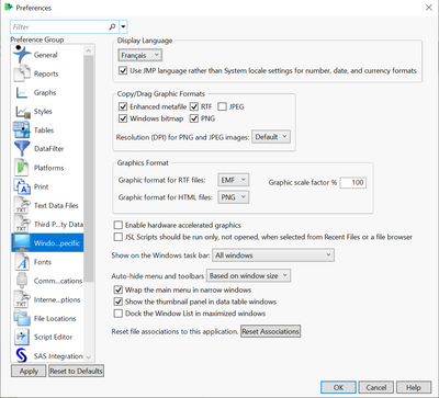
I initially set my language preferences to French to present to our customers in their mother tongue,
When I set back to English, script works properly.
Depending on settings on A) "Windows specific - Display language" and B) "General - Save scripts" & "General - Displays indexes" I obtain different graphs ...
Note, that is the case when I redo the whole sequence by myself saving my own scripts.
As instance
Case study 1): for A) English and B) selected (thus in english) everything goes well. It is what you presented and I'm able to repeat identically (thank you for the nice video).
Case study 2): for A) French and B) selected (thus in english) Graph 1 & 2 are correct while all States appear on graph 3. It is what I mentionned in my previous mails.
Case study 3): for A) French and B) deselected (thus NOT in english) Graph 1 is correct. On Graph 2 bars do not appear thus I do not have access to Graph 3.
Emmanuel
- © 2026 JMP Statistical Discovery LLC. All Rights Reserved.
- Terms of Use
- Privacy Statement
- Contact Us


