- New to JMP? Let the Data Analysis Director guide you through selecting an analysis task, an analysis goal, and a data type. Available now in the JMP Marketplace!
- See how to install JMP Marketplace extensions to customize and enhance JMP.
JMP Blog
A blog for anyone curious about data visualization, design of experiments, statistics, predictive modeling, and more- JMP User Community
- :
- Blogs
- :
- JMP Blog
- :
- Why design experiments? Reason 4: Clarity
- Subscribe to RSS Feed
- Mark as New
- Mark as Read
- Bookmark
- Subscribe
- Printer Friendly Page
- Report Inappropriate Content
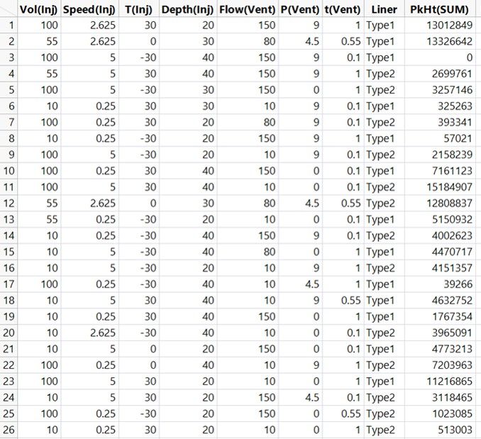
I want to demystify design of experiments (DoE) with a series of posts with simple explanations of some of the terms and concepts that can be confusing for people when they are starting out. In the first post in this series, we looked at the challenge of the vast possibility space in multifactor systems and introduced the concepts of factors, responses and full factorial designs. In the second post,we looked at how we can understand the behaviours in processes, including factor interactions, with visual and statistical models. In the third post, we showed how we build models of the process using data from efficient experiments and explained what we mean by multiple linear regression, main effects and quadratic effects.
We have illustrated all of this with a real-life case study in which we need to understand how to set the Large Volume Injector (LVI) in a GC-MS analysis system. The objective is to optimise the detection of low levels of contaminants in water samples. It seems appropriate that in this post we will be talking about clarity.
Here, when we talk about clarity, we mean clarity about the effects that our different factors (injection volume, injection speed, etc.) have on our response (the sum of all peak heights). We will see how the 26-run experiment that we introduced is almost uniquely able to provide this clarity.
As a contrast, we will also look at an example of data that does not bring clarity to our understanding. Along the way, we will explain orthogonality, confounding and aliasing. I want to bring clarity to your understanding of these concepts. We will therefore need to start simple.
A Simple Example of Correlated Effects, Orthogonality, Aliasing and Confounding
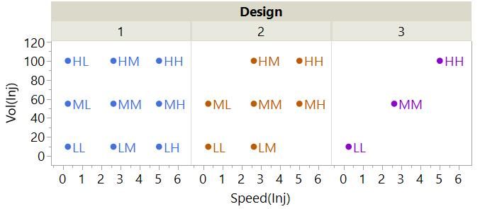
Let’s begin by thinking about just the first two factors for our LVI set-up and these three different experimental designs:
Each point on the plot represents a run in one of the three experiments.
- Design #1 is the full factorial for three levels (low, mid and high or L, M and H) of the two factors.
- Design #2 is the same but with two combinations removed – the LH and HL.
- Design #3 has only the LL, MM and HH combinations.
The coverage of the possibility space is clearly reduced from #1 through #2 to #3. Another thing that is changing is the correlation of our factors.
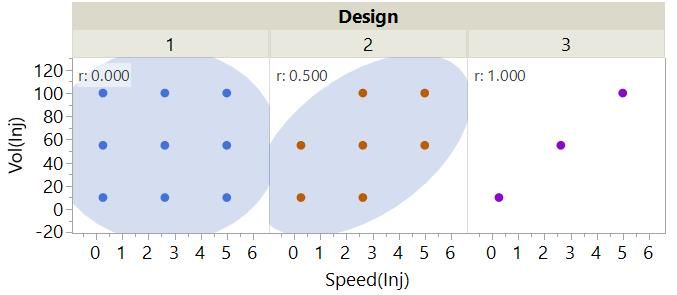
The full factorial has 0 correlation between the factors. We say that the design is orthogonal for the main linear effect of these factors. The confidence ellipse for #2 is tighter because it has a moderate correlation, r, of 0.5. We say that there is partial aliasing between these effects in this design. The density ellipse for #3 has collapsed to nothing because there is perfect correlation (r = 1). We say that the main effects are completely aliased or confounded in this design.
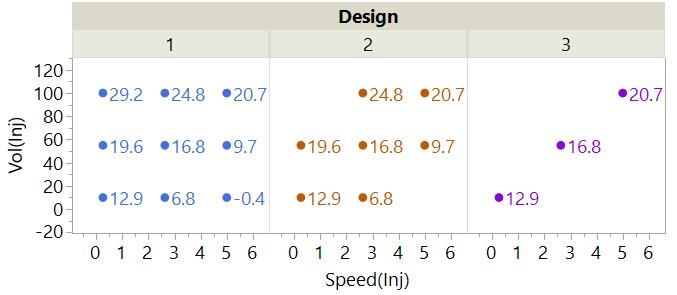
What are the consequences of this aliasing? To demonstrate this, we have simulated some response data for each run of each design. The points in the plots are now labelled with the value of the response, SimResp, for the runs.
Just by looking at the numbers from Design #1, you can get a sense of the effect of changing Vol(Inj) and Speed(Inj) on the response. You might also be able to get a sense of this from Design #2, but it not as clear.
There is an obvious problem with trying to understand the effect of the two factors from the data for Design #3: It is not possible to separate the effects of the factors. Each change we have made to one factor has been precisely matched with a change in the other factor. You can see why we call this confounding! We have a complete lack of clarity about the effect of our factors and therefore a poor understanding of our process.
As discussed in previous posts in this series, the best way to understand the effects of factors is by fitting a model. We will fit the main effects models to the data from each design – or at least we will try to.
In the case of Design #3, it is not possible to fit a model with the main effect of both factors, and we get a singularity warning when we try to fit this model in JMP:
This is telling us that we can fit one effect or the other, but not both.
We can fit the main effects model from the data from Designs #1 and #2. Here are the Profiler plots:
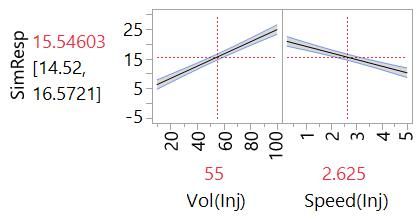
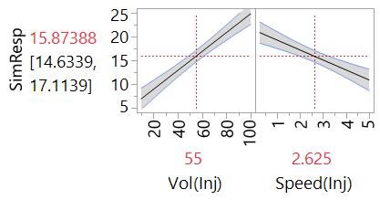
These plots include the confidence intervals that represent our uncertainty about the true effect of the factors. Our model is only an estimate after all. We expect that the line representing the effect is within the shaded bands of the confidence intervals. You can see that our uncertainty about the effects is greater in the case of the model from Design #2. This is partly because we had less data (seven runs versus nine runs) but also because of the partial aliasing of the effects. This is sometimes called variance inflation.
The take-home messages:
- We get the most clarity about the effects of factors with orthogonal experimental designs.
- We can cope with some aliasing – we can learn about the effects but with less precision.
- We can’t learn about the effects of factors that are confounded.
Experimental Designs For Clarity
Now let’s consider our 26-run design.
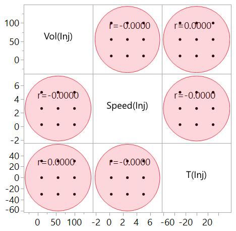
The next plot is a Scatterplot Matrix of our first three factors.
A Scatterplot Matrix shows scatterplots for every pair of variables. This one shows 0 correlation between all pairs of these factors; the design is orthogonal for these main effects. Our understanding of each of these effects is clear of confusion from the other effects. So far this looks like a good design.
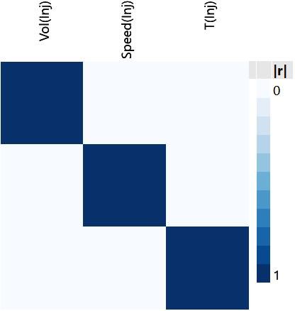
We can represent the correlation of the effects more efficiently with a correlation colour map:
This map has the same nine squares as the Scatterplot Matrix. Now the correlation of a pair of effects is represented by the colour of the square. The lack of correlation between our main effects is seen here in the pale blue squares. The dark blue diagonal from top left to bottom right is the correlation of each effect with itself (1 of course!) and is there for completeness.
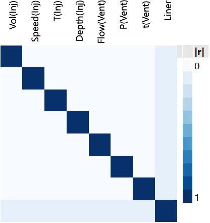
With this more efficient representation of the correlations, we can look at all the main effects.
The continuous main effects are all orthogonal with respect to each other. The clarity that this brings is one of the main reasons why these 26 runs make for such a useful design. The slightly darker blue squares under Liner tell us that there is partial aliasing of the categorial Liner effect with the other main effects (r = 0.0836). This should not be a concern. In fact, it is possible to calculate how much larger this would make the confidence intervals versus an orthogonal design (not more than 2.5%).
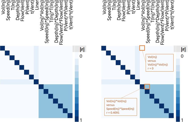
We can also look at a correlation colour map for all main and quadratic effects[1]. The colour maps below are the same except I have labelled two of the squares in the plot on the right to help with interpretation.
The pale blue region in the upper right quadrant represents the correlations between the main effects and the quadratic effects. For example, we can see that there is 0 correlation between the main and quadratic effects of injection volume, Vol(Inj) and Vol(Inj)*Vol(Inj). The map shows that there is a correlation of 0 between every quadratic effect and every main effect: Quadratic and main effects are orthogonal with respect to each other. This is no accident. Again, this was one of the reasons for this choice of experimental design.
The stronger blue in the lower right represents the higher correlations within the quadratic effects. For example, we can see that there is a correlation of 0.4091 between the quadratic effects of injection volume and injection speed, Vol(Inj)*Vol(Inj) and Speed(Inj)*Speed(Inj). The map shows that there is the same correlation of 0.4091 between all quadratic effects: The quadratic effects are partially aliased with respect to each other. This is a compromise that we can live with in this situation. It means that we should be able to understand the important curvilinear behaviours of any of the factors with just a little less precision. The important thing is that there is no confounding in the effects that we are looking at.
We have seen how the data from the 26-run experimental design can bring clarity to our understanding of the important behaviours in our process because of the minimal correlations of effects. Without the methods in software like JMP, it would be challenging to find an experimental plan that has both relatively few runs and these useful correlation properties.
As Clear As Mud
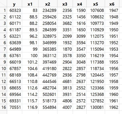
When data is collected without a plan there is inevitably more correlation, making it more difficult to understand what is driving the behaviours in a system. A classic example is this econometric data (the Longley data set available in the JMP sample data directory:(
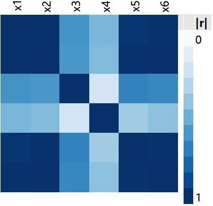
y is a measure of employment and x1 to x6 are potential predictors (x6 appears to be calendar year). The correlation colour map for the main effects shows correlations between x1, x2, x5 and x6 that are very close to 1:
The effect on our understanding of the effects of the factors can be seen from a Profiler plot of the full main effects model:
The widest confidence intervals are those for the most correlated effects and demonstrate the difficulty in trying to understand a system from data with highly correlated factors. For example, the model estimates that y decreases as x2 increases, but the confidence intervals indicate that the effect of that factor could also be strongly positive. We know almost nothing about the effect of x2.
We have seen that if we want to understand our processes and systems with clarity, we need to generate data from experiments that has minimum correlation between the effects we care about. We have seen that the correlation colour map is a powerful visual tool for understanding how good a design is in this respect. We have only looked at main and quadratic effects so far. What about more complex behaviours like the interactions that we mentioned before? In the next post in this series, we will look at these effects and see why the 26 runs in our experiment are a good choice if we want to ensure that these complex behaviours do not cloud our understanding of the system.
Notes
[1] There are a couple of steps if you want to manually determine the correlation of quadratic effects. For example, let's say you wanted to look at the correlation of the quadratic effects of two factors, X1 and X2. You first need to recode the factors so that that they are on the same scale. It is common to code the factors on the scale -1 to +1, with -1 being the lowest setting in the range, 0 being the mid-point and +1 being the highest value. You will often see this coding in books on DoE. With the factors coded in this way, you can then calculate the quadratic effects, X1*X1 and X2*X2, and look at the correlations. The same applies for looking at other higher order effects including interactions. DoE software tools, such as Design Evaluation in JMP, will enable you to evaluate the correlation of effects without having to go through these steps.
Did you miss any posts in this series on Why DoE? No problem. See the whole series here.
You must be a registered user to add a comment. If you've already registered, sign in. Otherwise, register and sign in.
- © 2026 JMP Statistical Discovery LLC. All Rights Reserved.
- Terms of Use
- Privacy Statement
- Contact Us

