Last month, Don (@DonMcCormack) took us on a deeper dive into a hybrid approach to withdrawing your retirement savings. Don’s analysis did show that an inflation-based approach could produce shortfalls if not managed correctly. With the state of the economy as it is and inflation higher than it has been in many years, the inflation-based approach seems particularly relevant.
This month we are going to take a little bit lighter approach and show where the worst states are for living a comfortable retirement. This data comes from a Bankrate article for 2021 and is based on combination of several factors including affordability, crime, culture, wellness, weather, and overall aggregate score that we calculated based on adding all the individual category scores together. Please check out the Bankrate article for further information on how they scored the states: The Best And Worst States For Retirement 2021: All 50 States, Ranked
We will show graphs based on these categories and give an overall score where a higher score indicates a more expensive retirement and potentially lower quality of life.
Some of the results may surprise you, but in the end, you need to make the decision on where to live that best fits your situation.
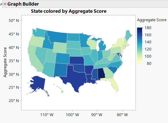
The first graph shown below is based on an aggregate score for all the factors listed above. The darker the blue, the lower the ranking and the worse off you potentially will be living there in retirement. As you move down the scale to yellow, the prospects for living a better life in retirement improve. Remember that all things are relative. What is best for you is what really matters most.
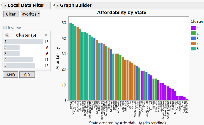
Below is a look at affordability to see where states fall. It is not always obvious why any given state fares worse than others, so these views will help shed some light and lead to better insights. Bars that are the same color belong to a cluster of similarly rated states. Maryland stands out in this graph, but remember color is based on all criteria not just Affordability. States considered to have good Affordability are on the right side.
So, what is driving the aggregate score? Let’s look at a couple of different analyses to see what we can learn. First up is hierarchical clustering. How do the states group together based on all the independent variables? Hierarchical clustering pairs objects that show a high degree of similarity as shown in the dendrogram below. We have used the clusters to help color several of the graphs as shown above.
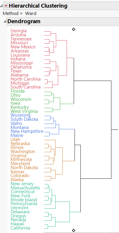
There are five clusters based solely on the data provided. We saved the clusters back to the data for future reference, but what are the clusters telling us?
A parallel plot including the clusters helps dig a little deeper especially when using a Local Data Filter.
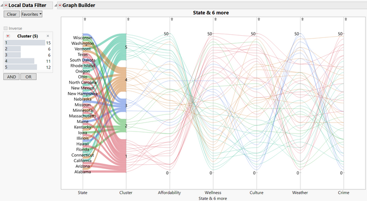
With the Local Data filter, we can select a cluster and compare the states in that cluster as shown in the example below. The graph shows how states in cluster 5 compared to one another.
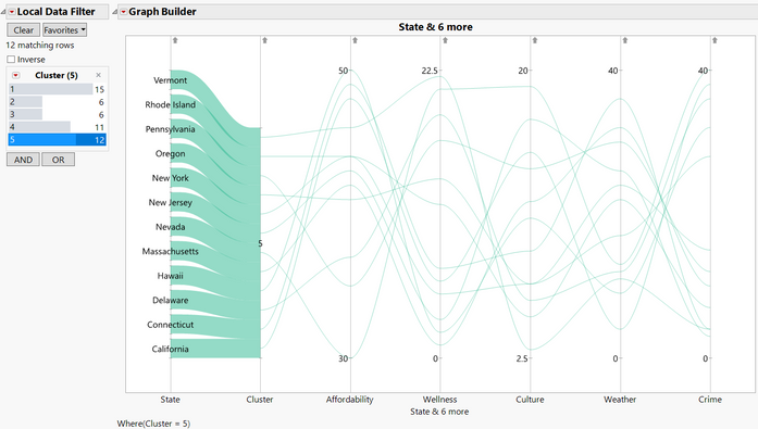
The states in cluster 5 have affordability values on the high side, and higher crime rates on the downside, but relatively good scores for culture on the upside.
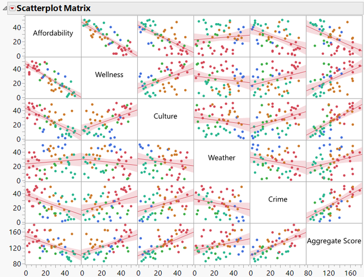
Multivariate analysis gives another set of tools that allow us to compare all the variables at once. In the scatterplot below, you can see where many of the variables are highly correlated with each other, but that weather appears to be fairly independent of the other variables.
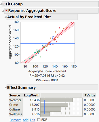
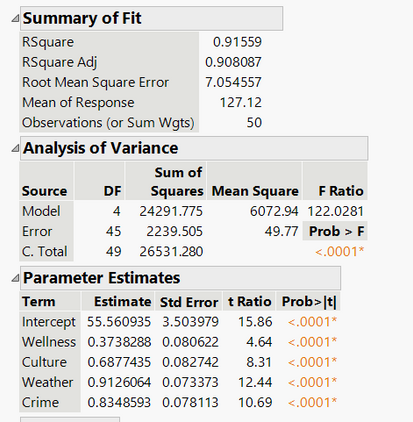
We built a predictive model using an Ordinary Least Square approach to show which factors were driving the value for our aggregate scores. The model shows that weather is the number one driver for a higher aggregate score and that affordability can be ignored when predicting the aggregate score. Another way to think about this is that affordability contributes no predictive power to the model once the main effects of the other factors have been considered. The model summary of fit shows high R2 and high R2 Adjusted values, and these values are closer together indicating a good predictive model. The Analysis of Variance Prob > F p-value is also very low, which indicates that model is better than the mean at predicting future data.
We will leave it to you to investigate further on your own with the attached JMP table. All the graphs and models shown in this post are saved in the data table so that you can easily recreate them. Best of luck finding the state for that fits your needs in retirement!
See all the posts in our retirement series here.
Ranking the Best and Worst States for Retirement1.jmp