- JMP will suspend normal business operations for our Winter Holiday beginning on Wednesday, Dec. 24, 2025, at 5:00 p.m. ET (2:00 p.m. ET for JMP Accounts Receivable).
Regular business hours will resume at 9:00 a.m. EST on Friday, Jan. 2, 2026. - We’re retiring the File Exchange at the end of this year. The JMP Marketplace is now your destination for add-ins and extensions.
JMP Blog
A blog for anyone curious about data visualization, design of experiments, statistics, predictive modeling, and more- JMP User Community
- :
- Blogs
- :
- JMP Blog
- :
- What Good Are Error Bars?
- Subscribe to RSS Feed
- Mark as New
- Mark as Read
- Bookmark
- Subscribe
- Printer Friendly Page
- Report Inappropriate Content
A cognitive psychology blog recently published an interesting post about an important and long-standing problem with scientific publications: Most researchers don't understand error bars.
Error bars are graphical elements included in a statistical plot to represent the uncertainty in a sample statistic. They are important to JMP users, as error bars are commonly mentioned when users are asked about what new features they want to see in the next version of the software.
They have been used for a long time, yet there is no real standard for them. Many publications have adopted some conventions over time, but no harmonization has occurred to date. The name "error bar" might imply that it represents one standard error, but in practice, error bars take various forms and represent other quantities, such as the sample standard deviation or a confidence interval of the sample mean. Different "rules of thumb" abound about how to make or interpret them. Whether you are an author selecting error bars for your plots or a reader interpreting error bars in an article, you might experience some confusion about their purpose and form.
The author of the blog, Dave Munger, polled readers before writing his entry to see if they knew how to use these statistical graphics and was not surprised to find that many participants had difficulty. He cited a large published study by Sarah Belia that found the same outcome for authors in psychology, neuroscience, and medical journals. How could intelligent, highly trained, and experienced researchers have difficulty with such an old, common, and seemingly simple device?
I think that the reason for this common professional malady is that we have used the same device for different purposes, we have used different graphics to represent the same thing, and we have used different formulae to compute them. To see this, compare error bars to another graphic device that is also used to represent uncertainty in sample statistics, the Shewhart control chart. This family of charts has an explicit model for each kind of sample statistic (e.g., individual data, sample average, sample range).
Control charts have rigorous rules for computing control limits and making the chart. Every chart is made of the same components so that if you learn how to read a sample means chart (Xbar chart), for example, you can also read a proportion defective chart (P chart). While the chart type depends on the data, the chart is generated and interpreted the same way, allowing these different control charts to keep a similar form and convey similar information. On the other hand, error bars do not have the same luxury; they do not have the same form or convey the same information, often making them ambiguous.
So for what do you use error bars? I can think of three common purposes, enough to illustrate my point.
1. Represent variation in a sample of data that is presented as a descriptive summary of the sample.
2. Represent uncertainty in a sample statistic that is used to infer something about the population.
3. Represent uncertainty in several sample statistics that are used to compare populations.
These purposes are very different, so there isn't one kind of error bar that works in every case. What does JMP do about it? JMP uses a distinct graphic for each purpose that is uniquely suited to each purpose. Examine the Big Class data set found in the Sample Data folder that accompanies JMP. Use the Oneway platform to explore the heights of different age groups. The key to eliminating this confusion is to use the correct graphic for each purpose.
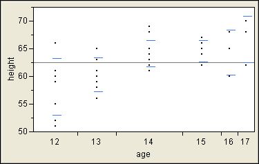
1. JMP shows the spread of the data with standard deviation lines.
If you have a question about the variation in each age group, you can use the Unequal Variances command to get the answer. In addition to a numerical report that includes hypothesis tests about the standard deviations, JMP adds standard deviation lines to the plot that represent one standard deviation above and below the sample average. These group statistics are not pooled because you want to know about the variation in each group.
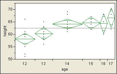
2. JMP shows the location of the sample average with a diamond.
If you have a question about the location of each group, you can use the Means command. Once again, you get a new graphic in addition to a numerical report. The means diamonds present the sample averages as point estimates (center lines) and as confidence intervals (top and bottom points of the diamonds). The default confidence level is 95%. At any time, you can change this level with the Set Alpha Level command, and all of the reports are updated. In addition, the width of the diamond is proportional to the size of the group. This graphic is distinct from the previous standard deviation lines, and it is richer and gives a better answer about the location of each group.
3. JMP compares sample averages with circles.
If you want to compare the locations of groups, you can use the means diamonds again. They include overlap lines near the top and bottom. If the interval between these lines for one group does not overlap the interval between these lines for another group, then the group means are significantly different. These comparisons use the same significance level as the confidence interval, which is alpha = 0.05 by default.
The Munger's blog post mentioned a "rule of thumb," suggesting: "the confidence intervals can overlap by as much as 25% of their total length and still show a significant difference between the means for each group." First, note that the purpose of a confidence interval as such is to show the uncertainty in the group mean. The overlap lines, on the other hand, are specifically for such comparisons.
Second, we must also know that the error bars represent a confidence interval. Third, the assumptions for this rule are not entirely clear nor always met in practice. Fourth, the extent of overlap is difficult to assess visually. Another rule of thumb is suggested for the cases when the error bars represent standard error instead, and this rule suffers from similar weaknesses. If we use software to make a plot, why not also use it to make a better graphic and produce the proper hypothesis test and p-value, which is a better way to determine significance?
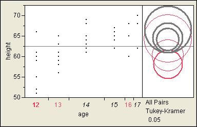
When you have more than two groups, though, the overlap lines provide no protection against the inflation of the experiment-wise alpha that is inherent in multiple comparisons. JMP provides a second way of comparing group averages that accounts for the number of comparisons to be made. Use one of the commands in the Compare Means group, such as the All Pairs, Tukey HSD command. This command produces a new graphic for each group. Like the means diamonds, the comparison circles inform you about the location (center) and spread (radius) of the sample statistics, but they are further adjusted to account for the number of comparisons. To compare group means, select a group by clicking on its circle, and JMP responds graphically with the answer; it is not enough to ascertain whether circles overlap.
I selected the lowest circle to ask whether this group (age=12) is different from any other groups in this example. The circles for three groups (age=14,15,17) change to gray to indicate that they are significantly different.
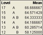
You can also use the connecting letters to determine which group averages are the same or different. Groups that do not share a letter are significantly different. Again you see that (age=12, group B) is different from (age=14,15,17, group A).
So, what good are error bars? They are good when they clearly convey useful information in an unambiguous way. They might be over-taxed, though, and used for purposes for which better graphics have been invented. JMP considers the information that you want and uses the best graphic available to convey it.
Added 24Nov2008:
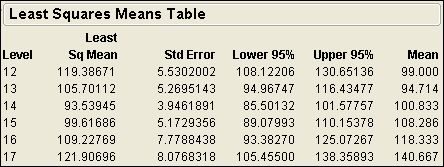
I found another relevant example of error bars in JMP. When you use Fit Model to analyze a linear model with standard least squares regression, you automatically get a leverage plot for each term in the model if the Emphasis is Effect Leverage. (If you use another emphasis, you can still obtain the leverage plot by clicking the red triangle at the top of the window next to Response and selecting Row Diagnostics > Plot Effect Leverage. Now open the Effect Details and the reports for individual effects.) A categorical effect will include a Least Squares Means Table beneath the leverage plot. This report includes the LS mean, standard error, and mean for each level of this effect. You can right-click in the report and select Columns > Lower 95% and Columns > Upper 95% to get the limits for the 95% confidence interval of the LS means estimate. The result will look something like this:
(Note: this result uses Big Class data set and the model is weight = age + sex + height. This picture is for the age effect.)
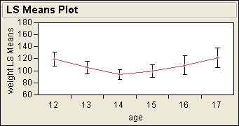
Now click the red triangle at the top of the leverage plot and select LS Means Plot. The plot shows a graphic of the LS means along with error bars for the 95% confidence interval for comparison. The plot looks something like this:
Let me know if you find any other examples of error bars in JMP!
Added 30Mar2009:
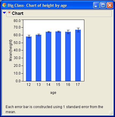
Error bars are optional in some JMP platforms. For example, you might want to show error bars in a bar chart. This example shows you how to add them.
1. Select Help > Sample Data. Open the Examples for Teaching section and select Big Class.
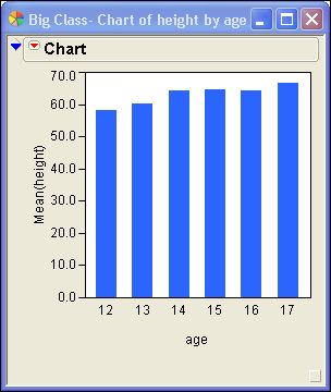
2. Select Graph > Chart. Select height > Statistics > Mean. Select age > Categories, X, Levels. Select OK.
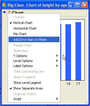
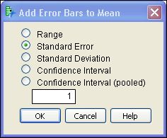
3. Click the red triangle next to Chart and select Add Error Bars to Mean.
4. You have choices about the quantity to use and its multiple. Use one standard error of the mean to show the uncertainty in its estimation.
5. Select OK.
That's all there is to it.
You must be a registered user to add a comment. If you've already registered, sign in. Otherwise, register and sign in.
- © 2025 JMP Statistical Discovery LLC. All Rights Reserved.
- Terms of Use
- Privacy Statement
- Contact Us

