- New to JMP? Let the Data Analysis Director guide you through selecting an analysis task, an analysis goal, and a data type. Available now in the JMP Marketplace!
- See how to install JMP Marketplace extensions to customize and enhance JMP.
JMP Blog
A blog for anyone curious about data visualization, design of experiments, statistics, predictive modeling, and more- JMP User Community
- :
- Blogs
- :
- JMP Blog
- :
- The happy place?
- Subscribe to RSS Feed
- Mark as New
- Mark as Read
- Bookmark
- Subscribe
- Printer Friendly Page
- Report Inappropriate Content
You may never have heard of the Craven district in the county of North Yorkshire, England, but it was recently named as the happiest place in the United Kingdom. I know it very well: I lived there between the ages of 2 and 18 -- so for all of my childhood and teenage years before leaving to go to university and settling in Scotland.
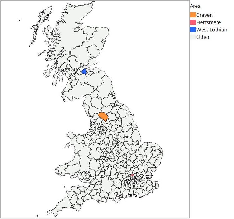
Craven is a rural area in the north of England. It’s the area coloured orange in the middle of the map of Great Britain, below. It has just one significant town, lots of villages with strange names like Wigglesworth, and loads of sheep. It’s popular with tourists, who visit for the limestone scenery of the Yorkshire Dales and the cosy country pubs. It was, for the most part, a very pleasant place to grow up.
The smaller blue area to the north is West Lothian, near Edinburgh, where I now live. The even smaller red area further south is Hertsmere, just north of London, which you will hear about later.
While I do miss living in “The Dales,” I visit my family there often enough to be reminded that it is not perfect. For one thing, it rains a lot. So when I heard that Craven is the happiest place in the UK I felt that I needed to explore the data.
Reports in the media were based on the results of the annual survey of National Well-Being from the Office of National Statistics [1]. The data is publicly available under the Open Government Licence. I will not bore you with details of all the data clean-up I needed to do. All I will say is that without the tools in JMP, I don’t think I would have got as far as actually analysing the data. I also needed to download and import the shape files for the administrative areas of Great Britain [2] for creating the map visualisations (that has been covered in this blog post).
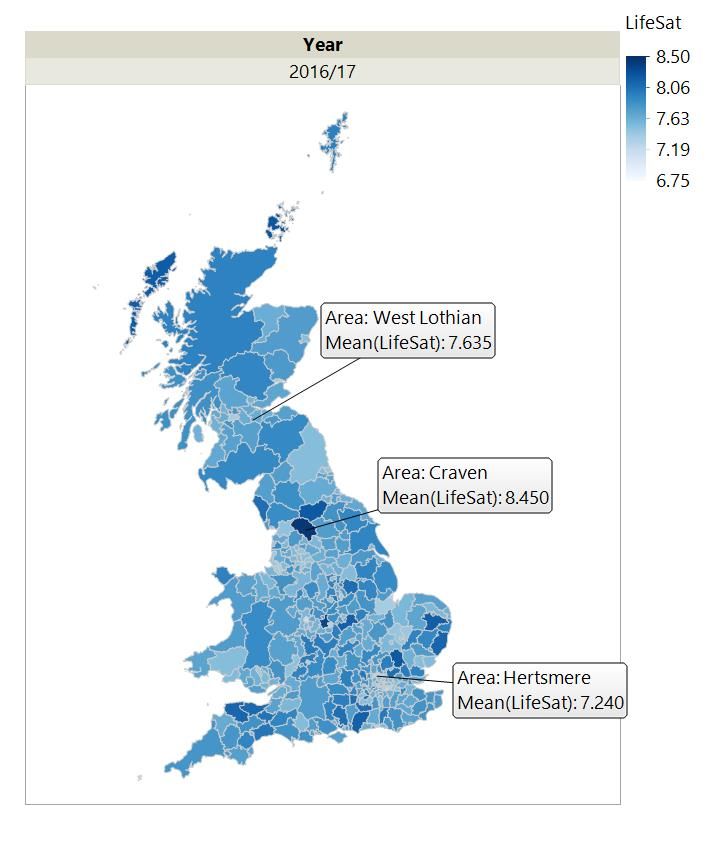
The survey looks at different attributes of well-being. I focused on Life Satisfaction (LifeSat). This is the answer to the question: “Overall, how satisfied are you with your life nowadays? Where 0 is 'not at all satisfied' and 10 is 'completely satisfied'.” The average for Craven, 8.45, is clearly at the high end of the scale for the most recent data (2016/17). Life Satisfaction for West Lothian was near the middle of the range at 7.64.
But how much should I read into this result? Before I rush into making radical plans to move my wife and children back south, it would be sensible to see if this pattern has been consistent over the last few years. I don’t think I want to live somewhere where my satisfaction with life changes dramatically from year to year.
Just looking at the north of England and the southern half of Scotland from 2013/14 to 2016/17, you can get a sense of the variation over time. If you can find Craven, you will see that it hasn’t always had the highest score for Life Satisfaction.

You can get a better sense of the variation from the trends for all 395 areas of the UK.
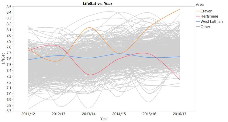
It looks like Life Satisfaction has generally increased, which is nice to know. You can also see that some areas have been more variable. I’ve picked out the trends for Craven and West Lothian, and you can see that they converged in some years. Also, the trend for West Lothian is quite stable, whereas Life Satisfaction for Craven has gone through peaks and troughs. Did something happen around 2014/15 so that the people of Craven felt less satisfied with their lives? A bad batch of best bitter (style of beer, mainly drunk in the north of England)?
I also picked out Hertsmere because it was highlighted in news reports as having the lowest score for happiness for 2016/17. It is also one of the lowest for Life Satisfaction, but that has not always been the case (strangely, the trend almost mirrors that of Craven). We might conclude that life for people in Hertsmere has got worse recently. However, I wondered if some of the variation in these trends could be attributed to other reasons.
The first thing to recognise is that the survey did not capture everyone in the UK. Instead, the results from a smaller sample of people in each area were used to estimate the answer you could expect from averaging the answers of everyone in that area. I know that there are not a lot of people in Craven compared to other areas. Did they manage to sample enough people for the estimate to be useful? If they surveyed only my dad, they would have got a very skewed estimate.
Helpfully, the original data includes the sample size for each area. For example, the sample sizes for 2016/17 for our three districts were:
|
Area Names |
2016/17-Sample Size |
|
Craven |
70 |
|
Hertsmere |
100 |
|
West Lothian |
650 |
That seems like quite a big difference. Is it important?
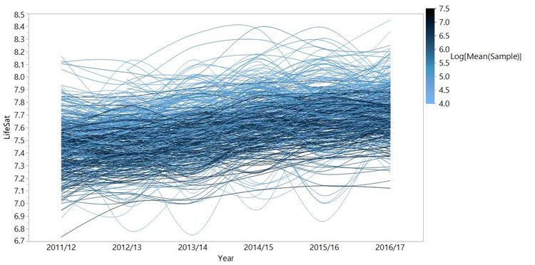
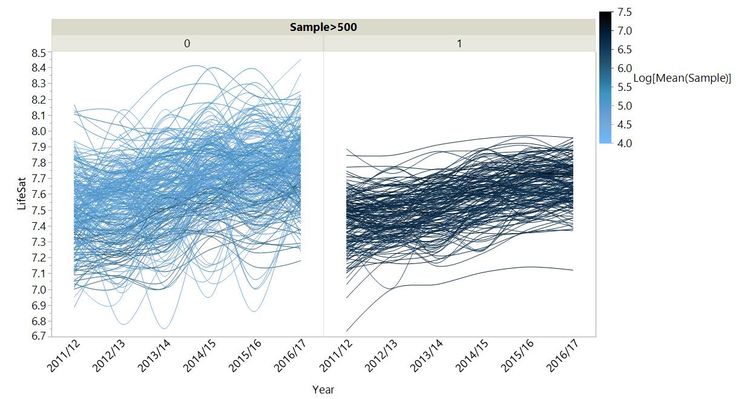
I took the average sample size for each area over the whole period and used it to colour the Life Satisfaction trends. In fact, I log-transformed sample size for this chart because it varies over several orders of magnitude.
Here is another view published on JMP Public that might help.
To fully appreciate this interactive bubble plot you should view this on a device with a larger screen. Click the play button at the bottom or move the [Year] slider to see the Life Satisfaction trends for each area develop. The bubbles and their trend lines have been coloured by sample size groups: orange (<300), grey (300-600) and blue (>600). Use the filter on the left to focus on particular sample size groups. You can click on bubbles to see which regions they are. You can also change the speed and bubble size using the sliders.
Again this shows that the estimates are more variable for smaller sample sizes. This is what a statistician would expect: Smaller sample sizes lead to less precise estimates. Therefore, all else being equal, you will tend to see the most extreme values coming from the smallest samples. In this case, with just one exception, we see the highest and lowest Life Satisfaction for each year are from areas in the <500 group, as we would expect. You can read Daniel Kahneman’s Thinking Fast and Slow for a great example of how being ignorant of this effect can lead to expensively bad decisions. You should read it anyway because it is excellent.
Was this year’s high Life Satisfaction score for Craven just an artefact of the small sample size? The statisticians that compiled the survey report used the sample sizes to compute confidence intervals for their estimates so you can make more informed decisions, although none of the news sources made any mention of these.
The confidence limits for Life Satisfaction in 2016/17 for Craven and West Lothian were 8.16-8.74 and 7.48-7.79, respectively. This would suggest that people in Craven really are somewhat more satisfied with their lives than in my adopted home in Scotland -- although there are many other areas with confidence intervals that overlapped with those of Craven.
Perhaps my life would be "reet champion" (Yorkshire dialect meaning “very good”) and even more satisfying if I moved back to "God’s own county" (Yorkshire dialect meaning “Yorkshire”). There are, of course, other factors to consider. As I said, a lot of my family still live around there. This data doesn’t tell me anything about the optimum distance from parents and siblings to achieve maximum life satisfaction.
You might also have noticed from the plot above that overall Life Satisfaction looks to be lower for the areas with higher sample sizes. This seemed curious to me. We can explore that more in my next post.
[1] Hicks, S., Tinkler, L., & Allin, P. (2013). Measuring Subjective Well-Being and its Potential Role in Policy: Perspectives from the UK Office for National Statistics. Social Indicators Research, 114(1), 73-86.
[2] Contains OS data © Crown copyright and database right 2017
You must be a registered user to add a comment. If you've already registered, sign in. Otherwise, register and sign in.
- © 2026 JMP Statistical Discovery LLC. All Rights Reserved.
- Terms of Use
- Privacy Statement
- Contact Us
