 What do the fashion world and graphs have in common?
During a recent trip with my family to Helsinki, Finland, it was easy to see the large presence of fashion company Marimekko. Started by a core group of Finnish designers in the early 1950s, Marimekko came to international prominence when Jacqueline Kennedy (wife of US President John F. Kennedy) was photographed wearing several of the company's signature dresses. Emphasizing a style that incorporates a more modern patterned approach to design, Marimekko has grown to become one of the fashion industry's leading success stories in Europe. However, the company's creations went well beyond just clothing and even inspired the development of two popular business graphs.
Marimekko Inspired Graphs
During the 1960s, the rise of modern management consulting firms such as McKinsey & Company drove an explosion in data collection and reporting. This increase generated many innovations in graphing practices. The same line bar patterns that were being utilized in many Marimekko designs helped create views that address a common graphing problem: how to see multiple sources of grouped information in one single graphical view. Two graphs that were created as solutions to this problem were named the Marimekko (often referred to as a mosaic plot) and the BarMekko (also called a variable width bar chart).
Analyzing the Fashion Industry
As many of these graphs were first created to visualize financial data, it is only fitting to try them out on data from leading fashion companies. I found data on the top 20 global fashion companies in 2018 in an article on the Business Insider website.
Now let’s say that we want to sell some new designs into the fashion industry and would like to start with companies that have the largest numbers of employees and biggest revenues. 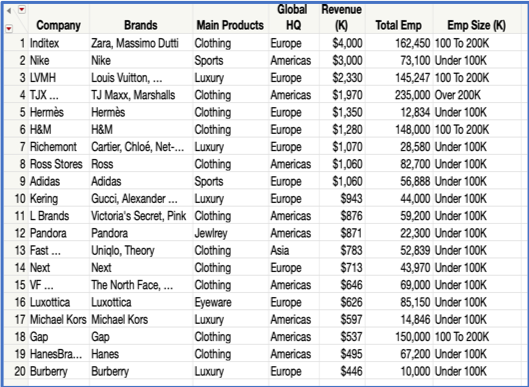
First Thought: Bar Chart
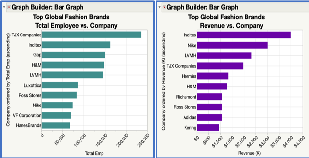
My first thought is to use bar graph charts in JMP Graph Builder to see the top 10 global fashion companies. What you see below are my first efforts in creating two horizontal bar charts that are ordered by magnitude, one for employees and one for revenue. However, showing separate graphs for each can hamper true insights as you may miss things when you switch your eyes back and forth between the two graphs. For example, while you might fixate on the fact that the TJX Companies (owner of TJ Maxx and Marshall retail stores) dwarfs the others in terms of total employee size in the first graph, you might not easily notice that TJX is only the fourth-largest in revenue in the second graph. It would be better to have a single graph view that can show all the information.
Solution One: The Marimekko Chart (Mosaic Plot)
Our first fashion-inspired graph is the Marimekko chart (often called a mosaic plot). This chart was a game changer in that it makes use of rectangular bars of different sizes (length and width) to show the proportion of total data across two categorical variables.
I created this view in JMP Graph Builder by putting the Company column on the Y axis, Emp Size (K) categorical column on the X axis, and Revenue continuous column on the Frequency. Then I selected mosaic plot as the Graph Type. Additionally, I filtered the view to show only the top 10 fashion companies by revenue.
Now we can quickly see that the largest revenue contributor for the 100K to 200K employee size category is Inditex (Spanish-based multinational retailer with brands such as Zara) and then Nike for the under 100K employee size. However, this view is still limited as we have lost our more granular continuous scale on employee size from the first bar chart. It's also more difficult to see which companies are different from each other because of the shape, especially when they are closer to the same size. So, can fashion inspire us again to give us an even better view?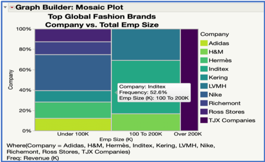
Solution Two: Meet the BarMekko (Variable Width Bar Chart)
What's needed is a way to use to view both the detailed continuous data for revenue and employee size, while still allowing us to break it out by company. What if we could take the best parts of the bar chart (measured bar heights ordered by magnitude) and combine it with the desired features from the mosaic plot (utilizing bar widths for a second measure)? This idea forms the basics of constructing a BarMekko (variable width bar chart).
To make this view in JMP Graph Builder, I first created a subset of the data where I took the Total Emp continuous column and broke it out into a range-type format in ascending order.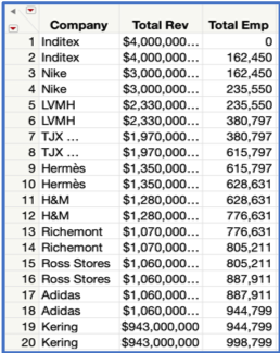
Then I put Total Emp continuous column on the X axis, Revenue continuous column on the Y axis and the Company categorical column into the Overlay sections in Graph Builder. Lastly, I changed the view to an area chart and selected Overlaid as the Area Style.
The chart below was again filtered to show only the top 10 fashion companies by revenue. Now we have a BarMekko chart that provides all the information on one chart at the right level of detail.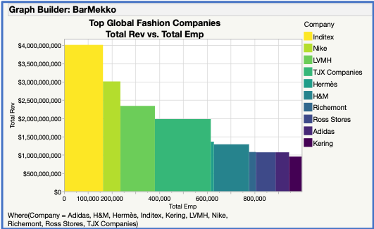
Not only is this a beautiful graph to view, but it also gives a much better sense of revenue and employee size on the same graph. Now the differences between companies (such as Inditex and Nike) are easier to spot and decipher. Organizations that are predominantly high-end retailers seem to dominate the graph and would seem to be a good place in the market to start targeting our new fashion designs.
You can access the data and try out these views for yourself in the post I created on JMP Public.
So, the next time you are graphing your own data, remember the impact that fashion has contributed to creating these compelling visualizations. Using these strong graph views, such as the Marimekko and the BarMekko chart, can help unlock the real story in your data. Perhaps you will even be inspired to create the next stylish chart that shows your data in a better way. Then as the influential British band The Kinks sang in their 1960s hit song, you too can become a Dedicated Follower of Fashion.