- New to JMP? Let the Data Analysis Director guide you through selecting an analysis task, an analysis goal, and a data type. Available now in the JMP Marketplace!
- See how to install JMP Marketplace extensions to customize and enhance JMP.
JMP Blog
A blog for anyone curious about data visualization, design of experiments, statistics, predictive modeling, and more- JMP User Community
- :
- Blogs
- :
- JMP Blog
- :
- Outliers Episode 2: Detecting outliers using quantile ranges
- Subscribe to RSS Feed
- Mark as New
- Mark as Read
- Bookmark
- Subscribe
- Printer Friendly Page
- Report Inappropriate Content
Welcome to my second blog installment on Outliers. In this episode, I’ll look at using quantile ranges to detect outliers.
In Episode 1, we looked at describing and visually identifying outliers. You may recall that there are simple one-dimensional (or univariate) cases where we need to identify outliers. These are the easiest to identify, and quantile ranges are an excellent way to look for them.
For multidimensional outlier detection, you’ll have to wait for my next posts!
What Are Quantiles?
Quantiles are very easy to understand. Let’s say we have a series of 20 numbers. We can sort the numbers from lowest to highest. We can then group these points into quantiles, which are identified by cut points in the sorted data that describe the point below which X% of data falls.
Note that quantiles are generally expressed as a fraction (from 0 to 1). They correspond exactly to percentiles, which range from 0 to 100. I will use these interchangeably throughout this post.
Figure 1 shows the 20 numbers before and after sort, and the 0.20 and 0.50 quantiles (or 20th and 50th percentiles).
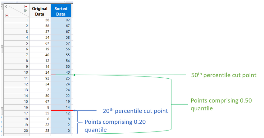
The cut point for the 50th percentile is the median of the sample. (In this case, the median is numerically 32.5, the midpoint between 40 and 25.)
A few other interesting definitions include:
- Quartiles, which divide the data into 25% groups. The first quartile represents the data points that fall in the lowest 25%, the second quartile points fall between 25% and 50%, and so forth.
- Interquartile range, or IQR, which defines the range covered by 2nd and 3rd quartiles.
Note that there are no assumptions made on the shape of the distribution when talking about quantiles.
Where Are Quantile Calculations Found in JMP?
You can find quantiles listed in three places in JMP. The Distribution platform and Graph Builder both use the same calculations. Explore Outliers/Quantile Range Outliers offers more flexibility to the user in terms of outlier sensitivity. Let’s look at each.
Distribution platform
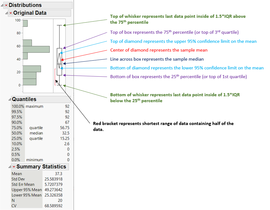
In Distribution, all continuous/numeric data histograms include a tabular quantiles summary. By default, JMP displays several quantiles of interest. Using the Distribution platform on the column labeled Original Data in Figure 1 gives the following output:
Several common quantiles are shown in the center table of Figure 2. You can change the quantiles that are displayed in this table by selecting the red hotspot and choosing Display Options, and then either Set Quantile Increment or Custom Quantiles.
Also displayed in Figure 2 is the Box & Whisker plot. Symbols shown in the plot are annotated in Figure 2.
The ends of the whiskers are of most interest in detecting outliers. Note that the whisker length is measured from the min and max of the interquartile range and that the whiskers end at the last data point that is inside 1.5 times that range. This is a common rule of thumb for outlier detection. Points falling outside of these whiskers may be worth further investigation.
But in the data set shown in Figures 1 and 2, this technique detects no outliers. This is not uncommon, particularly with small sample sizes.
Figure 3 shows the Distribution platform output for the 1,000 sample data from my previous blog post. These samples are drawn from a random normal distribution, with mean of 0.0 and standard deviation of 1.0. I also include the point at X1=4 which was visually identified as an outlier in my previous post:

With the larger sample size, some of the points now appear to be outliers (at least as defined by the ends of the whiskers). In this particular case, since we know that the data come from a normally distributed population with 1,000 points, it is probably not uncommon to see at least one point with a value of 4. In a real-world case, the points beyond the whiskers might warrant additional investigation.
Making Box and Whisker Plots in Graph Builder
You can also generate box and whisker plots in Graph Builder. The entire Graph Builder setup is shown in Figure 4:
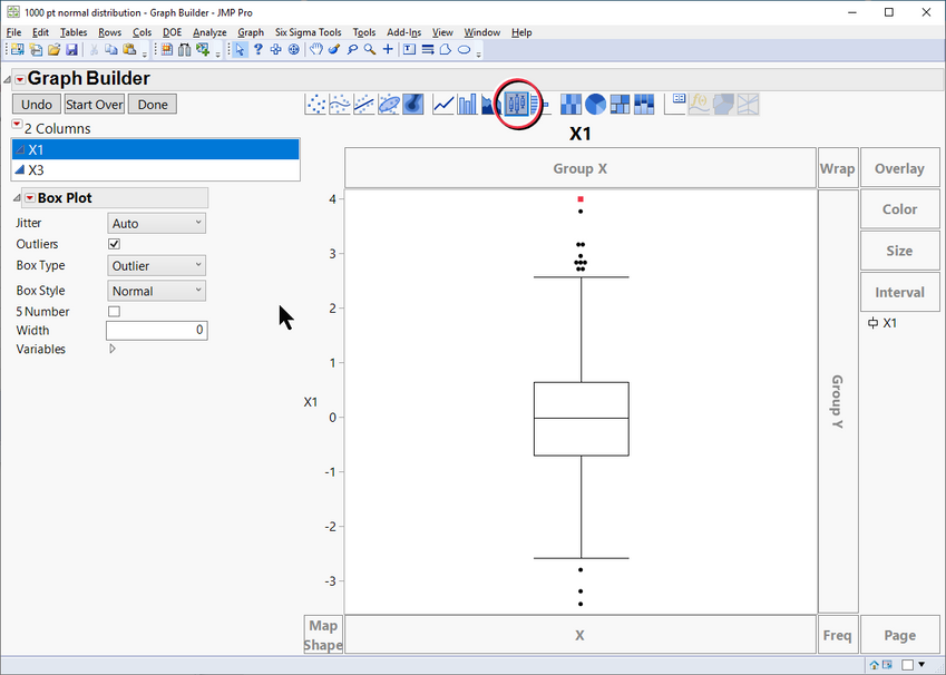
Note the icon for graph type above the graph (circled in red), which enables the Box & Whisker plot type.
As with the Distribution platform, the whisker lengths are 1.5*interquartile range, and extend down from the 25th percentile and up from the 75th percentile.
Explore Outliers
What if we want to choose other whisker limits?
As stated above, a whisker length of 1.5*IQR is a common practice for identifying outliers. I believe this probably comes from looking at large sample normal distributions. 1.5*IQR beyond the interquartile range can be shown to encompass 99.30% of the normal distribution (leaving 0.3488% of the data in each tail). This would identify a relatively rare event – if you have a normal distribution.
But what if you don’t have a normal distribution? What if the distribution looks something like this?

Figure 5 shows a skewed distribution of N=100 points, with five outliers beyond the upper whisker, per the 1.5*IQR method. But is the point at X1=3 really an outlier? Or perhaps there are other points concealed by the whisker that would warrant outlier investigation. How do we adjust this 1.5*IQR rule?
JMP allows you to do this under Analyze/Screening/Explore Outliers, and then choosing the Quantile Range Outliers option. Bringing up this option presents the input screen shown below for the 100 point sample summarized in Figure 5.
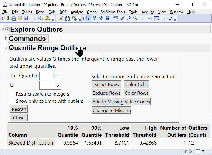
There are two main inputs for the Quantile Range Outliers panel:
- Tail quantile (TQ). This fraction describes the smallest cut point in the distribution that will be used in whisker calculations. (1-Tail Quantile) describes the upper cut point in the distribution. The difference between these cut points describes the range used in subsequent calculations.
- For the IQR calculations described previously, tail quantile would be 0.25, indicating that the whiskers would start at the 25th and 75th percentiles, and the range would be the interquartile range (or 75th-25th percentiles).
- The default value for the tail quantile in the Quantile Range Outliers is 0.1, indicating that the whiskers would start at the 10th and 90th percentiles, and the length depends on the (90th-10th percentile) range.
- Q. This is the multiplier used to determine the length of the whiskers.
- In the previous IQR calculations this was 1.5, so the interquartile range was multiplied by 1.5 to get the whisker length.
- The default value for Q in the Quantile Range Outliers is 3, indicating that the whisker length will be defined by the (90th-10th percentile) range multiplied by 3.
The output of the Quantile Range Outliers is shown at the bottom of the panel in Figure 6. Here we see that Column X1 had a 10th percentile at -1.283, and a 90th percentile at 1.65556. Ends of the whiskers (noted as the low and high thresholds [LT and HT, respectively] in the output) are based on the following calculations:
LT = 10th quantile – (90th quantile – 10th quantile) * Q
= -1.283 – (1.65556 – -1.283) * 3
= -10.099
HT = 90th quantile + (90th quantile – 10th quantile) * Q
= 1.65556 + (1.65556 – -1.283) * 3
= 10.4713
In this case, there is only one value in the column that exists beyond the high threshold, at a value of 12.0, which is displayed at the bottom of the report shown in Figure 6.
Sensitivity to tail quantile and Q
The outlier detection sensitivity is clearly governed by the values of tail quantile and Q. The traditional 1.5*IQR and the 3*(90th-10th quantile) methods are both acceptable, with the former being much more sensitive to detecting outliers. You can use the Quantile Range Outliers platform to adjust these values as needed for your particular case.
While the effectiveness of the choice of tail quantile and Q will depend on your particular distribution, we can gain some insight into their behavior by looking at normal distributions. Below is a table showing several combinations of tail quantile and Q, along with the percent of values in the tails of a normal distribution that would fall outside of the whiskers:

Expanding on this idea, we can create a contour map showing a more complete picture of the quantities in Table 1:
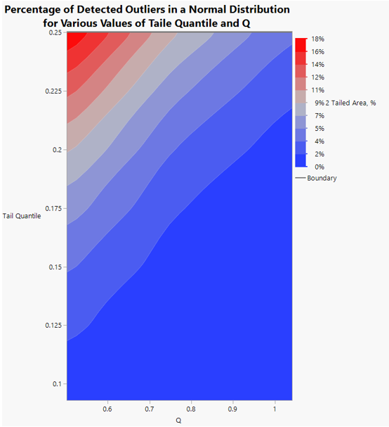
Figure 7 plainly shows that the combination of high values of tail quantile and low values of Q makes the calculations more sensitive to outliers, while low values of TQ and high Q makes us less sensitive.
Next Episode
Next time we will discuss Mahalanobis distance, which is used to detect outliers in multiple dimensions.
See all posts in this series on understanding outliers.
You must be a registered user to add a comment. If you've already registered, sign in. Otherwise, register and sign in.
- © 2026 JMP Statistical Discovery LLC. All Rights Reserved.
- Terms of Use
- Privacy Statement
- Contact Us

