JMP Blog
A blog for anyone curious about data visualization, design of experiments, statistics, predictive modeling, and more- JMP User Community
- :
- Blogs
- :
- JMP Blog
- :
- Need for Speed: ANOVA and comparing means
- Subscribe to RSS Feed
- Mark as New
- Mark as Read
- Bookmark
- Subscribe
- Printer Friendly Page
- Report Inappropriate Content
For previous Need for Speed posts, click here!
My name is 2-Click Clovis, and I am truly passionate about data analysis and, most important, time efficiency! JMP was an integral tool for my previous work in the semiconductor and manufacturing industries. Since joining JMP, I have learned so many new tips and tricks. I’ll never forgive myself for not knowing what I now know because I could have saved so many hours in my data analysis workflow! I’ve made it my mission to share my newfound knowledge with all current JMP users to help them regain their precious time.
After I demonstrate how quickly JMP can perform your routine data manipulation and analyses compared to other tools, I’ll show you the quickest way to get it done within JMP.
ANOVA and comparing means
Over the last few years working at JMP, I’ve had the privilege of providing training and performing JMP demos for engineers and scientists from so many diverse industries. During these demos, I’ve noticed, that although the data and variable names are vastly different across industries, the engineers and scientists are nine times out of ten interested in the same key statistical concepts and analyses.
One of these vital and universal statistical analyses that transcends industries is the one-way analysis of variance (ANOVA), combined with being able to compare the means between several independent groups.
The one-way ANOVA is used to find out whether there is a statistically significant difference between the means of two or more independent groups. It tests the null hypothesis that all the group means are equal. The alternative hypothesis is that at least two group means are statistically significantly different from each other.
It is important to note that the one-way ANOVA is not able to tell you which specific groups are significantly different from each other for three or more independent groups. It only tells you that at least two groups are different. Luckily for us, JMP not only has ANOVA capability but also has some post hoc tests to reveal which specific groups differ when there is a statistically significant one-way ANOVA result. Today’s example uses Tukey’s honestly significant difference (HSD) post hoc test and assumes that the population variances in each group are equal.
I remember trying to do all these calculations myself and spending hours fixing tiny mistakes along the way. Having a prebuilt platform where all I need to do is quickly drag and drop variable names into specific roles is such a game changer. I am so excited to pass this knowledge to you in this blog!
Fit Y by X in JMP
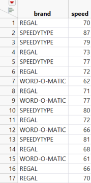
Today’s example involves three brands of typewriters (Regal, Speedtype, and Word-O-Matic) that were tested for typing speed. There are two columns in this table: brand and speed. The table can be downloaded if you want to follow along; it’s an attachment to this blog post.
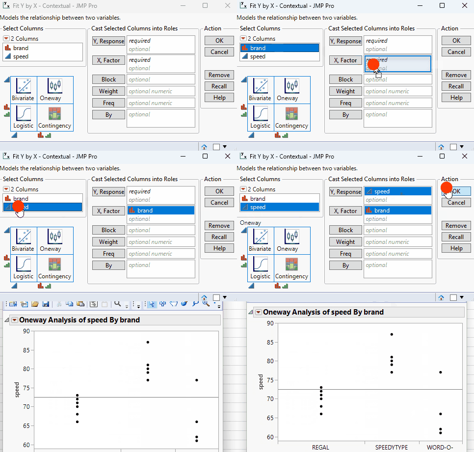
To perform a one-way ANOVA, start by selecting the Fit Y by X option under the analyze menu. Next, drag-and-drop click the continuous response variable (in this case, “speed”) to the Y role and the categorical factor variable (“brand”) to the X role. Click OK. The report initially contains a scatter plot of speed vs. brand.
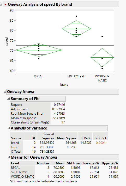
Click the red triangle, then click Means/ANOVA. The report now includes mean diamonds in the scatter plot, a summary of fit table, an ANOVA test with a p-value, and summary statistics for each group.
The line at the center of each mean diamond represents the group mean, and the vertical span represents the 95% confidence interval for the group mean. From a quick look, you can observe that the mean of Speedtype is noticeably higher than the other two brands. The ANOVA section shows a statistically significant p-value of 0.0004, meaning we can reject the null hypothesis that all group means are equal.
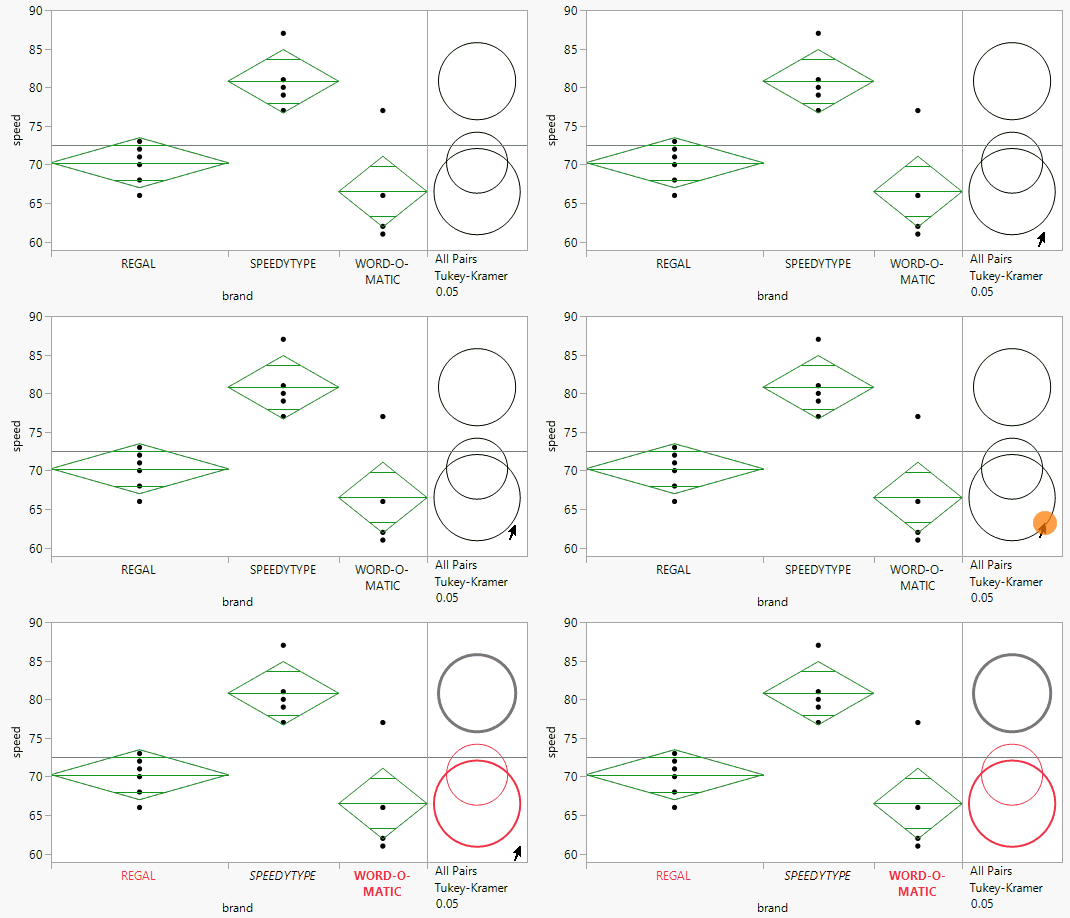
As a reminder, the ANOVA test tells us that at least one of the group means is significantly different from the others, but not which ones are different from each other. Our next step is to include a Tukey-Kramer multiple comparison between all pairs of means. Select the red triangle, then Compare Means, then All Pairs, Tukey HSD.
The report now includes comparison circles to the right of the initial scatter plot. These circles provide an interactive visual representation of group mean comparisons. Circles for significantly different means do not intersect or very slightly intersect. Click the circle associated with the Word-O-Matic brand and observe how both it and the Regal brand are highlighted in red. Red circles correspond to groups with means that are not significantly different. The Speedtype circle is gray and does not intersect with the other two brands’ circles, which signifies that the Speedway mean is significantly different from the highlighted group of Regal and Word-O-Matic.
For more quantitative results, scroll down to the Ordered Differences Report, which shows the difference between the levels of each comparison, the standard error of the difference, the confidence interval, and the p-value.
Note the p-values for the difference between Speedtype and Word-O-Matic and difference between Speedtype and Regal are highlighted in orange. Since they are both well below 0.05, it means that these differences are statistically significant, which matches up with the visual representation of the circles above.
This workflow, which involves just a couple UI clicks, can be applied to all sorts of data across all sorts of industries!
On that note,
is clicking out!
- © 2026 JMP Statistical Discovery LLC. All Rights Reserved.
- Terms of Use
- Privacy Statement
- Contact Us


You must be a registered user to add a comment. If you've already registered, sign in. Otherwise, register and sign in.