- New to JMP? Let the Data Analysis Director guide you through selecting an analysis task, an analysis goal, and a data type. Available now in the JMP Marketplace!
- See how to install JMP Marketplace extensions to customize and enhance JMP.
JMP Blog
A blog for anyone curious about data visualization, design of experiments, statistics, predictive modeling, and more- JMP User Community
- :
- Blogs
- :
- JMP Blog
- :
- Introducing packed bars, a new chart form
- Subscribe to RSS Feed
- Mark as New
- Mark as Read
- Bookmark
- Subscribe
- Printer Friendly Page
- Report Inappropriate Content
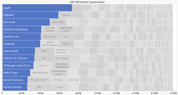
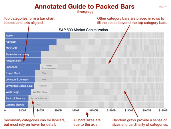
How do you visualize skewed data over hundreds of categories? I’ve been experimenting with a new chart form that could help with this. I'm calling it “packed bars.” It's a synthesis of an ordered bar chart and a treemap. Here’s what a packed bar chart looks like with recent S&P 500 market capitalization data.
The blue “primary” bars and the axis form a regular ordered bar chart showing the 12 largest companies by market capitalization. Each gray “secondary” bar represents one of the other companies. Some of the secondary bars can be labeled if space permits, but their main purpose is to provide context for the primary bars. The idea is to support the Focus+Context data visualization principle.
We can get a rough sense of how many secondary categories there are, what their total size is, and even how the sizes are distributed. And since they are on the same scale as the primary bars, we can even estimate some of the values from the length they span on the axis. In a dynamic display, category labels and values for secondary categories can be accessed via hover labels.
The right edge doesn’t always come out so even, but by placing the larger secondary bars first from left to right, it usually works out pretty well.
Examples
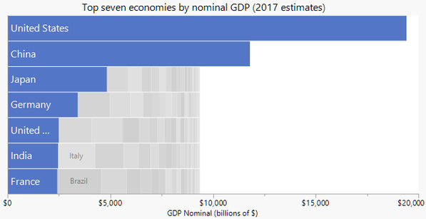
Sometimes the values are so skewed that the secondary fill doesn’t surpass the primary bars. That’s the case when charting world economies by nominal GDP. This packed bar chart highlights the top seven of 192 world economies. (Not the quite same as the G7, by the way).
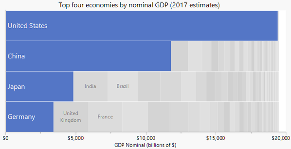
Choosing only four primary categories highlights the fact that the US economy is about a fourth of the world nominal GDP.
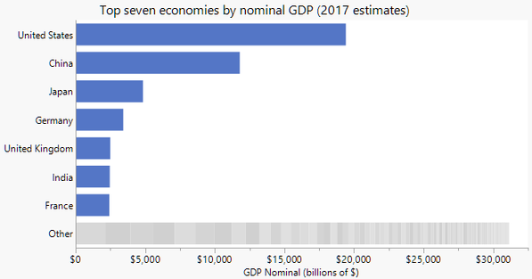
If the sum of the secondary categories fits in the same scale as the primary bars, they can be packed into a separate bar like this.
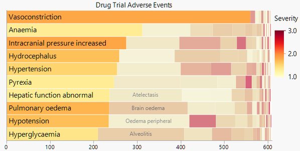
Economics is not the only source of skewed data. Here are side-effect counts from nicardipine drug trial data.
The size of the bars represents the number of occurrences, and the color represents the average severity. The secondary colors are still faded to keep the primary categories in focus, but they don’t have to be if a truer color representation is important.
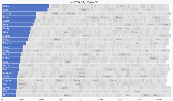
The data set that started me down this path was a collection of New York City registered dog names. Here is my creation highlighting the top 25 of more than 16,000 names.
Unlike the other packed bar examples, the secondary categories were placed alphabetically and row-by-row to support looking up a particular dog name (with the help of hover labels). The downside of this arrangement is that the right edge is noticeably less even.
An advantage of having a true x axis (unlike a treemap) is the ability to estimate the grand sum for the entire population. In this case, we have 25 rows, and each goes to just over 4,000 on the count axis. We can estimate the number of dogs at 25 x 4,000+ = 100,000+.
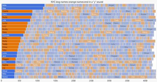
The nicardipine example showed the use of a continuous color scale for the bars. With categorical coloring, the fading is less likely to complicate the color interpretation. In this view of the dog names, I used orange for names that end in a “y” sound.
Variations
I’ve been experimenting with variations, and the examples above demonstrate many of them. When constructing a packed bar chart, we can choose among the following options:
How many rows? Is there a good general default? A round number like 10 makes it easy to apply the multiplication trick to get the grand sum, but the aspect ratio may be more important.
Place secondary bars left-to-right by size or row-by-row alphabetical? The left-to-right by size means that the left-edge position of each secondary bar corresponds to the by-size sort order, regardless of row. The bigger the bar, the farther to the left it is. In a sense that's consistent with the size-ordered primary bars and has the benefit of a cleaner right edge. And keeping like sizes together may be useful for understanding the distribution. Row-by-row alphabetical is more useful for finding particular categories in an interactive display. Secondary bars are placed alphabetically, left-to-right within each row, starting with the top row.
Coloring of secondary bars? I’ve been trying random grays, faded color, and true color. Randomizing the grays makes separator lines unnecessary (avoiding consecutive duplicate grays).
Labeling of primary bars? Putting the labels on an axis outside the chart area avoids the constraint of fitting within the bar. But putting the primary labels inside the bars helps distinguish this from a stacked bar chart and is more space efficient.
Labeling of secondary bars? I initially preferred no secondary labels to emphasize their context role, but having a few labels seems to be a big help to new viewers who aren't quite sure what’s going on.
Separate stack for the secondary bars? An “Other” stack is feasible when the data is so skewed that the sum of all the secondary values is on the same scale as the primary bars.
Merge all or some of the secondary bars into one solid “other” region? That would keep most of the context aspect, make the right edge smooth, and make the display less noisy. But it gives up some information about the cardinality and distribution of the secondary sizes.
Alternatives
How do packed bars compare to alternative ways of visualizing skewed data with many categories?
- Compared to a bar chart of top categories, the packed bar chart gains the context of the remaining categories. The main disadvantage is that the secondary bars make the chart bigger (or the primary bars shrink) and take up space that might be used for labels or annotations.
- Compared to treemaps, packed bars in general have more accurate data representations (bar lengths on an axis vs. areas without any axis), but the bigger advantage is for seeing the primary categories, which get prominent labels and axis-aligned sizes. However, treemaps support nesting and true space-filling (no jagged right edge). And tiny values may be better represented in treemaps in the sense that it’s easier to see a 3x4 pixel rectangle than a 1x12 pixel bar. While the axes in packed bars bring accuracy, they do take up space, making treemaps more space-efficient.
- Compared to packed bubbles (as in the original dog names bubbles chart), packed bars have more regular placement for scanning and the perceptual advantage of length over circle area for representing data values. However, as with treemaps, tiny values may be easier to make out as bubbles (a 4-pixel diameter circle vs. a 1x12 pixel bar).
- Compared to a one-dimensional scatterplot, packed bars add prominent, aligned labels for the primary categories and the sense of cumulative sum. A scatterplot has the advantage of using accurate positional encoding for all values and keeping the size channel available for another variable; but overstriking must be countered with jitter or dodging, which can be problematic with very skewed data.
- Compared to wrapped bars, which reorganize the bars into multiple columns, packed bars are more space efficient, which helps support more categories (1,000s instead of 100s), and packed bars add a sense of total area. Wrapped bars support more accurate reading of the “secondary” bar values since their bases are aligned, and wrapped bars should have a lower learning curve since they look more like regular bar charts.
Drawbacks
The chief criticism of packed bars is the resemblance to stacked bars, which leads one to believe that the bars in each row are related to each other. I made the gaps between stacks smaller than typical for a stacked bar chart in an attempt to reduce that potential confusion, but I'm not sure it can be eliminated. I hope the advantages outweigh that hurdle.
Other drawbacks are largely trade-offs that might be addressed by choices in the options listed above. For instance, if the random grays seem too distracting, the secondary bars can be colored in some other way or merged together as an intentional simplification.
Annotated guide
This next picture is not for you; it's for those who skimmed the post looking only at the pictures.
Try it in JMP
Though this effort is still experimental, I have attached a JSL script for creating the simplest variation of a packed bar chart in JMP. It works by first applying the packing logic to the data, creating synthetic row number and color variables. Then it creates a regular stacked bar chart in Graph Builder with the coloring and arrangement of a packed bar chart.
What do you think?
I think packed bars can be useful for certain types of data, but I realize I'm too involved to be objective. So I'm looking for feedback on all aspects of this effort: layout, terminology, labeling, colors, etc. And please let me know if you have data that might benefit from this display – I can try it out for you using my prototype. I've been tweeting more examples; if you're interested, check out dog names by gender and product injury counts. If you want to try creating packed bar charts on other charting platforms, that's great, too.
Thanks for taking a look!
Updates August 2017: In addition to the attached JMP script, there is now an Excel add-in and a d3.js script for making packed bar charts. They can be found at the packedbars github area. The add-in was done through a collaboration with Excel dataviz expert, Jon Peltier. A packed bars poster has been accepted for the IEEE VIS conference in October. The poster submission required a 25-second preview video; an animated GIF version with captions instead of audio is attached.
You must be a registered user to add a comment. If you've already registered, sign in. Otherwise, register and sign in.
- © 2026 JMP Statistical Discovery LLC. All Rights Reserved.
- Terms of Use
- Privacy Statement
- Contact Us

