“I’m not tech savvy. I just don’t get math. It’s like a foreign language. I can’t do this.” - Kirsten Crannell, Newburyport High School
I said those things throughout middle school, high school, and college as I avoided all things STEM-related. But, with every utterance of one of those phrases, I was adding a brick to the wall - a wall that stood between me and a career in science, technology, engineering, or math.
Despite meeting with teachers and professors, joining study groups, and sitting in the front of classrooms, the ever-present wall was in my way. Others picked up my lack of self-confidence: Just don’t go into accounting; maybe this isn’t for you; I can’t explain it to you again.
Despite my efforts, it still didn’t click. I was convinced I was incapable, no matter how hard I tried.
It didn’t help that my math and science teachers had been men. I grew up believing that men were the ones who excelled in these fields - not women.
Fast forward a decade. I find myself working as an event planner for JMP, a statistical software company. Even after my first year, I still said, “They didn’t hire me for my technical abilities!” It was a joke, but I still had the same dialog going. Surrounded by such brilliant people, I’d feel like an imposter - the least-intelligent person in the room.
But as time progressed and I started seeing female colleagues working as developers, system engineers, and software educators, I began to see the STEM world a bit differently. I saw myself as an important part of a technical team. And I saw the possibilities: I’m in this room too. I’m here, and I belong!
My turning point
I worked alongside a statistical educator who gave me the space to be vulnerable. I watched her teach people who had never used statistical software. I watched her excitement as she helped people bridge the gap from never opening JMP to having confidence in what they were doing. That gave me hope.
Slowly the wall between me and STEM started to come down one brick at a time. I had support and encouragement, and my mentor didn’t give up.
Finding data that mattered to me - data I was passionate about - was when that wall finally gave way. As I explored my data, a whole new world came into view. And wow, that view was beautiful! It was full of bar graphs, word clouds, tree maps, and more data visualizations that made sense to me.
To use a skiing analogy, I’m still on the bunny slope. But with practice, time, and patience, I am confident I will make it to the black diamond run. Wonderful things can happen when you stop getting in your own way and start believing in yourself.
My kind of data
I’ve heard our marketing people say that if you have data and you’re a curious person, you’re a good candidate for using JMP. Once I found data that I was curious about, well, you know where I’m going. Here’s how I got there.
I manage and host monthly hands-on workshops that teach JMP to small organizations. As someone who cares deeply about doing a good job and continuously improving as I go, I wondered what I could learn from the registration information and post-event survey data.
Event registration data
Here are the first questions I wondered about when looking at registration data for each workshop I hosted:
- What is my attendance rate?
- What was the cancelation rate?
- What do I know about people who didn’t show up?
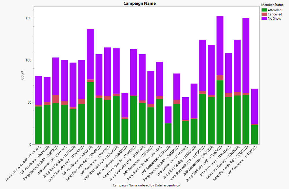
By creating this bar graph, I saw that about 50 percent of registrants attended, with fewer in July, August, and December, most likely due to holidays and vacations. Since these courses are free, we expect a higher no-show rate than with paid courses. This graph didn’t surprise me.
I wondered: Where are my registrants located?
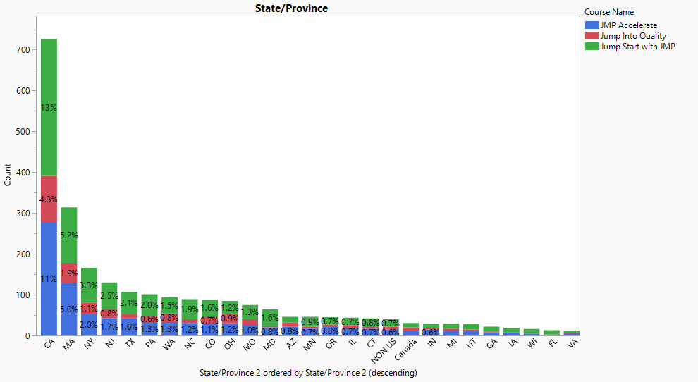
By creating this stacked bar graph, I saw that most registrants came from California, which is not surprising considering the size of the state. But what was surprising is that the second highest state for registrants was Massachusetts, a much smaller state. This tells me two things: customers in California and Massachusetts are more engaged than most, and sales teams in these territories are promoting these workshops to their customers. I love it when our sales professionals partner with us!
My final question about registration data: How many unique companies did we reach?
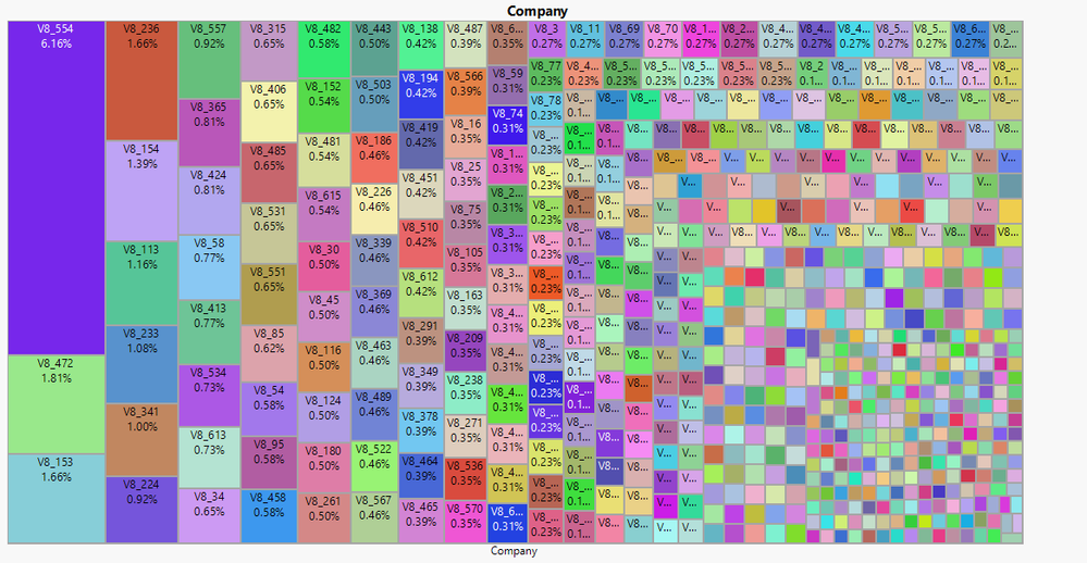
In one year we reached 617 different small organizations. The tree map shows the percentage of total registrants from each company. I love tree maps because they’re informative and beautiful. Note that we anonymized company names to conceal their identity.
Post-event survey data
I am just as passionate, if not more so, about the data showing attendees’ thoughts about the workshops. Before reviewing this data, note that surveys typically have a low response rate. Therefore, when analyzing this data, I focused on the responses themselves rather than the number of responses.
The first question: How satisfied were you with the workshop?
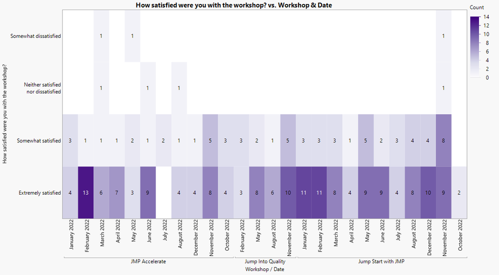
There are many ways to look at the answers, but I was particularly happy with a heat map. In a heat map, color shows the variation from extremely satisfied to somewhat dissatisfied; the darker the color, the more responses we had. Although we had a five-point scale for this survey question, this map shows a four-point scale because no one was extremely dissatisfied. Thank goodness. This heat map also breaks down the workshop by type: JMP Accelerate, Jump into Quality, and Jump Start with JMP.
Graph Builder is my go-to JMP tool for creating visualizations. JMP also has a tool to review survey data. The beautiful thing here is that users can show the data in many different forms, depending upon which output speaks to you and your audience.
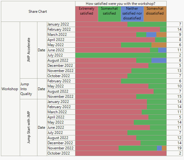
- Share chart. I like that this chart displays total responses from that survey along with the visual aspect of the responses grouped together, almost like a stacked bar chart. I don't like that I'm not able to see how many responses there were for each category, leaving me guessing how many are extremely satisfied versus somewhat satisfied.
- Frequency chart. I like that the frequency chart has separated each category, but I found it hard to understand the total responses for those categories.
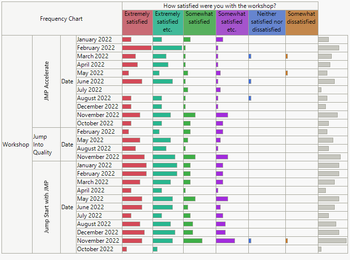
Having seen results visualized differently, you may realize that you prefer one chart over another. My preference was to use the heat map for the question of workshop satisfaction.
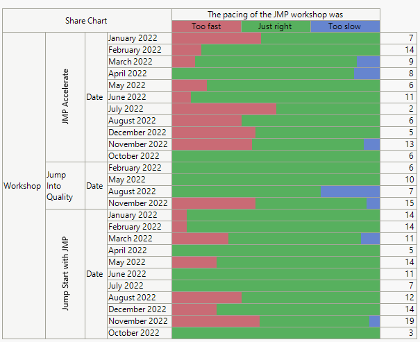
My second question: How was the pacing of the workshop?
I preferred to see workshop pacing results via the share chart. With only three points, I was able to see the data clearly. And with the knowledge that the JMP Accelerate workshop was designed for intermediate to advanced users, I was not surprised to see that course's beginner users found its pacing to be too fast.
The third question: What did you find most valuable?
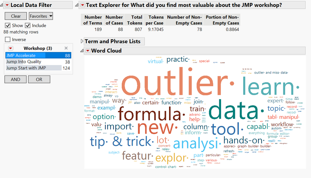
I used the local data filter to flip between the three workshops to see each word cloud. There was a good amount of cleanup involved, such as adding phrases, re-coding words, and adding stop words. The work was worth it, withTips & Tricks, hands-on, DOE, analyzing data, and learning new things in JMP jumped out of the word clouds.
One of my biggest lessons from this endeavor was realizing that I had to clean the data before I could start building my graphs and answering questions. While getting comfortable with JMP and exploring my data, I changed my process many times. And I constantly asked questions along the way to find the best way to represent my data. The questioning, analysis, and problem-solving skills I’ve always had are an integral part of STEM. The more I worked with my data, the more I learned.
But my most significant discovery is that I have only touched the surface of what JMP can do. I’m excited to continue my data exploration journey, and I welcome you to join me. If my story of an event planner turned data enthusiast has helped you think differently about your relationship with STEM, let me know. We can be data explorers together!