JMP Blog
A blog for anyone curious about data visualization, design of experiments, statistics, predictive modeling, and more- JMP User Community
- :
- Blogs
- :
- JMP Blog
- :
- Hierarchical clustering
- Subscribe to RSS Feed
- Mark as New
- Mark as Read
- Bookmark
- Subscribe
- Printer Friendly Page
- Report Inappropriate Content
In my previous JMP Blog post, I talked about two algorithms used for clustering: k-means and Normal Mixtures (using Expectation Maximization). Here, I look at a hierarchical clustering example.
When to Use Hierarchical Clustering
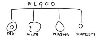
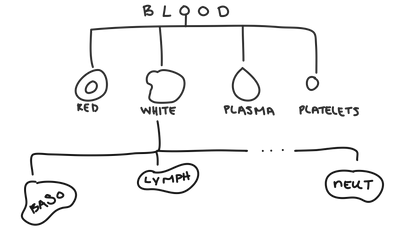
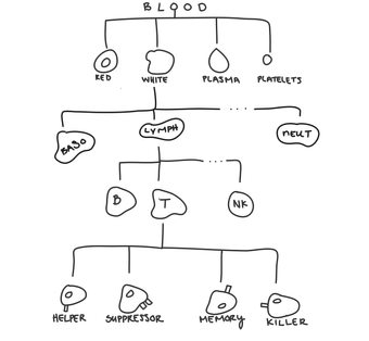
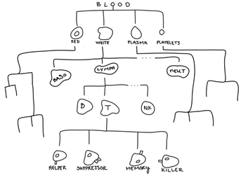
Hierarchical clustering is most useful when there’s a hierarchical structure in the data. Hierarchical data has groups that are themselves made up of subgroups that are made of subgroups ... so on and so forth forever. For example, when we look at blood, we can have red blood cells, white blood cells, plasma, and platelets.
Within white blood cells, you can have neutrophils, basophils, lymphocytes ... and many others.
Within lymphocytes, you can have T-cells, B-cells, and natural killer cells.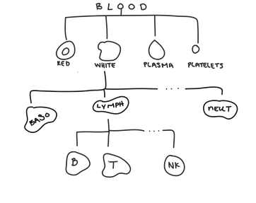
While looking at very specific groups of cells is often useful, there are many situations where we need to generalize and look at a higher-level group, like when doctors look at a white blood cell count from a blood test.
When grouping customers based on their purchasing habits, you may sometimes have enough funding to create 50 different marketing emails to cater to shoppers’ specific habits. But other times, you may only have a budget to create five. Hierarchical clustering allows you to select any number of clusters, while providing clusters that are as cohesive as possible.
TL;DR: Use hierarchical clustering when you think your data might have a hierarchical structure. It really can be that simple.
Agglomerative Hierarchical Clustering
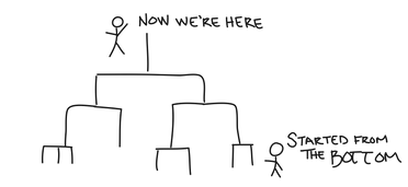
JMP uses Hierarchical Agglomerative Clustering (HAC for short), which models hierarchical relationships in the data by successively merging similar clusters together until all the data are in one cluster. At first, each data point is its own singleton cluster. But, that’s awfully lonely, so we then merge the two closest clusters together to form a new cluster. Then we merge the next two closest clusters together, and then we do it again. And again. And again. Until all the data are in one cluster. We often refer to HAC as bottom-up clustering because we started at the bottom, and now we’re here, with one cluster containing all our data points. You could say that the whole team is here.
Distance Metrics
Deciding which clusters are close to each other is not always straightforward; there are many linkage criteria we can use to determine how far apart two clusters are.
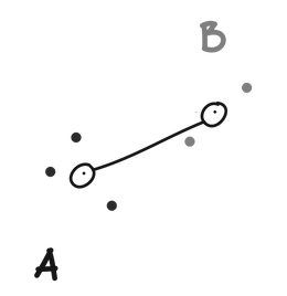
Single linkage defines the distance between two clusters (A and B) as the minimum distance between any point in A and any point in B.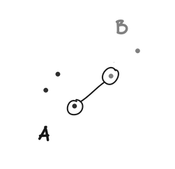
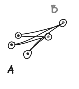
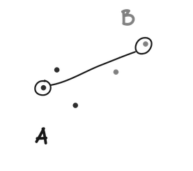
Complete linkage defines the distance between to clusters (A and B) as the maximum distance between any point in A and any point in B.
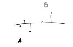
Ward’s method is slightly different from the above methods. Instead of using a pure measure of distance, a univariate ANOVA is fit using cluster assignments as groups. Two clusters (A and B) are combined if they result in the smallest increase in error sums of squares when another ANOVA is run with A and B combined into one group. From our ANOVA article, we know that error is the within group variation. So Ward’s method asks which two groups we can combine and still have low within group variation (i.e., which two groups are the most similar).
How to Read a Dendrogram
Once we’ve determined the hierarchical structure for our data, we can examine the different clusters at any level. We often want to make observations about the structure. The easiest way to do that is by looking at a dendrogram.
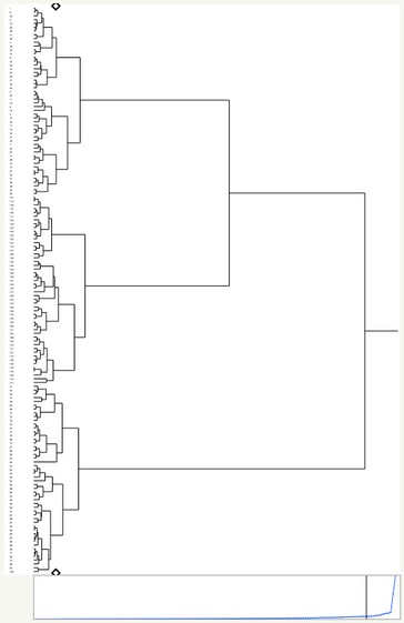
Dendrograms show how clusters were combined. In JMP, the Y axis represents data points/clusters, and the X axis represents distance. For example if two clusters join lower on the dendrogram (to the left), then they are more similar than two other clusters that join higher up on the dendrogram (more to the right).
Dendrograms that are dense at the bottom (left) usually have clusters that are more separable, whereas dendrograms that are not dense at the bottom (left) tend to have less separable, more spread-out clusters.
Clustering is more of an art than a science, so the interpretation of your clusters likely requires domain expertise to produce something meaningful. Using your dendrogram, you can create any number of clusters from 1 to N (where N is the number of data points that you have). “Cutting” the dendrogram at any level will tell you the membership of each cluster.
In JMP
Let’s take a look at a data set that records the average grams of protein, fat, and carbs from 150 people. There are many reasons we might want to cluster these different diets. Perhaps we want to look at whether different diets have different rates of heart disease. Or maybe we want to look at the cholesterol or iron levels of each cluster.
In JMP, performing hierarchical clustering is pretty simple. Just go to Analyze > Clustering > Hierarchical Cluster and select the columns you want to cluster on. If each data point has a name or label, select that and add it as a Label. You can also select your linkage criteria here. Click OK, and JMP will create your clusters and a dendrogram for you.
Once inside the Hierarchical platform, you can color your dendrogram by clusters, which can help you pick out different patterns in the clusters.
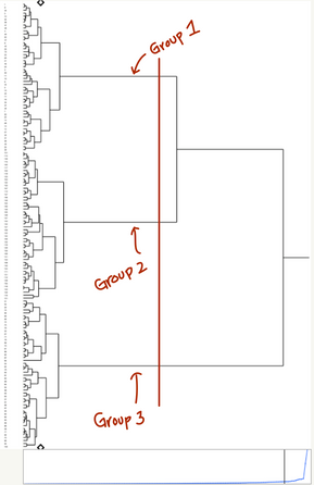
You can also grab hard cluster assignments for any number of clusters from 1 to N (where N is your sample size). Just go to the red triangle menu and select Number of Clusters and type in your desired number. You can also drag the small black Diamond on the dendrogram to select a number of clusters. Then go back to the red triangle menu and select Save Clusters. When you select a k (number of clusters), JMP will “cut” the dendrogram at the place where there are exactly k clusters.
You can also drag the diamond on the side of the plot to the point on the dendrogram at which you want to cut.
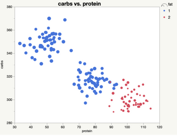
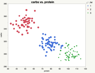
Saving our clusters as a column allows us to better visualize the clusters, and use the cluster assignment as a group variable in further analyses (like an ANOVA to see whether cluster membership has a significant effect on rates of cardiac disease).
When looking at just two clusters, we can see that there is a relatively high protein, low-carb, low-fat cluster, and a relatively low protein, high fat and carbs cluster.
We could also look at the three-cluster solution, which allows us to tease apart the high protein, low-carb, low-fat group into an extreme and more moderate group. The hierarchical structure helps us understand how these groups relate together, while still allowing us to treat them as separate when needed.
JMP will recommend a k for you based on the distance graph shown below the dendrogram. The x axis of the graph represents each time two clusters are merged. The y axis represents the distance between the last two clusters that were joined. When the slope dramatically changes, that means that the last two clusters merged were relatively far apart. This suggests that the remaining clusters are relatively separate, and that the current configuration is a good choice for k.
The dendrogram for this data set is most dense at the bottom (left), meaning that there’s likely a few separable clusters, which we can confirm looking at this plots above.
Try It
Hierarchical clustering (and clustering in general) is not a panacea for all your unlabeled data woes. But it is extremely good at modeling the hierarchical structure in data that actually has a hierarchical structure. It gives us information above and beyond non-hierarchical clustering because it tells us how different clusters relate to each other. This information can be invaluable if we need to combine or split up clusters. Hierarchical clustering gives you some flexibility in how you group your data, and in the end, we all need to be a little more flexible. Try it yourself with the data table attached to this post.
You must be a registered user to add a comment. If you've already registered, sign in. Otherwise, register and sign in.
- © 2026 JMP Statistical Discovery LLC. All Rights Reserved.
- Terms of Use
- Privacy Statement
- Contact Us

