Worldwide global warming is a fact. It is directly attributable to human activity, specifically to our burning of fossil fuels such as coal, oil, gasoline, and natural gas, resulting in the greenhouse effect. The largest sources of greenhouse gases are transportation, electricity production and industrial activity. Curbing dangerous climate change requires very deep cuts in emissions, as well as the use of alternatives to fossil fuels. In fact, countries around the world have committed to lower their emissions as part of the 2015 Paris Climate Agreement.
With the help of publicly available data, I used different analysis techniques in JMP to find evidence of how countries around the globe are working on their energy transitions to achieve their commitments. If you want to follow along, I have attached my findings and data to this post. This is the first of a series of three episodes on greenhouse gas emissions; check back tomorrow and the following day for episodes 2 and 3.
The first thing I looked at was how temperature deviation has progressed year after year back to 1880. I used the Global Temperature Times Series data from the Datahub.io, a collection of thousands of data sets that are free to use. This temperature data included the global component of Climate at a Glance (GCAG) and the GISS Surface Temperature (GISTEMP) from 1880-2016.
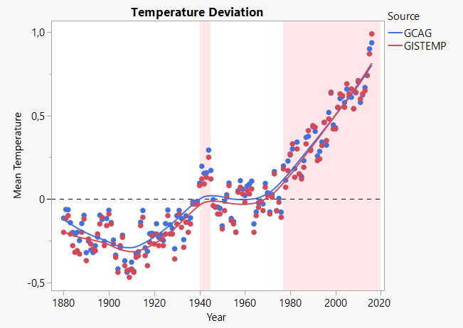
I used the cumulative sum (CUSUM) control charts in JMP, which are useful for detecting shifts that occur over time, such as gradual drift. In my case, I was interested in detecting shifts of temperature anomalies over time. I used mean temperature deviation as my Y, year as my X and GCAG and GISTEMP as a By Variable. The two vertical lines on the CUSUM chart below indicated that shifts in temperature occurred in 1940 and 1977. Below is a CUSUM chart representation of mean temperature source GCAG (identical result was obtained with GISTEMP).

Using the same data set in Graph Builder in JMP, we can clearly observe temperature anomalies occurring in the 1940s and really picking up in 1970 until now.

But what caused the warming in the 1940s and the subsequent cooling? Although humans were not burning very large amounts of fossil fuels or emitting large amounts of carbon dioxide (CO2) in the early 20th century relative to later in the century, CO2 emissions were non-negligible and did play a role in the early century warming. Actually, CO2 and increased solar activity played the largest roles at that time, but other factors played a part as well. This warming period was followed by a period of slow or no warming until 1970s, which may have been partly caused by aerosol cooling.
The main culprit is likely to have been an increase in sulphate aerosols, which reflect incoming solar energy back into space and lead to cooling. This increase was the result of two sets of events:
- Industrial activities picked up following World War II, which, in the absence of pollution control measures, led to a rise in aerosols in the lower atmosphere.
- A number of volcanic eruptions released large amounts of aerosols in the upper atmosphere.
The introduction of pollution control measures reduced the emission of sulphate aerosols. Eventually, the cumulative effect of increased greenhouse gases started to dominate in the 1970s, and warming resumed. One final point: It should be noted that in 1945 the way that sea temperatures were measured changed, leading to biased measurements and to a substantial drop in apparent temperature. To learn more about this, see the references at the end of this post.
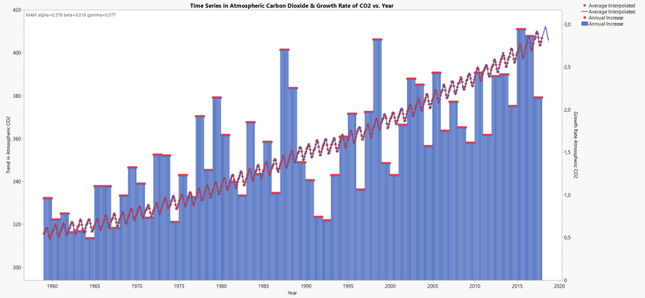
The chart below showcases the steady, worldwide increase of CO2 in the atmosphere since 1958. A time series of the average CO2 released into the atmosphere is on the left Y axis, and annual CO2 atmospheric growth rate is represented by red points and the blue bar chart scaled on the right Y axis.

But what has been happening in Europe more recently? I found more recent data and other greenhouse gas emissions on the European Commission Eurostat website. In particular, the data set on air emissions in European countries from 1994-2009 was quite interesting. Was there any decrease in the most abundant greenhouse gas emissions, such as methane (CH4), carbon dioxide (CO2), nitrous oxide (N2O) and others in more recent years? The answer was “yes”! The three area graphs from Graph Builder shown below demonstrate the decrease of the three most abundant greenhouse gas emissions in Europe over the last decade, with the most significant being methane emission (CH4).

All the charts in this blog post have been published on JMP Public. Stop by there and interact with the graphs.
Additional reading:
Edit: I am performing a Khoros test for a support case that is open with us. By only submitting this for review, the test should be complete. Please reject/dismiss this change. Thank you.
You must be a registered user to add a comment. If you've already registered, sign in. Otherwise, register and sign in.