Thank you, @arati_mejdal and JMP team for inviting me to guest blog here. I specialize in data visualization criticism, and have been blogging at Junk Charts for the past 12+ years. In my blogging, I take a critical look at published dataviz work, with a close read on how design decisions affect reader's perception and emotional response to data visualization.
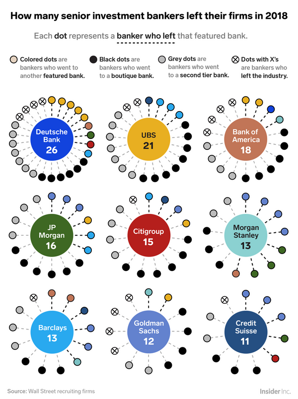
Today's post deals with the following chart, which appeared recently at Business Insider (hat tip: my sister):
 Source: Business Insider
It's immediately obvious that this chart requires a heroic effort to decipher. The question shown in the chart title "How many senior investment bankers left their firms?" is the easiest to answer, as the designer places the number of exits in the central circle of each plot relating to a top-tier investment bank (aka "featured bank"). Note that the visual design plays no role in delivering the message, as readers just scan the data from those circles.
Anyone persistent enough to explore the rest of the chart will eventually discover these features:
- There are nine plots each representing a top-tier bank.
- Banks are divided into three groups: top-tier (aka "featured"), second-tier, and boutiques. Based on the order of these groups shown in the legend, one supposes that moving from a top-tier bank to a boutique bank is regarded as less humiliating than moving to a second-tier bank, which in turn is less humiliating than exiting to a different industry
- The plots are arranged in a 3-by-3 grid, intended to be read top-to-bottom, left-to-right. Readers discover this order while reading off the number of exits from the central circles.
- Each bank is identified by a color. These nine colors include four kinds of blue. The designer embeds the legend for color into the central circles; that's how the reader discovers which color maps to which bank.
- Each plot is made up of a central circle, a set of dots arranged around the central circle, and a corresponding set of spokes adjoining them.
- Each dot conveys the next position taken by each senior investment banker that has left a top-tier bank in 2018. Because of the placement of the color legend, eyes must criss-cross the chart to discover the bank identities. For the grayscale dots, eyes go up top to read the top legend.
- All dots are intended to be read from the top vertical position in a clockwise manner. The grayscale dots are placed behind the colored dots, and always in the order of boutiques, second-tier, and exits from banking. The colored dots, however, have no discernible order. The reader may expect the same logical sequence as the arrangement of plots within the chart, that is to say, by decreasing number of senior banker exits from each bank. Only the first plot of Deutsche Bank observes this ordering scheme. Another possibility is to order by decreasing numbers of bankers moving to a specific bank. This applies to every plot except the second plot one of UBS.
- The different numbers of spokes on each plot implies different angles of spokes, which presents a challenge when comparing one plot to another (which is comparing one bank to another).
- The spokes do not aid our perception.
These design features cause many, if not most, readers to give up before they understand fully what the designer means to convey.
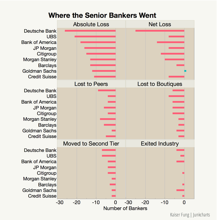
In rethinking the visualization, one needs to clarify the intent of the chart. I decided to switch the layering structure: each plot now shows a different metric used to compare the nine top-tier banks. This reflects the expectation that readers are more interested in comparing across banks than within a specific bank.
Here is a quick sketch using JMP Graph Builder:

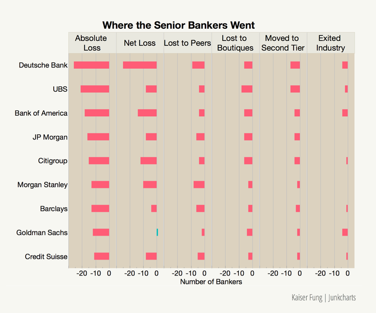
The last decision I made before arriving at the above sketch is the grid layout. I originally made a 1-by-6 layout but ultimately chose the 3-by-2 layout. The former asks readers to absorb six metrics and nine banks all at once, while the latter stages the presentation so that readers can hold just two metrics in their heads at any time.
Here is the 1-by-6 layout:

Designers should recognize that readers have no prior engagement with the data set. After spending hours, if not days, with a data set, we lose the perspective of someone examining the data for the first time. The key is to break down the complexity.
If you like this post, come to Junk Charts to find over a thousand other examples.
redo_businessinsider_ibankers.jmp