- JMP will suspend normal business operations for our Winter Holiday beginning on Wednesday, Dec. 24, 2025, at 5:00 p.m. ET (2:00 p.m. ET for JMP Accounts Receivable).
Regular business hours will resume at 9:00 a.m. EST on Friday, Jan. 2, 2026. - We’re retiring the File Exchange at the end of this year. The JMP Marketplace is now your destination for add-ins and extensions.
JMP Blog
A blog for anyone curious about data visualization, design of experiments, statistics, predictive modeling, and more- JMP User Community
- :
- Blogs
- :
- JMP Blog
- :
- Evaluating college football’s top coaches: Just how good (and consistent) are th...
- Subscribe to RSS Feed
- Mark as New
- Mark as Read
- Bookmark
- Subscribe
- Printer Friendly Page
- Report Inappropriate Content
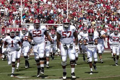
We are once again at the end of another college football season. Regular seasons are finished, and conference championships have been held. Bowl season awaits!
As I was watching a game recently, I wondered about the top coaches in the game today. Is there any difference between these coaches’ career winning percentages? Are these coaches consistently winning over time, or are there “hiccups” in their careers? Do they make a difference in the winning percentage at their schools, or are the schools just such perennial powerhouses that head coaches don’t make that much difference?
I decided to have a look.
Data Source
College football coaching records are available from many sources, including Wikipedia.com, NCAA.org, and ESPN.com. I started with the top 10 active coaches by winning percentage, but had to eliminate two because they had coached fewer than 50 games.
The list of top 10 coaches included a couple of names that wouldn’t normally be considered among that “heavyweights”, but who had excellent won/loss records: Joe Moglia of Coastal Carolina, and Lance Leipold of Buffalo. It will be interesting to see how they stack up in the analysis.
I then arbitrarily added in Bob Stoops of Oklahoma recently retired) and Jim Harbaugh of Michigan to round out the 10 coaches. (This is just a list I came up with… I don’t intend to slight any particular program!
My list of coaches includes:
- Nick Saban (head coach at Toledo, Michigan State, LSU, and Alabama)
- David Shaw (Stanford)
- Chris Peterson (Boise State, Washington)
- Urban Meyer (Bowling Green state, Utah, Florida, and Ohio State)
- Jimbo Fisher (Florida State, Texas A&M)
- Dabo Swinney (Clemson)
- Bob Stoops (Oklahoma)
- Jim Harbaugh (Michigan)
- Joe Moglia (Coastal Carolina)
- Lance Leipold (Wisconsin-Whitewater and Buffalo)
I used Internet Open in JMP to collect the data and then used a variety of the data preparation tools in JMP to assemble the data for analysis. I’ll mention the data formats required for each of the analyses mentioned below.
Q1: Is there any difference in the top coaches’ career winning percentages?
To answer this question, we want to compare individual coach’s career winning percentages. Since Coach might be our categorical input factor (with 10 levels, one for each coach), and Winning Percentage is our response variable, we might be tempted to perform an ANOVA. ANOVA would correct for different “sample sizes” (i.e., games coached) for each coach and would perform an F test to identify differences.
This would be fine if the output percentages were normally distributed. However, winning percentages are bounded by 0% and 100% (i.e., it is a binomial distribution). A more appropriate analysis for this data is a Chi-Squared analysis.
JMP has Chi-Squared analysis built into the Fit Y by X platform, and also in the Consumer Research/Categorical analysis in JMP. The Categorical analysis platform is more complete and flexible, performing the Chi-Squared analysis and including not only whether there is a difference in winning percentage between any of our coach’s career records, but also which of our coaches differ from which others.
Before I could perform the analysis, I had to make some changes to the data format. The original data set looked like this: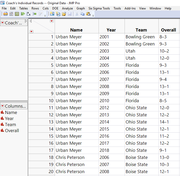
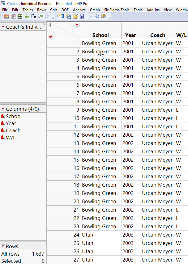
To convert from the first table to the second, I first expanded each year’s Wins and Losses into two new columns in the original data table, and then I used a custom JSL Script to expand the table. For details on that, see Appendix A.
To answer the question, I chose to use the Categorical platform in the Consumer Research tools in JMP.
A1: Are these coaching records different, and are some coaches better than others?
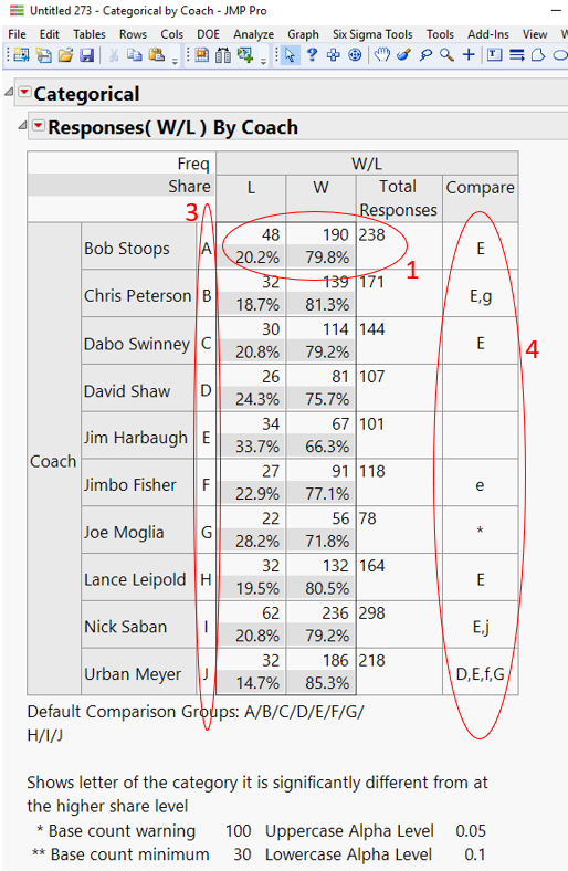
Running the reformatted data table through the Consumer Research tools in JMP (specifically the Categorical platform) gives us the results shown in Figure 3.
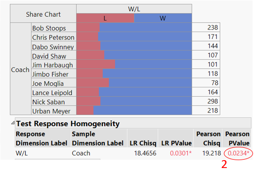
The Contingency Table in Figure 3 shows the summary statistics (Wins and Losses), the Total Games (or Responses), and the Percent Wins and Losses for each coach. (See the red ellipse in Figure 3, labeled #1.) These percentages are depicted graphically in the bar chart below the table.
Below the bar graph, note the Pearson PValue (red ellipse labelled #2). The value is 0.023. We are interested detecting differences with at least 95% confidence. Since the PValue is less than 0.05, we are 95% confident that there is a difference between at least one of these coach’s W/L records and the remaining coaches.
But which coaches are different from which others? A simple evaluation would be to simply look at the W/L percentages, and rank order accordingly. But this does not consider the different sample size for each coach.
For this, we look at output table in Figure 3. Each coach is given an alphabetic label (A through J; see red ellipse labeled #3.) In addition, there is a column labelled “Compare” (see red ellipse labelled #4). Various coach’s “letters” are listed in this column. For example, the letter in the Compare column next to Bob Stoops is an “E”, referring to coach E, which is Jim Harbaugh. This indicates that Bob Stoops’ W/L record (79.8% wins) is statistically different than Jim Harbaugh’s (66.3%) over their careers.
However, since “E” is the only letter listed next to Bob Stoops, there are no other coaches whose records are different from Stoops’.
Similarly, Dabo Swinney and Lance Leipold have better records than Harbaugh’s.
Note that Jimbo Fisher has a lowercase “e” across from his name. Where the capital letters signify 95% confidence that there is a difference between two coaching records, lowercase letters indicate only a 90% confidence. So, considering the records and total games coached, we have only 90% confidence that Fisher’s record is better than Harbaugh’s.
Based strictly on W/L records, Urban Meyer stands out among these coaches, with 95% confidence that his record is better than David Shaw’s, Harbaugh’s, and Joe Moglia’s, and 90% confidence that his record is better than Fisher’s. We can’t tell (with at least 90% confidence) that his record is different from any of the other coach’s records.
Q2: Are the coaches’ records consistent over their individual careers?
I also wanted to know if these coaches had consistent W/L records over time (even when changing schools), or whether (for example) they got better over time. For this, I turned to the Quality and Process tools in JMP.
As for Question 1 (above), we are dealing with percentages (i.e., binomial distributions). Therefore, rather than generating typical control charts for normally-distributed data, we turn to a “P-Chart.”
The P-Charts require a winning percentage for each coach by year. I used the original data table for this analysis, modified with columns for each year’s number of Wins and Losses, and added two additional columns:
- One included a formula for winning percentage.
- The second was a sum of W+L (i.e., total games coached each year).
I then used the Quality and Process/Control Chart/P platform to generate the charts.
A2: Are the coaches’ records consistent over their individual careers?
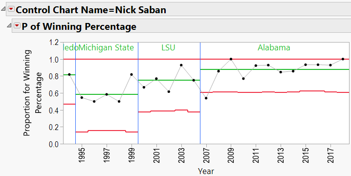
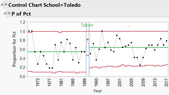
Using the winning percentage as my response, Number of Games as my Sample Size, Year as my Sample Label, and Coach’s Name as my “By” variable, I generated P-Charts for each coach. Appendix B shows all the charts. Let’s have a look at Nick Saban’s chart:
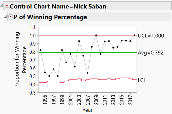
Here we see that Saban has been coaching since 1994. The red lines in the chart indicate “Control Limits,” or the boundaries within which a process is considered “in control.” The top Control Limit is clipped at a value of 1.0 (or 100% games won). The lower limit varies between 0.4 and 0.5. Note that the variation is caused by different numbers of games coached each season. Also listed is Saban’s career winning percentage (0.792).
There does appear to be an upward trend to Saban’s record, beginning in about 2008 (after joining Alabama). We can add a “Phase” to the P-Chart indicating the school that he coached at:
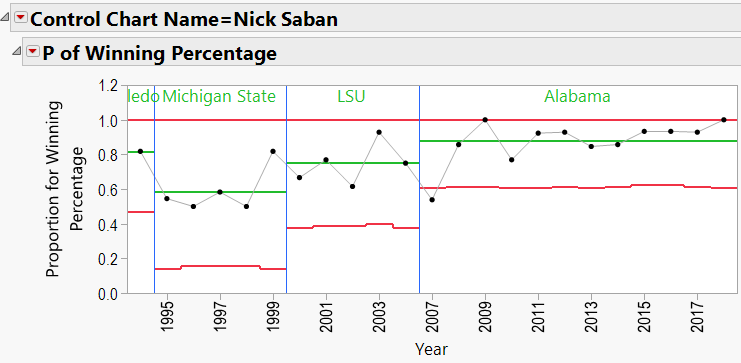
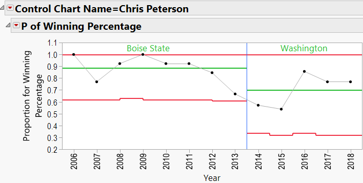
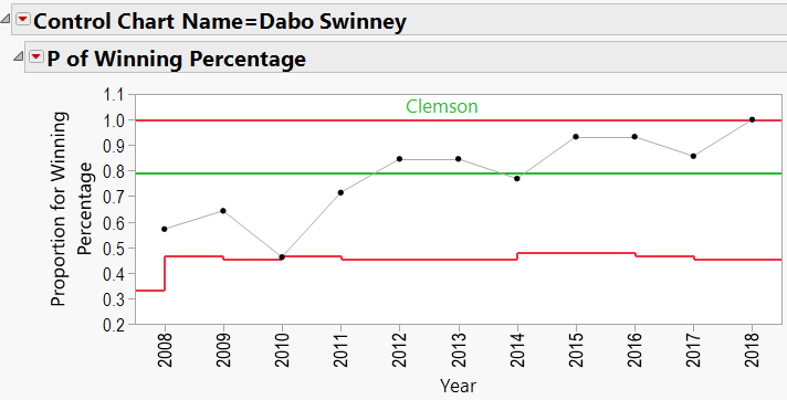
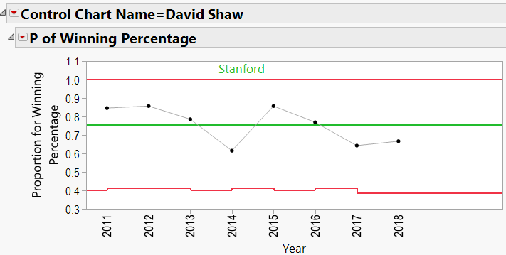
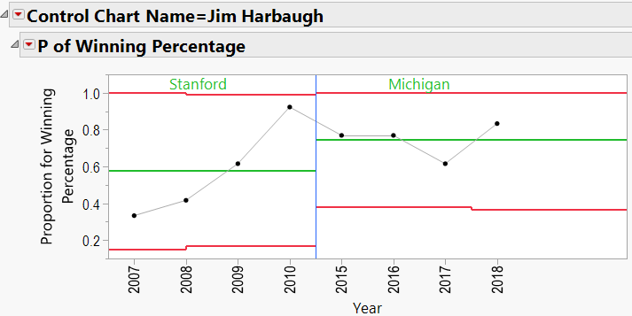
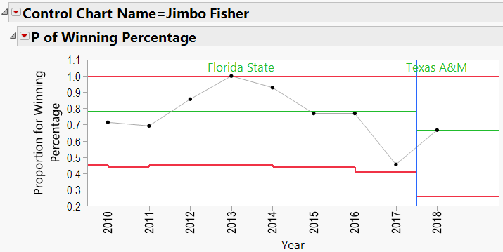
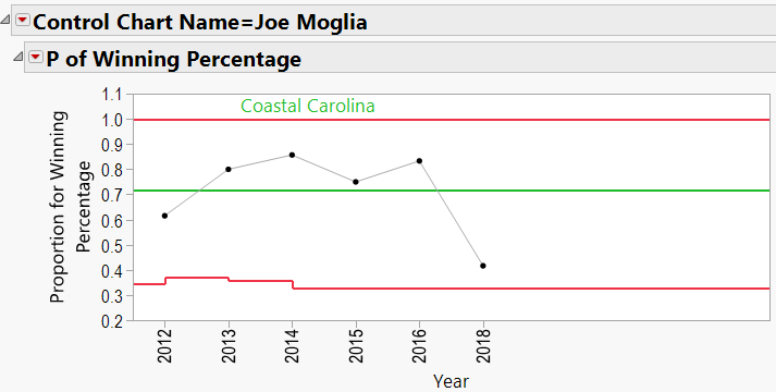
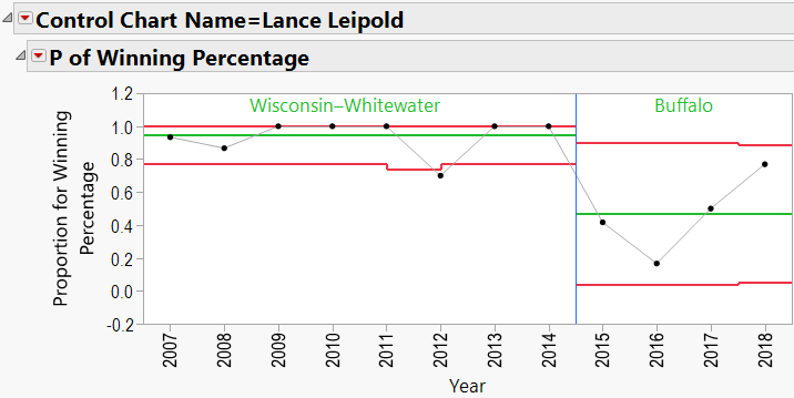
Looking through the other charts (Appendix B) shows similar charts for other coaches, with an occasional “out-of-control” year, and variations from school to school.
Q3: Does bringing in a specific coach help a school’s overall W/L record?
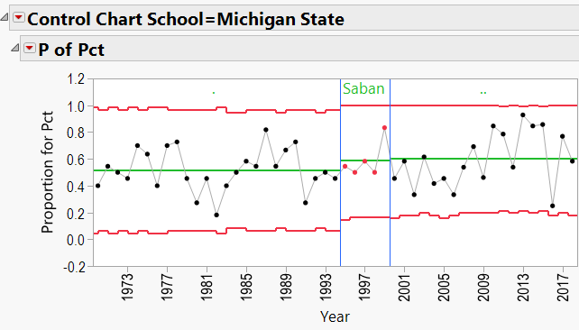
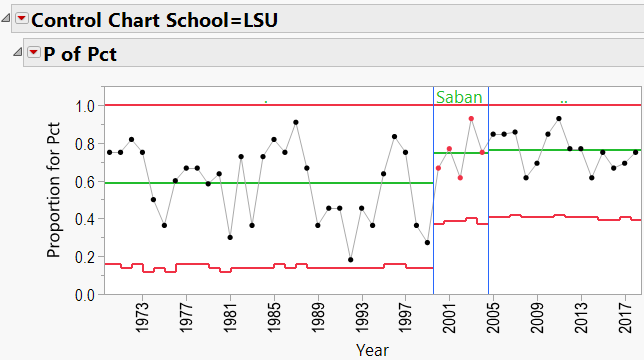
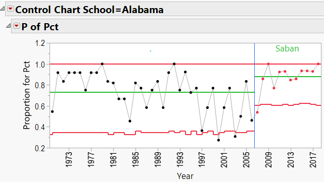
As mentioned in the discussion about coaching consistency, it appears that moving to Alabama was good for Nick Saban’s record. Can the same be said for the school’s good fortunes? In other words, can we say that Alabama benefited from hiring Nick Saban?
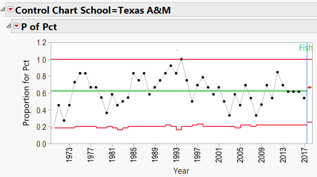
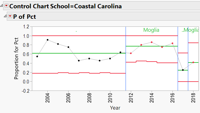
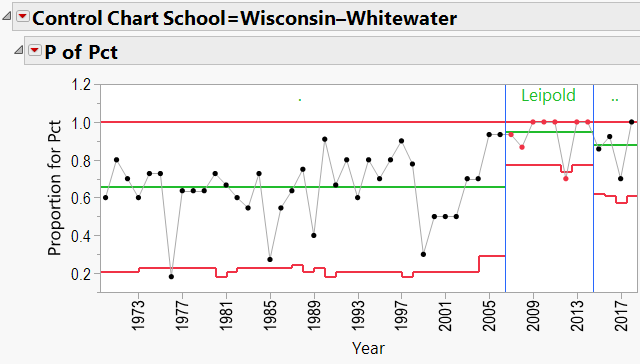
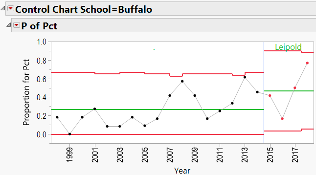
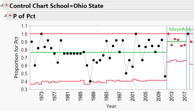
This is again a P-Chart question, but we need to flip the axes. First, I downloaded all of the W/L records for all schools coached by any of the 10 coaches in this study. I went back as far as 1970. This resulted in a data table containing columns of School Name, Year, Coach Name, Games Played, and Winning Percentage. I added a column called “Top Coach?” that contained:
- A dot (“.”) for any school/year that was not coached by one of my 10 coaches.
- The coach’s name if the coach during that school/year was one of my 10 coaches.
I also used “Color by Row State” to color all rows red where the school/year was coached by one of my 10 coaches. This helped to highlight those particular years in the control charts.
A3: Does bringing in a specific coach help a school’s overall W/L record?
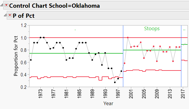
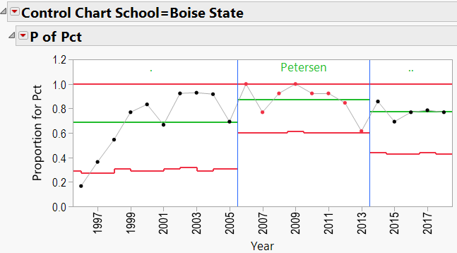
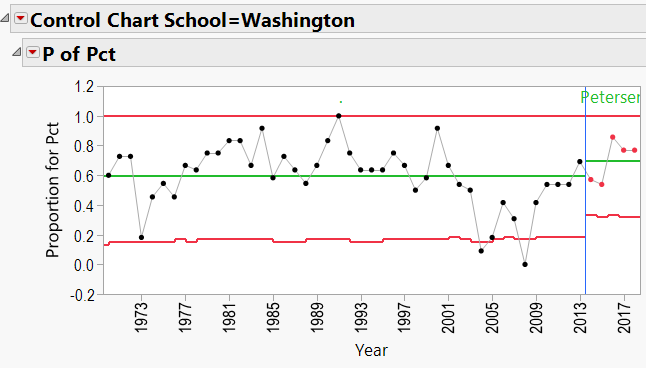
The P-Charts were set up using:
- Process = winning percentage
- Sample Label = year
- Phase = coach’s name
- By = school name
- Sample Size = total games per year
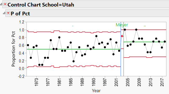
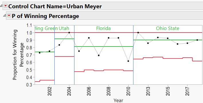
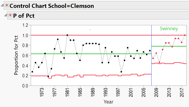
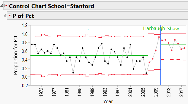
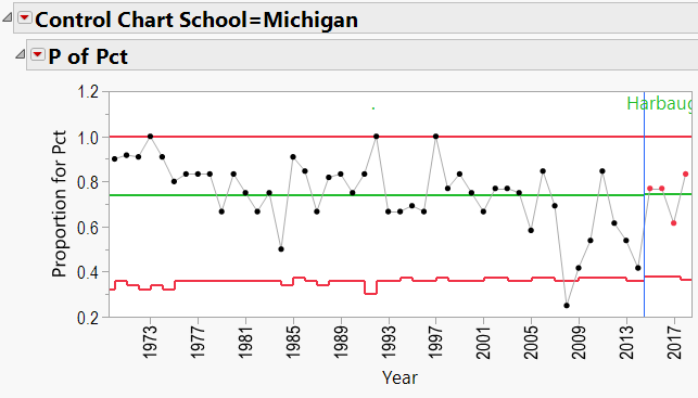
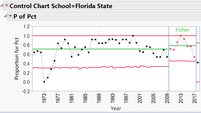
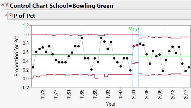
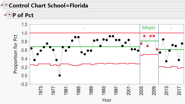
Appendix 3 contains all these charts. Since Urban Meyer has traveled to several different schools during his coaching career, let’s have a look at his results:
Summary
We took a look at three questions in this study:
- Is there a difference in winning percentages between these 10 winning coaches?
- JMP’s Consumer Research/Categorical platform results would indicate that there is a difference in their winning records, at least between certain coaches.
- Have the coaches had consistency in their winning records over time?
- JMP’s Quality Tools/Control Charts showed that not only are these coaches generally consistent in winning, but there seems to be an effect of “school” playing into the results. For example, Nick Saban’s fortunes improved when he moved to Alabama. (Or did Alabama’s improve when Saban moved in??)
- Have the schools benefitted from the services of these coaches?
- Again, JMP’s Control Charts show that wherever these coaches are employed, the school’s good fortunes seem to improve.
So does this mean that these coaches are “worth their salt” in terms of their multi-million dollar contracts? I’ll leave that for a different discussion.
And if you are curious about how your own favorite coach performed, you are welcome to download his results and plug them into JMP yourself, via JMP’s free 30 day trial!
Appendix A: Table Manipulations
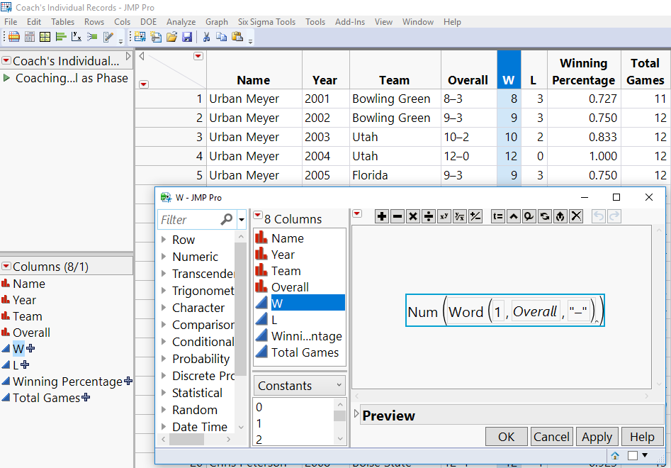
To convert from the table shown in Figure 1 to that shown in Figure 2, I first expanded each year’s Wins and Losses into 2 new columns in the original data table, and then used a custom JSL Script to expand the table. A typical formula is illustrated below:
Now that I had the actual numbers for wins and losses for each year, I wrote a simple JSL script to get to the final desired format. (If you're interested in the script, it is attached to this blog.) Running that script produced the final data table (Figure 2) used for the contingency analysis to compare coaching career W/L records. The file itself (Coach's Individual Records -- Expanded.jmp) is also attached.
Appendix B: P-Charts by Coach, showing effects of Schools:
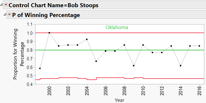
Bob Stoops:
Chris Petersen:
Dabo Swinney:
David Shaw:
Jim Harbaugh:
Jimbo Fisher:
Joe Moglia:
Lance Leipold:
Nick Saban:
Urban Meyer:
Appendix C: P-Charts by School, 1970-Present, showing effects of coaches:
Bob Stoops Schools:
Chris Petersen Schools:
Dabo Swinney Schools:
David Shaw Schools:
Jim Harbaugh Schools
Jimbo Fisher Schools:
Jo Moglia Schools:
Lance Leipold Schools:
Nick Saban Schools:
Urban Meyer Schools:
You must be a registered user to add a comment. If you've already registered, sign in. Otherwise, register and sign in.
- © 2026 JMP Statistical Discovery LLC. All Rights Reserved.
- Terms of Use
- Privacy Statement
- Contact Us

