- JMP User Community
- :
- Blogs
- :
- JMP Blog
- :
- Analyzing spectral data: Multivariate methods and advanced pre-processing
- Subscribe to RSS Feed
- Mark as New
- Mark as Read
- Bookmark
- Subscribe
- Printer Friendly Page
- Report Inappropriate Content
A quick reminder of where we left off in Part 1 of this series on spectroscopic data: We were analyzing a popular spectroscopy data set by Martens et al. "Light Scattering and light absorbance separated by extended multiplicative signal correction. Application to near-infrared transmission analysis of powder mixtures" Analytical Chemistry 2003 Feb1;75(3):394-404. A few simple pre-processing steps allowed us to dramatically improve the signal-to-noise ratio in the data.
In this post, we use the same data to demonstrate the utility of the multivariate platforms in JMP. In spectral analysis, multivariate statistics are used extensively as one iteratively tries different pre-processing steps and assesses the impact on the data. We focus on unsupervised learning, or exploratory data analysis, at first. Then we demonstrate how the functional data explorer (FDE) can be used to build multivariate calibration models. Finally, we introduce a more advanced pre-processing method -- the extended multiplicative signal correction -- and show how this can further improve our multivariate calibration model.
Multivariate Methods
Principal Components Analysis
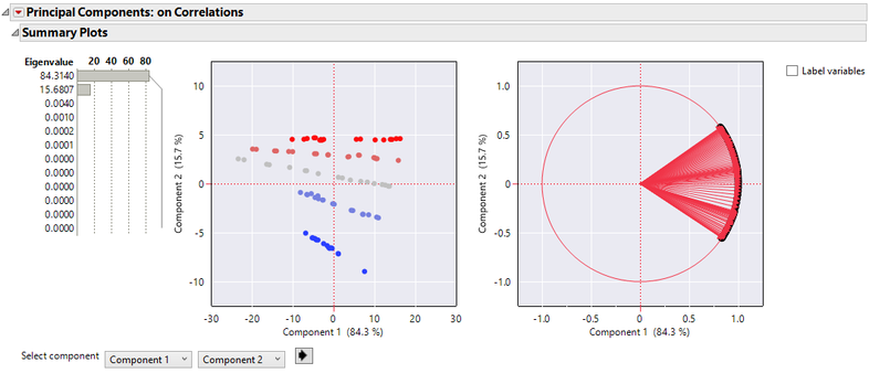
The first exploratory method we demonstrate is principal components analysis (PCA). Interestingly, when a PCA is performed on the raw spectra, the known subgroups can be identified in the score plot without the need for any pre-processing (Figure 1). Remember from Part 1 that the samples are mixtures of gluten and starch, and that the colors indicate the gluten fraction. While there is good separation between groups, there is still a considerable amount of variation for spectra with the same gluten fraction, which will cause problems for multivariate calibration later. This error improves considerably by the end of this post, after we find the optimal pre-processing workflow.
Figure 1. The score and loading plots for the PCA model. The loading plot indicates a high degree of correlation across wavelengths, as expected. The colors indicate the gluten fraction present in each sample from 0 (blue) to 1 (red). The eigenvalues indicate that variation in this data set can be explained with 2 principal components.
Model Driven Multivariate Control Chart
Typically, some type of outlier analysis is performed to identify and remove influential outliers from the model. JMP provides outlier analysis tools within the PCA platform. However, with JMP 15 came the Model Driven Multivariate Control Chart (MDMCC), which is a more full-featured tool for outlier analysis that allows for deeper investigation into root cause analysis and comparing spectra for differences.
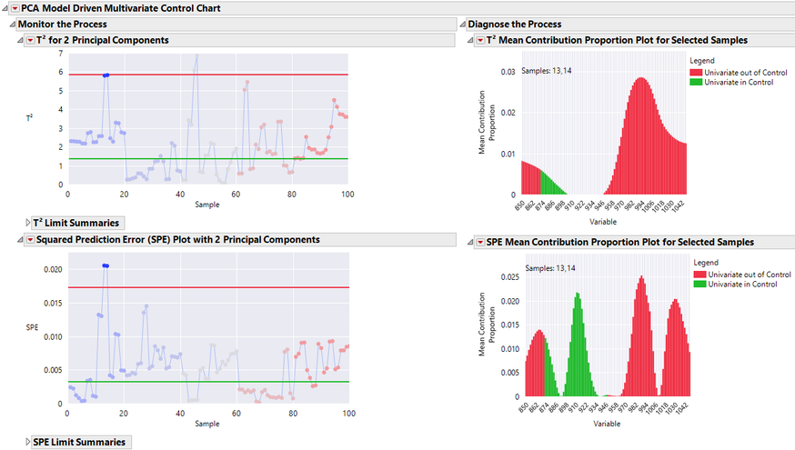
Figure 2. The Model Driven Multivariate Control chart identifies two spectra (13 and 14) as outliers according to the T2 and SPE charts. Mean contribution proportion plots demonstrate the wavelengths with largest contribution to the out of control signal.
For the spectra in this analysis, MDMCC identifies two spectra (13 and 14), as outliers based on their PCA derived T2 and SPE charts (Figure 2). The T2 chart indicates that these points are far from the data within the model plane, while the SPE chart indicates that the points are distant from the model plane. Another way to conceptualize this is that these spectra are 1) distant from the average spectra and 2) poor fits in the PCA model. Since both of these conditions are satisfied, the points are potentially influential outliers, meaning that they may pull the PCA model plane toward them when the model is fit. If these are truly erroneous data, there is potential for a poor PCA model. Note that there are other points besides 13 and 14 that are outliers in the T2 chart, but not in the SPE chart. Since these points are distant from the average spectra, but still fit the PCA model, they are less likely to be influential outliers. To see a good illustration that distinguishes T2 and SPE outliers, see Figure 4 of this paper.
To get a better sense of why the points 13 and 14 are outliers, we construct mean contribution proportion bar charts for the T2 and SPE charts (Figure 3). These show the wavelengths with the largest contribution to the outlier status in both charts. You can also hover over individual bars to see univariate control charts for a specific wavelength.
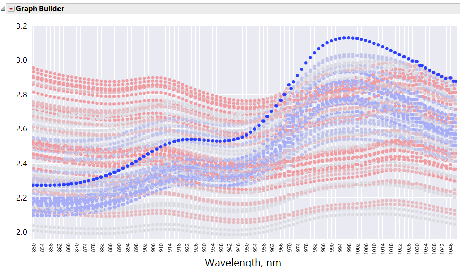
For this example, it is helpful to plot the spectra in Graph Builder to get a better sense of why the observations are outliers (Figure 3). One noticeable anomaly is that these two spectra have abnormally large absorbances at longer wavelengths.
If we decide these outliers are suspect, it is easy to refit the model with the outliers removed. To do this, turn on Automatic Recalc in the MDMCC report, select the outlier observations in either the T2 or SPE control chart, and then use right click >> Rows >> Row Exclude.
Figure 3. Graph Builder view for spectra 13 and 14 as selected in MDMCC via dynamic linking. This graph shows how the two selected spectra could be perceived as outliers when compared directly to the rest of the data.
The Score Plot for MDMCC can also be used to compare subgroups (Figure 4). Group A is the top “red” subgroup and Group B is the bottom “blue” subgroup. The Relative Score Contribution Plot shows where there are significant differences between the two subgroups by wavelength.
Figure 4. Group comparison between spectra with 0% and 100% gluten. The wavelengths with largest absolute contribution in the bar chart show the largest difference between groups.
Functional Data Explorer
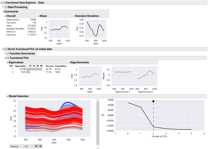
The PCA platform in JMP is a good general-purpose tool but was not designed for data with a functional form like spectra. Fortunately, in JMP Pro, there is a tool that is specifically designed for functional data. The Functional Data Explorer (FDE) platform in JMP Pro can be used for deeper investigation of spectral data. FDE is used to analyze curve data over some continuum, for NIR spectra the continuum is wavelength. Because all spectra are measured on the same equally spaced grid, we can fit a direct functional PCA model, which performs a functional PCA without fitting a basis function (Figure 5). Note that we did not exclude the outliers that we identified in the previous section (13 and 14) from the FDE model. While one might choose to exclude these outliers, we include them in the fit because in a later section we will compare to a FDE model that is fit to pre-processed data where these observations are no longer outliers (see Figure 14).
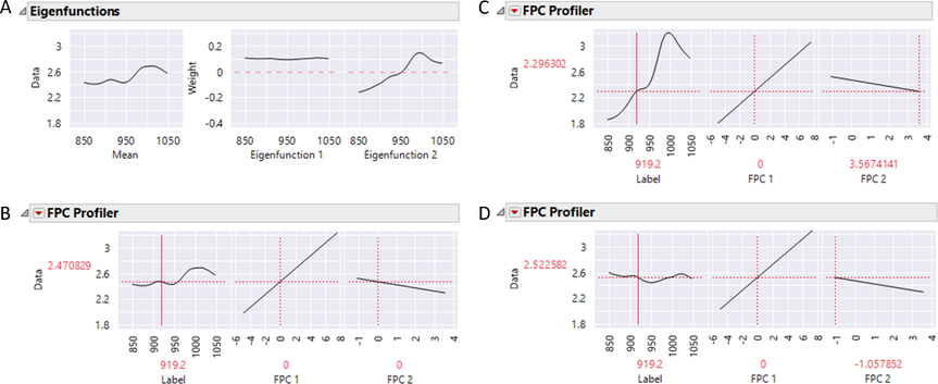
In Figure 5, the eigenvalues corresponding to the functional principal components (fPCs) show how much variation is explained by each fPC. In the case of this data, the variation is characterized by the first two fPCs, as was the case with PCA. You also see a mean curve associated with the fPCs. If your data tracks the mean function exactly, all fPCs would be zero. If the fPC value is positive, the shape of the function varies from the mean in a shape similar to the corresponding eigenfunction, while a negative fPC indicates the reverse effect. The eigenfunctions are comparable to a common plot used in the PCA analysis of spectral data called the spectral loadings plot, where the loadings are ordered by wavelength.
Figure 5. The direct functional PCA model fit summaries. Two functional principal components explain 100% of variation in the data.
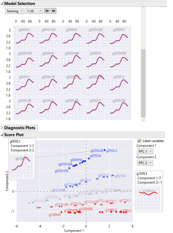
The individual spectra are fit and the resulting score plot is shown in Figure 6. A handy feature in the functional principal components platform is the ability to hover over points in score plots and see graphlets for the corresponding spectra. This is very useful in this example, as the score plot organizes the data into subgroups of similar spectra, and then the hover help shows the differences in the functional form. This can be used to discover differences between subgroups without relying on any more sophisticated analyses.
Figure 6. The score plot for the FDE model fit. Differences between subgroups can be explored by hovering over points in the score plot, revealing the functional form of the spectra.
The fPC Profiler allows for easier interpretation of the score dimensions for the individual fPCs (Figure 7). Moving one of the fPC sliders shows the effect on the predicted function of moving along one of the fPC directions, with the other fPC values fixed.
Figure 7. Eigenfunctions (A) and the fPC Profiler (B-D) for the FDE model fit. The fPC profiler with the fPCs set to their mean values (B), fPC2 set to its minimum value (C), and fPC2 set to its maximum value (D). When the fPC2 value is positive, the shape of the spectra varies from the mean in a shape similar to the corresponding eigenfunction, while a negative fPC indicates the reverse effect.
Functional Design of Experiments (Multivariate Calibration)
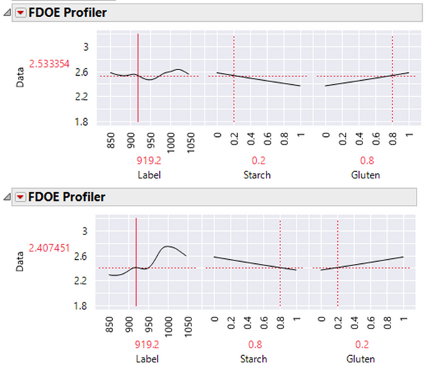
Since these data are from a designed experiment, a Functional DOE analysis is relevant (Figure 8). The FDOE Profiler allows for the prediction of the functional form of spectra at starch and gluten fractions not observed in the experimental data. In spectra analysis, this is called a multivariate calibration model. Since starch and gluten are mixture proportions that sum to 1, we apply a mixture constraint in the Profiler.
Often it is desirable to build the inverse of this model, in which experimental factors (the constituent proportions, in this case) are predicted as a function of the spectra. Confusingly, this is also called multivariate calibration. For clarity, we adopt Brereton’s terminology and refer to this as inverse multivariate calibration. To fit these types of models, one can output the functional principal components and provide them to any predictive modeling platform in JMP. This enables one to fit flexible models, such as neural networks, to the function summaries. These models may be able to model nonlinearities and dependencies better than PLS. We will illustrate such an approach in the next post.
Figure 8. The functional DOE profiler. A linear constraint has been applied to starch and gluten so that they sum to 1. Spectra are predicted at experimental factor combinations not observed in the original data.
Hierarchical Clustering
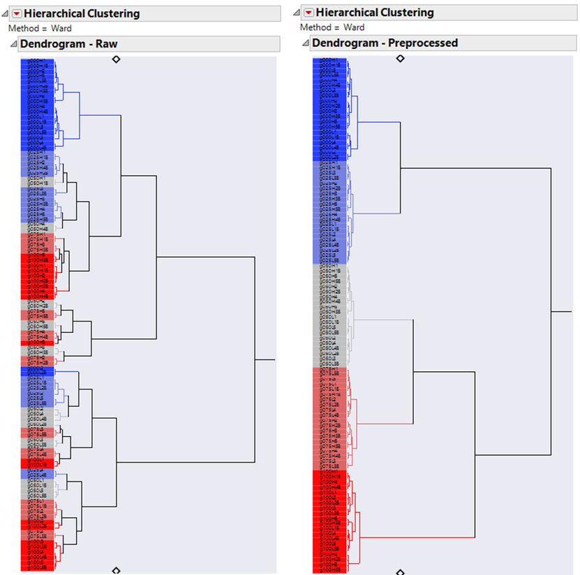
Hierarchical clustering is another unsupervised machine learning tool popular in spectral analysis. The goal of hierarchical clustering is to identify subgroups in the data, where differences are small within clusters and large between clusters. In previous sections, we identified subgroups but did so in a subjective way. Hierarchical clustering provides an objective criterion for defining these subgroups.
The cluster dendrogram shows a hierarchy of clustering that goes from the tips, where every spectrum is in its own cluster, to the root, in which all spectra are in one cluster. The dendrogram shows how clusters are merged iteratively by the clustering algorithm. The length of the internal branches is proportional to the difference between clusters, where the difference between clusters is defined according to a linkage criterion.
The hierarchical clustering in JMP is a rich platform, with many features useful for spectral analysis that we do not have time to cover here. We provide the report in the attached journal so that you can discover the features on your own. Some features worth checking out are the interactive selection of the number of clusters, the output of cluster assignments, the ability to select and highlight clusters in the dendrogram, and the ability to launch parallel plots for clusters. It is also worth noting that hierarchical clustering has excellent performance for large n and large p problems.
Figure 9. Hierarchical clustering of the raw spectra (left) and the spectra preprocessed according to part 1 of this series (right). The raw data shows much more scattered clustering of the individual spectra resulting in poor sub-grouping while the pre-processed data shows better defined sub-grouping. One can save the individual cluster designations and use that as an input into a modeling process if so desired.
Advanced Pre-processing
Extended Multivariate Signal Correction
This section introduces a useful diagnostic plot called the scatter effects plot and a powerful pre-processing method called the extended multiplicative scatter correction (EMSC). The scatter effects plot is straightforward to create in JMP, and an example is provided in the attached journal. The EMSC will require some JSL knowledge to reproduce. We present the EMSC because it works well for these data, and the Fit Model platform is a useful pedagogical tool for teaching the method. Also, we intend to provide many pre-processing methods like the EMSC in the FDE platform in a future release of JMP, so stay tuned for that.
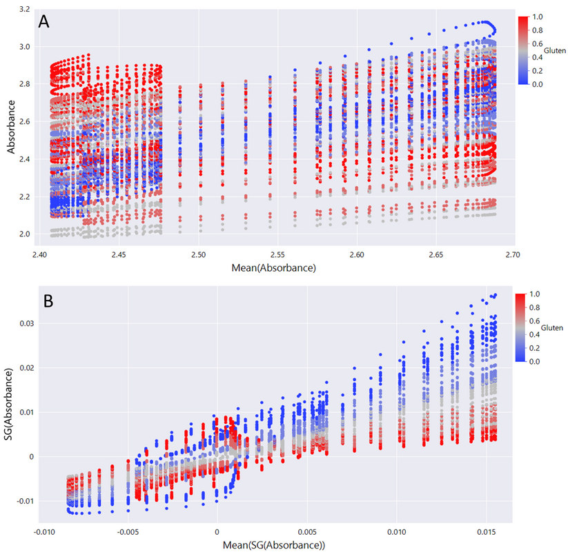
Figure 10 shows the scatter effects plot, which is useful when selecting pre-processing methods. There are patterns in these plots that indicate different sources of noise, and you can use this information to select what pre-processing methods are appropriate for your data. In the scatter effects plots, shifts in the y intercept indicate a constant baseline shift, or an additive effect. A pre-processing method like the 1st derivative Savitzky Golay (SG) filter -- which we introduced in the previous blog post -- removes these effects. Multiplicative scatter effects occur when spectra have large variation at only certain wavelengths. These show up as shifts in slope, or “fanning”, in the scatter effects plot. Some pre-processing methods that can remove multiplicative effects are the multiplicative scatter correction (MSC) and the standard normal variate. We showed the standard normal variate in the previous post. In this post, we introduce the MSC. Chemical effects also show up as a distinct pattern in these plots. Interestingly, these show up as loops!
Figure 10. Scatter effects plot for raw spectra (A) and 1st derivate SG filtered data (B). After the additive effects are removed by the SG filter, multiplicative effects remain. A pre-processing method that removes multiplicative effects will be necessary for these data.
The scatter effects plot for the raw data strongly suggests an additive effect (Figure 10A). There may also be multiplicative effects, but it is hard to tell because the additive effect is so dominant. So, we first remove the additive effect by applying a 1st derivate SG filter on the data as we did in the previous post. In the previous post, we plotted the pre-processed spectra in Graph Builder and showed that multiplicative effects remained. The multiplicative effects are also apparent in the scatter effects plot -- note the considerable fanning (Figure 10B). So, there are both additive and multiplicative effects in the data. The EMSC can remove both sources of noise in one step.
In their original paper, Martens et al. introduced the EMSC and showed how this method could improve upon simpler pre-processing methods, such as those shown in our previous post. We are building up to the EMSC, but it is easiest to start with the multiplicative scatter correction (MSC) first. The MSC aims to correct for the various sources of noise in the data by making the data look more like a reference spectrum. Since there often is not a good standard available, the mean spectrum is frequently used. For each spectrum, a separate regression is performed. Let x = {x1, …, xp} be a vector of absorbances for a given spectrum and x* = {x*1, …, x*p} the reference spectrum. The model is
And the spectrum is corrected as follows:
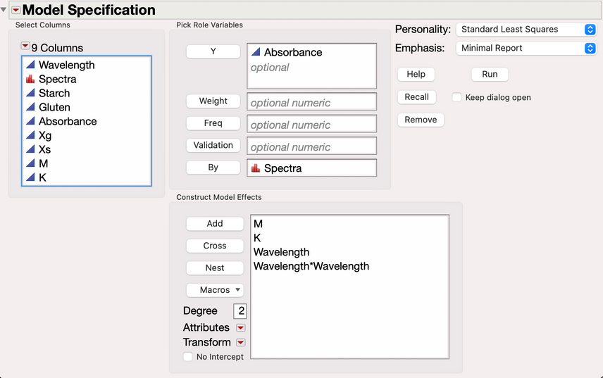
One problem with the MSC is that it does not account for the relationship that exists between scatter effects and wavelength. The EMSC address this by incorporating a polynomial relationship into the model. Typically, a quadratic relationship is assumed for wavelength. Another problem with the MSC is that by regressing each spectrum on the mean spectrum, the real chemical effects that are of interest can be removed. If the samples are known to be a mixture of a small number of chemical components -- and pure reference spectra are available for each component -- the EMSC can be extended further by incorporating prior chemical composition information into the model. In the data from Marten et al., there are pure gluten (xg) and pure starch (xs) samples in the data. As in the Marten et al. paper, we chose sample 1 and sample 93 to be the reference spectra. The EMSC model will modify the reference spectrum depending on the estimated chemical composition, which better preserves the true chemical signal in the data.
m = (xg + xs)/2 and k = (xg - xs) and l = {l1, …, lp} is the vector of wavelengths. The m and k model terms are expressed in this way to simplify the correction equation. The corrected spectra are computed as:
To perform the EMSC in JMP, we will first need to create columns for the xg and xs reference spectra. We do this by subsetting the data table to create tables for the reference spectra, and then join the reference tables back to the original table. We do this with the following steps:
- Use Rows >> Row Selection >> Select Where to select all rows corresponding to one of the reference spectra.
- Use Subset to create a table containing only the reference spectra.
- Join the tables back to the original table, using wavelength as the matching column.
Next, we create the k and m columns, which can be done using formula columns that operate on the xg and xs columns. We then are ready to estimate the EMSC model. This can be done in fit model using the options shown in Figure 11. To perform the EMSC correction, we need to extract the model term coefficients and save them to columns in the data table. We need to use a jsl script for this, but the script is fairly straightforward. Finally, we perform the EMSC correction using the formula shown in Figure 12.
Figure 11. Fit model launch dialogue for the EMSC model.
Figure 12. Column formula for the EMSC correction.
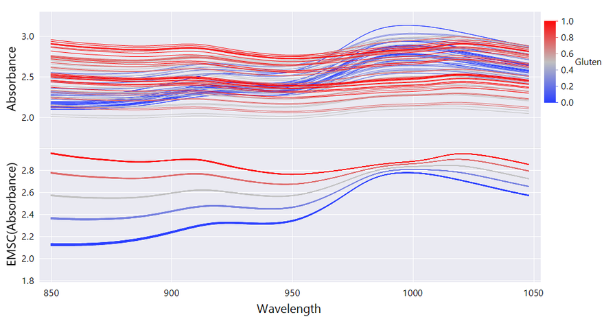
The final result is shown in Figure 13. The spectra are remarkably free from scatter effects, and are a much more accurate representation of the true underlying spectra.
Figure 13. Spectra before and after the pre-processing steps applied in this blog. (Top) Before pre-processing, (Bottom) after EMSC correction.
Final Multivariate Calibration Model
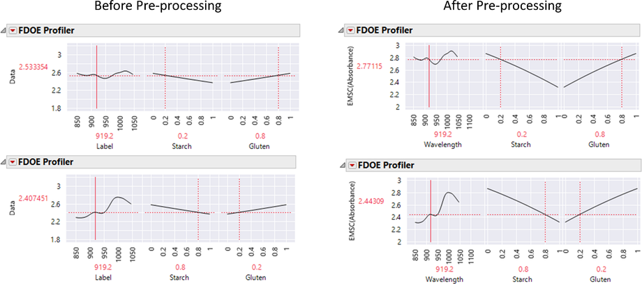
The spectra are now ready for our final multivariate calibration model in FDE. We perform functional DOE using the method described in the FDE section. The resulting model allows us to accurately predict the spectral form for a given combination of mixture proportions. An example of such predictions is shown in Figure 14.
Figure 14. Functional DOE of EMSC corrected spectra before and after pre-processing. A linear constraint has been applied to starch and gluten so that they sum to 1. Note the large changes in spectral shape after pre-processing. Since scatter effects have been removed from the spectra, we can obtain more accurate estimates of the predicted spectral shape at factor combinations not observed in the data.
Conclusions and Future Posts
We demonstrated several multivariate platforms in JMP that are useful for identifying patterns in your spectral data. We focused on the subgroup analyses and outlier analyses common in spectral analysis. The utility of FDE for analyzing spectral data was on full display as we demonstrated the numerous exploratory tools available. Importantly, functional design of experiments allows one to easily build multivariate calibration models. We demonstrated how the Fit Model platform in JMP can be used to build an extended multiplicative signal correction (EMSC) model, which dramatically cleaned up the noise in our data. By building EMSC models from scratch in Fit Model, we gain more control and a deeper understanding of the model building process.
In the next post, we will cover supervised multivariate models. We adopt Brereton’s terminology and refer to these as inverse multivariate calibration models. These will predict experimental factors as a function of spectra. We will build models in the Partial Least Squares and Generalized Regression platforms. We will also show how functional principal components can be output from FDE and provided to any predictive model in JMP, enabling the construction of more complex calibration models
- © 2024 JMP Statistical Discovery LLC. All Rights Reserved.
- Terms of Use
- Privacy Statement
- About JMP
- JMP Software
- JMP User Community
- Contact





You must be a registered user to add a comment. If you've already registered, sign in. Otherwise, register and sign in.