- New to JMP? Let the Data Analysis Director guide you through selecting an analysis task, an analysis goal, and a data type. Available now in the JMP Marketplace!
- See how to install JMP Marketplace extensions to customize and enhance JMP.
JMP Blog
A blog for anyone curious about data visualization, design of experiments, statistics, predictive modeling, and more- JMP User Community
- :
- Blogs
- :
- JMP Blog
- :
- An analyst’s new year’s resolution: Use models to solve more problems
- Subscribe to RSS Feed
- Mark as New
- Mark as Read
- Bookmark
- Subscribe
- Printer Friendly Page
- Report Inappropriate Content
As a new year begins (was there ever a time you wanted a fresh start more???), you may have begun formulating some new goals for the year or started working toward them already. We are a few days into 2021, so hopefully you haven’t yet abandoned the ones you made!
If you have room for another new year’s resolution (or if you need a new one), may I suggest one that I have heard a lot of analysts articulate to me: “I would like to use models (or more do more modeling) in my work.” This goal sounds more achievable than “I will lose 10 lbs.” or “I will get eight hours of sleep,” right?
Analysts are a motivated bunch, but they often get stuck because they don’t have a method to follow. The biggest barrier I have seen from analysts who want to use models to solve their problems is that they get confused and/or bogged down with all the outputs they need to look at once they’ve built a model.
“Which model outputs should I be looking at? There are so many! And how should I interpret them?”
The truth is this: There are a lot of outputs you can look at, and it can be pretty overwhelming if you don’t know which ones are the most important and what they are telling you.
Quick detour
Knowing this is a topic (and what I put forth in this series) that may spark a lot of debate and discussion, let me tell you a little bit about my background so that you have some context for my point of view. My education is in biomedical engineering, and I worked in medical device R&D for several years before transitioning to a role as an applied statistician for a consumer packaged goods company (CPG) supporting shampoo formulators in designing and analyzing experiments to better formulate shampoo. (The next time you wash your hair, pay tribute to the statistical models that were used to perfect the lather volume and texture!)
After leaving the CPG company, I spent a good chunk of my career using data and analytics in retail. The scientists, engineers, business analysts and other collaborators I worked with all had to use data, analytics and software to make quick but sound decisions. A few had some formal training in statistics, while the majority simply learned statistics and statistical software on the job and are looking for clear guidance on best practices with an emphasis on the principal “less is more.” I tried to structure this guidance with these practitioners in mind (myself included).
What you'll learn
In this five-part blog series, I am going to focus on regression model outputs, specifically, Standard Least Squares output because that is the most commonly used method used for modeling. Standard Least Squares are a great beginning, particularly for those new to modeling.
First, be comforted by the fact that the statisticians and developers at JMP set up the default reports in a way that presents the most important information to analysts.
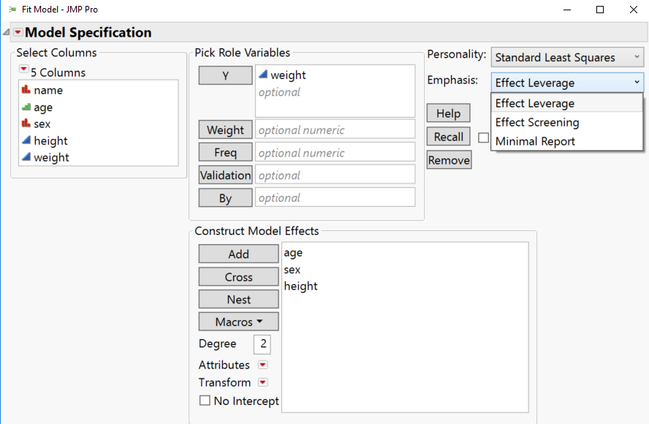
For those already using JMP: Have you ever noticed the Emphasis in the Fit Model input dialog and wondered what it is? I know I was pretty confused about it for a while. In contrast to the Personality options right above it, Emphasis does not change the type of analysis that is done. The different options simply turn on different model outputs as a default when you click Run. JMP uses the amount of data (number of rows) you have in combination with the number of model terms you want to estimate (number of terms in the Model Effects dialogue) to determine the best set of outputs to show you by setting a default Emphasis (Figure 1). JMP is always guiding analysts toward the best path, and the Emphasis selected is no exception. JMP uses the contents of your data to set the default Emphasis. (For more specifics on how it does this, you can read the documentation.)

The outputs that are shown after you click Run are the ones you should focus on first. The outputs that are the most important given your data and the model you are trying to fit are expanded and displayed.
That being said, there are still a lot of graphs and tables to look at and without some training, you will not know which outputs to prioritize and how to interpret or take action on those outputs. Sadly, there still is no pill that you can take to give you this knowledge!
Until that pill exists, I hope this blog post serves as a quick guide.
Model health and interpretation menu
Model outputs can be broken into two main categories of outputs: model health and interpretation. Model health outputs help you determine if your model is healthy or if you need to perform some “first aid.” Interpretation outputs are those that help you decide which factors are important and how they influence the response(s).
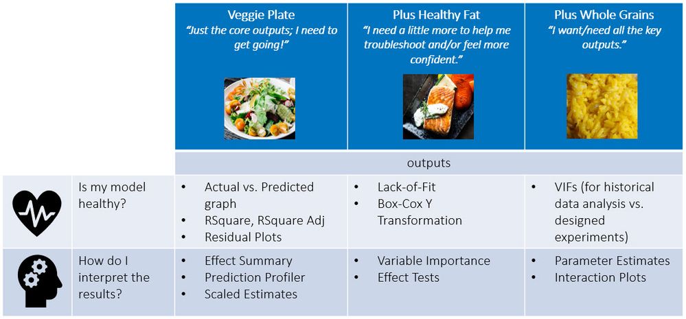
I have developed the menu in Figure 2 to help you focus on the key outputs based on how deep you want to go (or how hungry you are, so to speak). I think it’s only appropriate to use healthy foods in this menu because we are all on our best behavior (or have the best intentions) when setting our new year’s resolutions! My previous drafts of this blog post used a fast food menu board, which seemed…incongruous :smiling_face_with_smiling_eyes:. I offer you three meals:

- The Veggie Plate has the core outputs only and is for the analyst who is looking to move quickly or whose analysis allows for that simplicity.

- The Veggie Plate + Healthy Fat (salmon is one of my faves!) includes the Veggie Plate outputs plus additional outputs that can help with finding remedies for poor model health or for analysts who really like getting into the data. Omega-3s have so many healing benefits!

- Finally, the Full Square Meal includes outputs (“Whole Grains”) that are appropriate when you are struggling to get a good model or when you are just feeling extra hungry for more outputs to help you understand your problem.

Taste testing the menu
If you want to follow along, I’ll be using the Tiretread data set in JMP’s sample data library. If you don’t have JMP, you can download a free 30-day trial or use it in a remote desktop environment when you take the Statistical Thinking for Industrial Problem Solving course (also free; link in the P.S.).
The Tiretread data set comes from a designed experiment where the goal was to optimize four product characteristics (responses): Abrasion, Modulus, Elongation and Hardness using three ingredients (factors): Silica, Silane and Sulfur. The analysis of the experiment involved building and using four (one for each response) standard least squares models relating the factors (via model terms describing main effects, interactions and quadratics*) to each of the four responses.
*Not to beat a dead horse, but the Statistical Thinking for Industrial Problem Solving modules on Correlation and Regression and the Design of Experiments will help you understand the terminology better.
Summary
I hope you will be bold in 2021 and pursue this goal of using models in your work and learning how to interpret the outputs. Know that JMP has your back with the default settings in the Fit Model platform. JMP considers the amount of data you have and the number of effects you are trying to estimate and presents the most important outputs to you.
And I also have your back! I hope you will continue reading the rest of this blog series to get an additional boost of confidence using models.
In the next three posts, I will describe how to interpret the outputs that are in each of the three “meals” and what actions to take in response to them where appropriate. In the last blog post of this series, I will show how you can set your Preferences in JMP so that your favorite outputs always show up in your model results.
Back in a week!
P.S. To go deeper on the topic of modeling, I highly recommend the Statistical Thinking for Industrial Problem Solving course we offer that is free, specifically the Correlation and Regression module. It goes deeper into the statistical concepts and includes hands-on exercises as well (along with free access to our software).
You must be a registered user to add a comment. If you've already registered, sign in. Otherwise, register and sign in.
- © 2026 JMP Statistical Discovery LLC. All Rights Reserved.
- Terms of Use
- Privacy Statement
- Contact Us


