- New to JMP? Let the Data Analysis Director guide you through selecting an analysis task, an analysis goal, and a data type. Available now in the JMP Marketplace!
- See how to install JMP Marketplace extensions to customize and enhance JMP.
- Subscribe to RSS Feed
- Mark Topic as New
- Mark Topic as Read
- Float this Topic for Current User
- Bookmark
- Subscribe
- Mute
- Printer Friendly Page
Discussions
Solve problems, and share tips and tricks with other JMP users.- JMP User Community
- :
- Discussions
- :
- Re: why JMP Bivariate does not show data points nicely ???
- Mark as New
- Bookmark
- Subscribe
- Mute
- Subscribe to RSS Feed
- Get Direct Link
- Report Inappropriate Content
why JMP Bivariate does not show data points nicely ???
I have a question. why JMP Bivaruate does not distinguish the data in the same way as overlay plot does? In overlay plot, low number of datapoints always show up in front. so you can see all data points for different legends clearly and distinguishly. But Bivariate is wiered in the way that small number of data points always got hidden undernith.
but on the other hand overlay chart dies noot provide options like in Bivariate (many differnt fit lines e.g). JMP is so annoying and missing the obviuousness on the JMP creater part.
- Mark as New
- Bookmark
- Subscribe
- Mute
- Subscribe to RSS Feed
- Get Direct Link
- Report Inappropriate Content
Re: why JMP Bivariate does not show data points nicely ???
Hi @ram_asra_gmail_,
I'm sure we can find a way to get what you're looking for! Could you post an image of the kind of graph you're getting in Bivariate that you don't like, and another of that same graph in Overlay Chart that you do like? I'm having a hard time imagining the difference in behavior you're describing.
There's always a way in jmp to get what you want -- happy to help you find it.
- Mark as New
- Bookmark
- Subscribe
- Mute
- Subscribe to RSS Feed
- Get Direct Link
- Report Inappropriate Content
Re: why JMP Bivariate does not show data points nicely ???
unfortunetly,, cant upload pic. but below is the jsl. if you run, it will show clear difference between bivariat and Ovlay (& overlay in grph builder). it will show how the data for different groups are just randomaly mixed in bivariate instead of clear level defined in overlay.
Thanks
Ram
open("C:\Program Files\SAS\JMP\14\Samples\Data\Semiconductor Capability.jmp");

Graph Builder(
	Size( 450, 306 ),
	Show Control Panel( 0 ),
	Variables( X( :NPN2 ), Y( :NPN1 ), Overlay( :SITE ) ),
	Elements( Points( X, Y, Legend( 5 ) ) )
);

Bivariate(
	Y( :NPN1 ),
	X( :NPN2 ),
	Automatic Recalc( 1 ),
	SendToReport(
		Dispatch(
			{},
			"Bivar Plot",
			FrameBox,
			{Row Legend(
				SITE,
				Color( 1 ),
				Color Theme(
					{"My_Color", 8193, {{53, 171, 50}, {255, 0, 0}, {33, 53, 237},
					{225, 225, 0}, {160, 66, 255}, {255, 128, 0}, {150, 128, 0},
					{166, 166, 166}}}
				),
				Marker( 0 ),
				Marker Theme( "" ),
				Continuous Scale( 0 ),
				Reverse Scale( 0 ),
				Excluded Rows( 0 )
			)}
		)
	)
);

Overlay Plot(
	X( :NPN2 ),
	Y( :NPN1 ),
	Grouping( :SITE ),
	Overlay Groups,
	:NPN1( Connect Color( 40 ), Overlay Marker( 8 ) )
);- Mark as New
- Bookmark
- Subscribe
- Mute
- Subscribe to RSS Feed
- Get Direct Link
- Report Inappropriate Content
Re: why JMP Bivariate does not show data points nicely ???
- Mark as New
- Bookmark
- Subscribe
- Mute
- Subscribe to RSS Feed
- Get Direct Link
- Report Inappropriate Content
Re: why JMP Bivariate does not show data points nicely ???
Hi @ram_asra_gmail_ ,
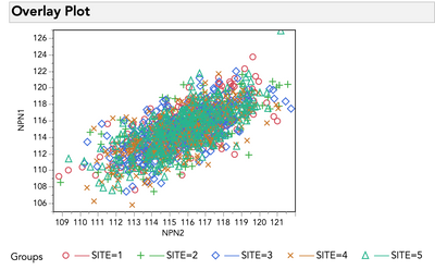
I think I understand now what you were describing, but let me reiterate it back to be sure. Overlay plot delivers a result like this:
Open( "$SAMPLE_DATA\Semiconductor Capability.jmp" );
Overlay Plot( X( :NPN2 ), Y( :NPN1 ), Grouping( :SITE ), Overlay Groups, :NPN1( Connect Color( 40 ), Overlay Marker( 8 ) ) );
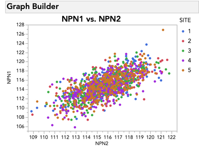
Which you prefer, because the markers for each group (site in your example) exist in layers stacked on top of each other. In other words, all Site 5 markers will be drawn on top of Site 4 markers, which will all be drawn on top of Site 3 markers, etc. As you noticed, Graph Builder does the same:
Open( "$SAMPLE_DATA\Semiconductor Capability.jmp" );
Graph Builder( Show Control Panel( 0 ),
	Variables( X( :NPN2 ), Y( :NPN1 ), Overlay( :SITE ) ),
	Elements( Points( X, Y, Legend( 5 ) ) )
);
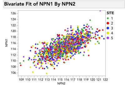
However, for reasons I will clarify in a second, Bivariate from Fit Y by X does not do this:
Open( "$SAMPLE_DATA\Semiconductor Capability.jmp" );
Bivariate( Y( :NPN1 ), X( :NPN2 ), SendToReport( Dispatch( {}, "Bivar Plot", FrameBox, {Row Legend( SITE )} ) ) );
I can certainly see how you might prefer what Overlay Plot and Graph Builder are doing! Let me try to explain why these platforms differ, and then offer some suggestions I hope will help.
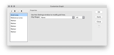
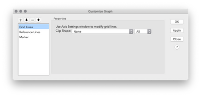
The reason for the difference in these platforms is that Overlay Plot and Graph Builder, being built purposely to deal with more than two variable, draw the markers in layers based on the overlying variable. You can see this for yourself if you right click > customize any of the plots. Graph Builder and Overlay Plot will look like this:
And Fit Y by X (bivariate) will look like this:
Notice the five marker layers in Graph Builder / Overlap Plot (one for each site)? Those layers control the draw order, and thus the overlap order. Notice that there is only one marker layer for Fit Y by X, which in turn means that points, when drawn, can't honor layering with respect to another variable. When you create a Row Legend as you did in Fit Y by X (right click > row legend), JMP provides a legend that allows you to color or mark the points, but this does not fundamentally change the drawing behavior of the platform. After all, Fit Y by X is designed for one y, and one x, as the name implies, which means it is not built to draw the markers in layers, even if you have a legend to identify them. So I'm sorry to say, there is no quick fix (that I'm aware of) to force a Fit Y by X Bivariate plot to draw the points in layers like Graph Builder and Overlay Plot.
I promised some suggestions. I assume that you're using Fit Y by X for analyses, so my first suggestion is to do whatever analysis work in Fit Y by X that you need, but then use Graph Builder for crafting your final visual that you're sharing with others. This is how I work most of the time -- as much as I enjoy Fit Y by X (and other platforms), I have far greater creative control over the graphs I'm making in Graph Builder, so that is my go-to tool for making a graph I plan to share. This may not sound so much like a solution as a push to use a different part of JMP, but sometimes that really IS the best solution!
Another option is to take advantage of the By Variable when launching Fit Y by X, e.g:
Open( "$SAMPLE_DATA\Semiconductor Capability.jmp" );
Bivariate( Y( :NPN1 ), X( :NPN2 ), By( :SITE ) );
Admittedly, this isn't the same thing as this will give you separate plots, and separate models of fit by group. But, with large numbers of overlapping points and what sounds like a real need to see particular ones, perhaps this is an option?
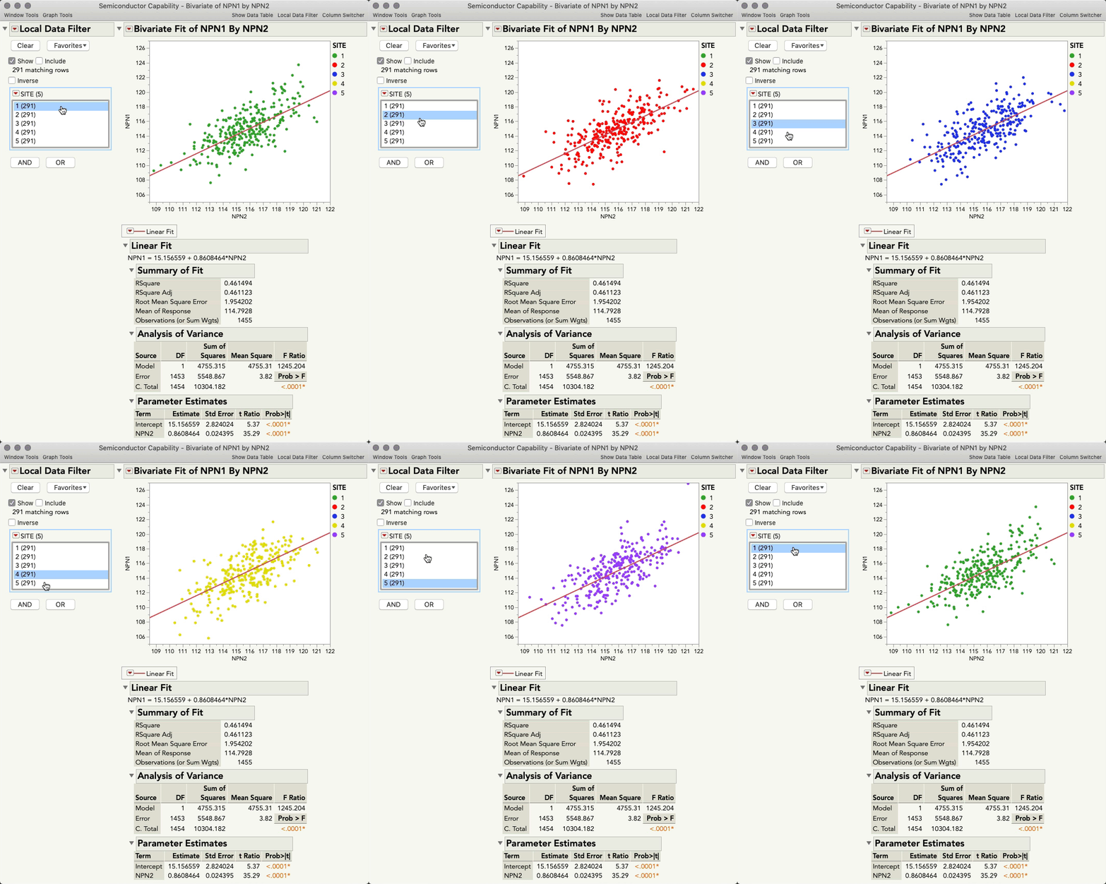
Finally, if keeping all the rows together for analysis is necessary, but you have a need to see the points separately for each group, a Local Data Filter, with only "Show" checked might do the trick.
Open( "$SAMPLE_DATA\Semiconductor Capability.jmp" );

Bivariate(
	Y( :NPN1 ),
	X( :NPN2 ),
	Automatic Recalc( 1 ),
	Fit Line( {Line Color( {212, 73, 88} )} ),
	Local Data Filter(
		Mode( Include( 0 ) ),
		Add Filter(
			columns( :SITE ),
			Where( :SITE == 5 ),
			Display( :SITE, Size( 181, 85 ), List Display )
		)
	)
);
This allows you to toggle through the levels of the grouping variable to see all the points unoccluded, but since "Include" is not checked, the local data filter does not affect which rows are available for the analysis.
I hope something here helps a little bit, and also hope it gives a little clarity to why jmp is behaving the way it does.
- Mark as New
- Bookmark
- Subscribe
- Mute
- Subscribe to RSS Feed
- Get Direct Link
- Report Inappropriate Content
Re: why JMP Bivariate does not show data points nicely ???
Thanks julian for long reply. but unfortunateli also know all these tricks but it wont work. Nevermind.
- Mark as New
- Bookmark
- Subscribe
- Mute
- Subscribe to RSS Feed
- Get Direct Link
- Report Inappropriate Content
Re: why JMP Bivariate does not show data points nicely ???
Fair enough, @ram_asra_gmail_! If I can think of anything else I'll be sure to let you know.
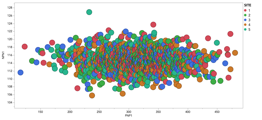
By the way, just to clarify a point made somewhere else (and because I think you might be interested) the layering of points in Fit Y by X Bivariate isn't simply random, but drawn left-to-right. This is most easily seen if you outline the points (right click graph > marker drawing mode > outlined), and then make them larger (right click graph > marker size > other > 15+):
Recommended Articles
- © 2026 JMP Statistical Discovery LLC. All Rights Reserved.
- Terms of Use
- Privacy Statement
- Contact Us


