- New to JMP? Let the Data Analysis Director guide you through selecting an analysis task, an analysis goal, and a data type. Available now in the JMP Marketplace!
- See how to install JMP Marketplace extensions to customize and enhance JMP.
- Subscribe to RSS Feed
- Mark Topic as New
- Mark Topic as Read
- Float this Topic for Current User
- Bookmark
- Subscribe
- Mute
- Printer Friendly Page
Discussions
Solve problems, and share tips and tricks with other JMP users.- JMP User Community
- :
- Discussions
- :
- time course data in microtiter plate format
- Mark as New
- Bookmark
- Subscribe
- Mute
- Subscribe to RSS Feed
- Get Direct Link
- Report Inappropriate Content
time course data in microtiter plate format
can anyone help me with the graph builder to build the time course data that are recorded using a microtiter plate reader?
I have read the post about microplate map thing. While that is for 2 dimensional data. With the time data, how one can define the map role data? Thanks
- Mark as New
- Bookmark
- Subscribe
- Mute
- Subscribe to RSS Feed
- Get Direct Link
- Report Inappropriate Content
Re: time course data in microtiter plate format
- Mark as New
- Bookmark
- Subscribe
- Mute
- Subscribe to RSS Feed
- Get Direct Link
- Report Inappropriate Content
Re: time course data in microtiter plate format
Hi Dave,
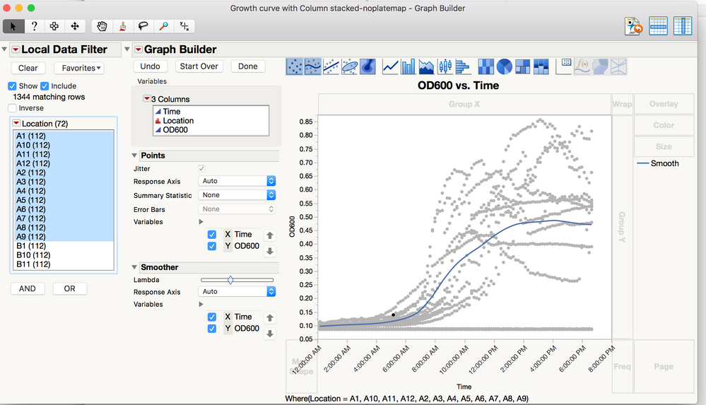
Do you mind showing me your data table? When you use the local data filter which column you use to do the filter?
How do you group the different column and define them as bioreators? I put the reactor name in column info. So each column is the data for this reactor. For each time point, the data is a row for a set of the reactors. In summary, I have a time series column, and all the reactors cloumns. I don't have any column to select for filter. I am stuck at this point. Thanks
- Mark as New
- Bookmark
- Subscribe
- Mute
- Subscribe to RSS Feed
- Get Direct Link
- Report Inappropriate Content
Re: time course data in microtiter plate format
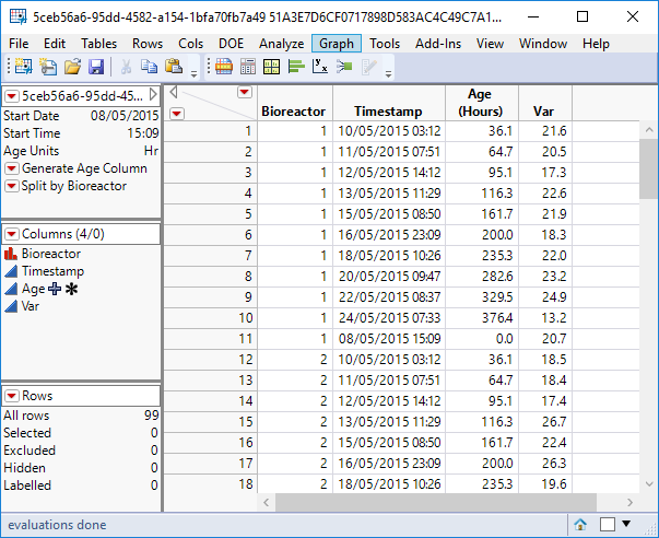
The data has been stacked: the first 'n' rows correspond to the time course data for the first bioreactor vessel, the following 'n' correspond to the next bioreactor vessel etc. Var is on the y axis, age or timestamp on the x-axis, bireactor is the wrapping variable and/or data filter variable.
Looking at your data table, to get it into this shape you would need to first transpose the data and then stack the columns.
- Mark as New
- Bookmark
- Subscribe
- Mute
- Subscribe to RSS Feed
- Get Direct Link
- Report Inappropriate Content
Re: time course data in microtiter plate format
Thanks a lot for the demonstration! I am almost there. Stack column is really a key.
By local data filter, I can choose certain column to show while still cann't display them individually.
As a new user, I really appreciate the help from you and Mark.
- Mark as New
- Bookmark
- Subscribe
- Mute
- Subscribe to RSS Feed
- Get Direct Link
- Report Inappropriate Content
Re: time course data in microtiter plate format
- Mark as New
- Bookmark
- Subscribe
- Mute
- Subscribe to RSS Feed
- Get Direct Link
- Report Inappropriate Content
Re: time course data in microtiter plate format
Great question, visualizing time course data in a 96-well format can definitely get tricky, especially when trying to preserve both the kinetics and spatial layout of the plate.
One approach that’s worked for me is to first reshape the raw data into a long format where each row includes: Time, Well ID (e.g., A1, A2…), and the corresponding measurement. Then, in Graph Builder, you can assign Time to the X-axis and the Response to the Y-axis. To preserve the plate layout visually, use the Well ID to map the data spatially. Drag the Well ID to the Map zone, which should reflect the physical position of each well on the plate.
To see the full kinetics for all 96 wells at once, you can also consider using small multiples (facet plots). Each panel will show the time course for a single well, allowing you to detect outliers, trends, or patterns across the plate. If your software allows it, faceting by rows and columns (based on the plate layout) will make it even easier to interpret.
Also, for plate mapping and planning your visualization more effectively, you might find this 96 well plate template helpful, it’s a handy reference when aligning your data structure with the physical layout of the microtiter plate.
Hope this helps! Let me know if you need help with reshaping your dataset or setting up the small multiples.
- « Previous
-
- 1
- 2
- Next »
Recommended Articles
- © 2026 JMP Statistical Discovery LLC. All Rights Reserved.
- Terms of Use
- Privacy Statement
- Contact Us


