- New to JMP? Let the Data Analysis Director guide you through selecting an analysis task, an analysis goal, and a data type. Available now in the JMP Marketplace!
- See how to install JMP Marketplace extensions to customize and enhance JMP.
- Subscribe to RSS Feed
- Mark Topic as New
- Mark Topic as Read
- Float this Topic for Current User
- Bookmark
- Subscribe
- Mute
- Printer Friendly Page
Discussions
Solve problems, and share tips and tricks with other JMP users.- JMP User Community
- :
- Discussions
- :
- Re: side by side bar graph with 2 y
- Mark as New
- Bookmark
- Subscribe
- Mute
- Subscribe to RSS Feed
- Get Direct Link
- Report Inappropriate Content
side by side bar graph with 2 y
Hi,
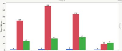
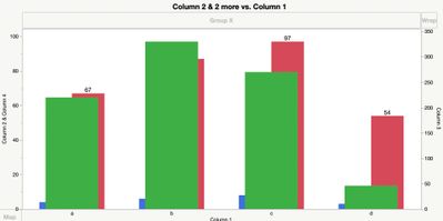
I am trying to create a bar graph with 2 y axis. but whenever i move a column to the right to create the second axis - the bars become almost nested and I can't separate them.
I would like the bars to be separate as in the first graph but with the 2 different axis.
Seems like something very basic that I am missing -what is it?
Thanks,
Eran
- Mark as New
- Bookmark
- Subscribe
- Mute
- Subscribe to RSS Feed
- Get Direct Link
- Report Inappropriate Content
Re: side by side bar graph with 2 y
It seems to be a glitch: I'm working with JMP 14.1 and I too cannot figure out how to restore the proper bar lineup with 1 or 2 variables on the Left Y axis and 1 variable on the Right Y axis. Maybe a more seasoned JMP user could provide a suggestion
- Mark as New
- Bookmark
- Subscribe
- Mute
- Subscribe to RSS Feed
- Get Direct Link
- Report Inappropriate Content
Re: side by side bar graph with 2 y
I thought that in a previous JMP14 version it did work - and only recently encountered this when I tried to do it in the current Jmp15.1.0
I guess it is a glitch and hope it's fixed soon.
Eran
- Mark as New
- Bookmark
- Subscribe
- Mute
- Subscribe to RSS Feed
- Get Direct Link
- Report Inappropriate Content
Re: side by side bar graph with 2 y
I just checked the same graph options in JMP 13.1 and I have same problem
Best,
TS
- Mark as New
- Bookmark
- Subscribe
- Mute
- Subscribe to RSS Feed
- Get Direct Link
- Report Inappropriate Content
Re: side by side bar graph with 2 y
Hi @eranse ,
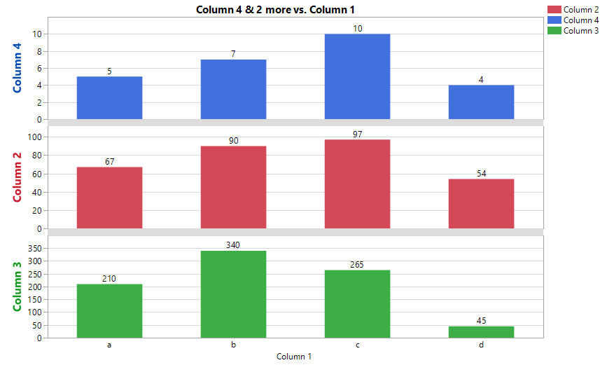
I am guessing you want a second axis because the magnitude of Column 3 is so much larger that Columns 2 and 4. However, in my opinion, a two axis bar chart is fraught with the risk of misinterpretation: a bar with a value of 90 next to a bar with about the same height and a value 340 is jarring. I think two axis plots can be useful to show data trends with lines, and even then only if the axes are colored to match the curves, etc.
Since the GraphBuilder platform is not producing what you need, I am suggesting an alternative plot
Graph Builder(
	Size( 763, 517 ),
	Show Control Panel( 0 ),
	Graph Spacing( 10 ),
	Variables( X( :Column 1 ), Y( :Column 4 ), Y( :Column 2 ), Y( :Column 3 ) ),
	Elements(
		Position( 1, 1 ),
		Bar( X, Y, Legend( 9 ), Label( "Label by Value" ) )
	),
	Elements(
		Position( 1, 2 ),
		Bar( X, Y, Legend( 8 ), Label( "Label by Value" ) )
	),
	Elements(
		Position( 1, 3 ),
		Bar( X, Y, Legend( 7 ), Label( "Label by Value" ) )
	),
	SendToReport(
		Dispatch( {}, "Graph Builder", OutlineBox, {Select} ),
		Dispatch( {}, "Column 4", ScaleBox, {Label Row( Show Major Grid( 1 ) )} ),
		Dispatch( {}, "Column 2", ScaleBox, {Label Row( Show Major Grid( 1 ) )} ),
		Dispatch( {}, "Column 3", ScaleBox, {Label Row( Show Major Grid( 1 ) )} ),
		Dispatch(
			{},
			"Y title",
			TextEditBox,
			{Set Font Size( 12 ), Set Font Style( "Bold" ), Font Color( 53 )}
		),
		Dispatch(
			{},
			"Y 1 title",
			TextEditBox,
			{Set Font Size( 12 ), Set Font Style( "Bold" ), Font Color( 19 )}
		),
		Dispatch(
			{},
			"Y 2 title",
			TextEditBox,
			{Set Font Size( 12 ), Set Font Style( "Bold" ), Font Color( 20 )}
		),
		Dispatch(
			{},
			"400",
			LegendBox,
			{Legend Position( {9, [1], 8, [0], 7, [2]} ), Position( {1, 0, 2} )}
		)
	)
)
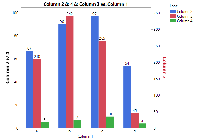
However, I can create the graph you want (that I do not like). It requires restructuring your data. See the attached journal that creates the data table and this graph.
"Just because you can, doesn't mean you should."
- Mark as New
- Bookmark
- Subscribe
- Mute
- Subscribe to RSS Feed
- Get Direct Link
- Report Inappropriate Content
Re: side by side bar graph with 2 y
Thanks,
I understand the potential problem with a graph with different y scales, but it is helpful to show the direction of the data, and I am not certain that placing the information on different graphs is always better.
Thank you for the solution - it does solve it perfectly.
Best,
Eran
Recommended Articles
- © 2026 JMP Statistical Discovery LLC. All Rights Reserved.
- Terms of Use
- Privacy Statement
- Contact Us


