- JMP Statement Regarding Critical PHP Remote Code Execution Vulnerabilities (CVE-2026-109618, CVE-2026-109619)
- Don’t miss your chance to experience Discovery Summit Europe at our best available rate! Early bird registration through 31 Oct.
- Graph Builder Toolbar streamlines interactive graphing. Creates shortcuts on Report and GraphBuilder Helpers toolbars. Download and install the extension.
- Subscribe to RSS Feed
- Mark Topic as New
- Mark Topic as Read
- Float this Topic for Current User
- Bookmark
- Subscribe
- Mute
- Printer Friendly Page
Discussions
Solve problems, and share tips and tricks with other JMP users.- User Community
- :
- Discussions
- :
- Re: plot regression line through overlay groups

- Mark as New
- Bookmark
- Subscribe
- Mute
- Subscribe to RSS Feed
- Get Direct Link
- Report Inappropriate Content
plot regression line through overlay groups
Hello,
I want to create an x-y graph with a single regression line passing through data points that are differentiated by color for each of four groups. I can create an overlay plot with different colored groups, see below:
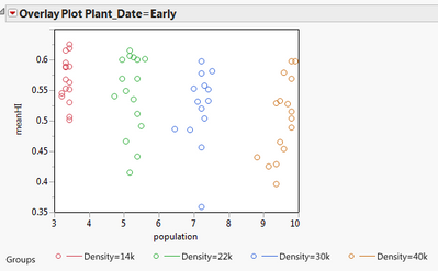
But can't do regression in Overlay mode. This is pretty simple to do in Proc Gplot so I figure there's a way in JMP.
Any pointers?
Thanks!
Accepted Solutions


- Mark as New
- Bookmark
- Subscribe
- Mute
- Subscribe to RSS Feed
- Get Direct Link
- Report Inappropriate Content
Re: plot regression line through overlay groups
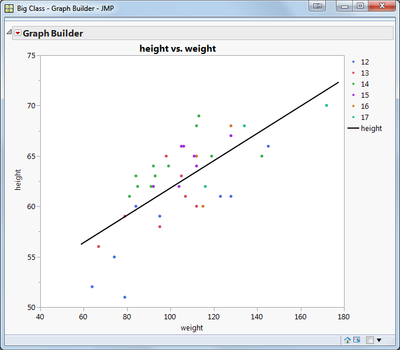
You can use Graph Builder to do this. Plot meanHI vs population, and drag the Density column into the Color area. Then click on the Line of Fit toolbar icon.
Here's a scripted example using Big Class:
dt = open("$sample_data\Big Class.jmp");
dt << Graph Builder(
Show Control Panel( 0 ),
Variables( X( :weight ), Y( :height ), Color( :age ) ),
Elements(
Points( X, Y, Legend( 1 ), Jitter( 1 ) ),
Line Of Fit(
X,
Y,
Legend( 4 ),
Confidence of Fit( 0 ),
Confidence of Prediction( 0 ),
Degree( "Linear" ),
Equation( 0 ),
Root Mean Square Error( 0 ),
R²( 0 )
)
)
);
- Mark as New
- Bookmark
- Subscribe
- Mute
- Subscribe to RSS Feed
- Get Direct Link
- Report Inappropriate Content
Re: plot regression line through overlay groups
You can use Graph Builder to do this. Plot meanHI vs population, and drag the Density column into the Color area. Then click on the Line of Fit toolbar icon.
Here's a scripted example using Big Class:
dt = open("$sample_data\Big Class.jmp");
dt << Graph Builder(
Show Control Panel( 0 ),
Variables( X( :weight ), Y( :height ), Color( :age ) ),
Elements(
Points( X, Y, Legend( 1 ), Jitter( 1 ) ),
Line Of Fit(
X,
Y,
Legend( 4 ),
Confidence of Fit( 0 ),
Confidence of Prediction( 0 ),
Degree( "Linear" ),
Equation( 0 ),
Root Mean Square Error( 0 ),
R²( 0 )
)
)
);
- Mark as New
- Bookmark
- Subscribe
- Mute
- Subscribe to RSS Feed
- Get Direct Link
- Report Inappropriate Content
Re: plot regression line through overlay groups
That worked. Thank you for the speedy reply and the scripting example.
Recommended Articles
- © 2026 JMP Statistical Discovery LLC. All Rights Reserved.
- Terms of Use
- Privacy Statement
- Contact Us