- New to JMP? Let the Data Analysis Director guide you through selecting an analysis task, an analysis goal, and a data type. Available now in the JMP Marketplace!
- See how to install JMP Marketplace extensions to customize and enhance JMP.
- Subscribe to RSS Feed
- Mark Topic as New
- Mark Topic as Read
- Float this Topic for Current User
- Bookmark
- Subscribe
- Mute
- Printer Friendly Page
Discussions
Solve problems, and share tips and tricks with other JMP users.- JMP User Community
- :
- Discussions
- :
- pie graphs+heat maps
- Mark as New
- Bookmark
- Subscribe
- Mute
- Subscribe to RSS Feed
- Get Direct Link
- Report Inappropriate Content
pie graphs+heat maps
Hello everyone,
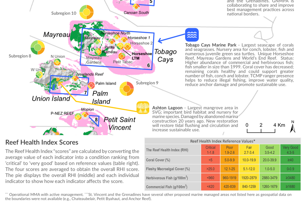
As a marine biologist, I recently stumbled across a visual presentation of coral reef data that I really like (see attachment). In it, you will see various pie graphs in which the individual wedges are essentially heat maps to show relative levels of certain parameters. I would like to adapt this for my own research, and I THINK it cn be done with Graph Builder, though not as a heat map, per se. Here is my idea: say I want four pie wedges representing four response variables (A, B, C, and D). The size is unimportant, so I will give each a value of 0.25 so that they occupy equal areas. I realize I can overlay color, so I created a "color" column and assigned values for the four response variables, but then my graph didn't change accordingly. 
- Mark as New
- Bookmark
- Subscribe
- Mute
- Subscribe to RSS Feed
- Get Direct Link
- Report Inappropriate Content
Re: pie graphs+heat maps
This is great! Do you think it could be done directly in Graph Builder or would it require scripting and advanced knowledge to do so? I know I can just modify the script but I’m just thinking in terms of streamlining it were I to go with this option over the pie graphs for tons and tons of data. Did it require a custom shape or did you manually pin all those icons in the map?
- Mark as New
- Bookmark
- Subscribe
- Mute
- Subscribe to RSS Feed
- Get Direct Link
- Report Inappropriate Content
Re: pie graphs+heat maps
Anderson,
Graph Builder doesn't provide a way to place bar charts or pie charts at specific locations on a map. You can get around it by:
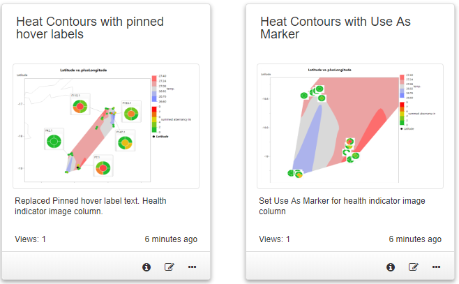
- Creating a table from your Graph Builder graph where you use sample number in the map role (built using bars or the custom map shapes. This creates a table with sample number column and a column of images for each sample.
- Copy the image column from the generated table back to the unstacked data table( make sure that the image column matches the order of the sample number. **
- a. Label the image column OR b. Set 'Use as Marker' for the image column.
- Using the unstacked data table, create a Contour Map in Graph Builder using salinity or temp column as the color Role.
- Add a points element. Optionally using another color role.
- If you follow step 3.a, the images will appear in hover labels. You can pin some hover labels and Replace Text to remove any unwanted hover label text.
- if you follow step 3 b, all markers will be shown with the image from the image column. This can cause a cluttered display which you can resolve by zooming in or by deleting images that are overlapping.
** I found they were not in the same order, and had to sort before copying the image column. In hindsight, I realized I could have used a join or virtual join to get the images on the correct rows. I wish I would have read this first: https://community.jmp.com/t5/JSL-Cookbook/Geographic-Maps-with-Graphs-as-Markers/ta-p/53782.
I published both 3.a and 3.b here:
https://public.jmp.com/packages/Heat-contour-with-image-annotations/js-p/5d64597acf28b80f980812ba
About the method I used to draw the bars. I didn't use custom maps, I used the custom graphics script to calculate the length of the bars and to position them above each point.
When it comes to streamlining, JSL is often the best choice.
~John
- Mark as New
- Bookmark
- Subscribe
- Mute
- Subscribe to RSS Feed
- Get Direct Link
- Report Inappropriate Content
Re: pie graphs+heat maps
This discussion inspired me to create a paper and presentation for JMP Discovery Americas 2020.
As I prepared the paper, I had time to experiment and improve on the techniques described in this post.
Included with the paper, are some resources (custom maps and examples) and detailed instructions on how to use them.
I hope you will find this post and my paper useful.
Thanks,
~John
- Mark as New
- Bookmark
- Subscribe
- Mute
- Subscribe to RSS Feed
- Get Direct Link
- Report Inappropriate Content
Re: pie graphs+heat maps
John,
This is great, and I fully intend to watch the talk your week (it is on my schedule.). I think this capacity, along with the "graphlets," will open up all kinds of doors for overlaying data onto Graphbuilder graphs and plotting data onto custom figures (like the human body example we talked about earlier that is found somewhere on the JMP website in the form of a tutorial, I believe). I'll be curious to see if anyone has any suggestions in terms of aesthetics. I personally like the pie graphs, but maybe there is a better way we are not even considering? I like your idea of the video game style "health bars," too.
Come to think of it, maybe this could benefit epidemiologists. For instance, if you had infection rates overlaid on a lat-lon grid, then pinned wedges/pie graphs with additional information about patients or groups of patients on the contour plot, you could potentially add a layer of complexity that may not be possible using the standard GraphBuilder features (I guess for most types of data, the graphlets would work for this, too, though).
- Mark as New
- Bookmark
- Subscribe
- Mute
- Subscribe to RSS Feed
- Get Direct Link
- Report Inappropriate Content
Re: pie graphs+heat maps
Anderson,
That human body example is used here :
I saw your Discovery Summit Americas 2020 Presentation recording :
~John
- « Previous
-
- 1
- 2
- Next »
Recommended Articles
- © 2026 JMP Statistical Discovery LLC. All Rights Reserved.
- Terms of Use
- Privacy Statement
- Contact Us


