- We’re retiring the File Exchange at the end of this year. The JMP Marketplace is now your destination for add-ins and extensions.
- JMP 19 is here! Learn more about the new features.
- Subscribe to RSS Feed
- Mark Topic as New
- Mark Topic as Read
- Float this Topic for Current User
- Bookmark
- Subscribe
- Mute
- Printer Friendly Page
Discussions
Solve problems, and share tips and tricks with other JMP users.- JMP User Community
- :
- Discussions
- :
- Re: making a graph of a sequence
- Mark as New
- Bookmark
- Subscribe
- Mute
- Subscribe to RSS Feed
- Get Direct Link
- Report Inappropriate Content
making a graph of a sequence
Hi all,
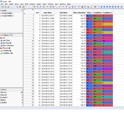
I have a data table that presents a sequence over time and records only when there is a change (un equal time intervals).
I would like to produce a graph with time on the horizontal axis and parallel horizontal lines representing the three categorical variables (place, condition and condition 2).
The colors along the lines will represent the different categories of place and conditions.
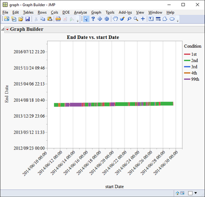
I manage to produce a somewhat fake presentation by setting start time as X and end time as Y, connecting with a line, coloring by category and compressing the Y axis so the line looks horizontal.
attached is the data table with two scripts to run.
I would be very thankful for any suggestions,
Thanks,
Ron
- Mark as New
- Bookmark
- Subscribe
- Mute
- Subscribe to RSS Feed
- Get Direct Link
- Report Inappropriate Content
Re: making a graph of a sequence
hi Bill,
This is the file. It has a stat date, end date, duration in minutes and three categorical columns.
it looks like this. the truth is the graph i seek would look very similar apart that the length of the colors would be proportional to the duration.
do you think it would be useful to inflate the file (rows) by duration first? (as in this link: Expand by Frequency Column Add-In )
thanks!
- Mark as New
- Bookmark
- Subscribe
- Mute
- Subscribe to RSS Feed
- Get Direct Link
- Report Inappropriate Content
Re: making a graph of a sequence
Hi Bill,
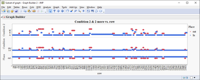
i gave the idea of inflating the table rows a go. the result is much closer but their are still a few issues.
now i create a graph in which each row (inflated) is a dot along the axes of row number.
i would like the dots to be in one line for place (in and out). visually this will be a good enough illusion of the sequence i want to see.
another problem is that i can only color by place or by condition but not both separately in the same graph.
attached is the row inflated data table with the script for this output.
thanks!
ron
- Mark as New
- Bookmark
- Subscribe
- Mute
- Subscribe to RSS Feed
- Get Direct Link
- Report Inappropriate Content
Re: making a graph of a sequence
Hi Ron,
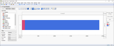
I was able to generate the below chart by creating two new formula columns. The first column is a sequence that increases by one each time the Place entry switches I called it Place Group. Then a second column was created using Col Sum for Place Duration with Place Group as the Group By variable. Change the Place Group Modeling Type to Nominal. Then, in Graph Builder, put the place duration on the X-axis and switch to a bar chart, put Place Group in the overlay zone, and Place in the color zone. Switch the Bar type to stacked and leave Mean as the summary statistic:
This will work for the other two conditions, as well, but, I think you will need to do separate graphs... maybe you can combine them in one window...
I've attached the jmp file with the new columns and Graph Builder scripts. Hope that gets you closer to what you're wanting to do.
-Jerry
- Mark as New
- Bookmark
- Subscribe
- Mute
- Subscribe to RSS Feed
- Get Direct Link
- Report Inappropriate Content
Re: making a graph of a sequence
Thank you jerry.cooper,
this must be the right solution. Yet, for what ever reason I can't produce it with JMP11. The colors just don't work out. my outcome looks like this:
- Mark as New
- Bookmark
- Subscribe
- Mute
- Subscribe to RSS Feed
- Get Direct Link
- Report Inappropriate Content
Re: making a graph of a sequence
May I know how you plot this type of graph further in detail?
Thank you in advance
- Mark as New
- Bookmark
- Subscribe
- Mute
- Subscribe to RSS Feed
- Get Direct Link
- Report Inappropriate Content
Re: making a graph of a sequence
Hi Ron,
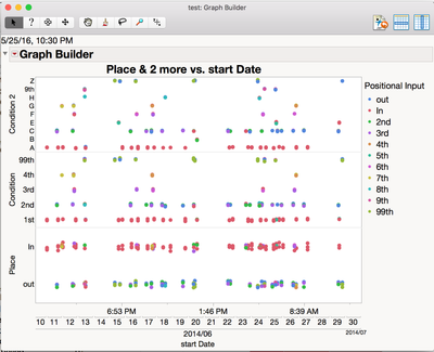
Here is another option.
I stacked the columns first. I then joined the stacked table back with the original table.
Best,
Stan
Data Table( "graph.jmp" ) << Stack(
columns( :Place, :Condition, :Condition 2 ),
Source Label Column( "Category" ),
Stacked Data Column( "Positional Input" ),
Output Table("stacked")
);
Data Table( "graph.jmp" ) << Join(
With( Data Table( "stacked" ) ),
Merge Same Name Columns,
By Matching Columns( :start Date = :start Date ),
Drop multiples( 0, 0 ),
Include Nonmatches( 0, 0 ),
Preserve main table order( 1 ),
Output Table( "test" )
);
Graph Builder(
Size( 693, 562 ),
Show Control Panel( 0 ),
Variables(
X( :start Date ),
Y( :Condition 2 ),
Y( :Condition ),
Y( :Place ),
Color( :Positional Input )
),
Elements( Position( 1, 1 ), Points( X, Y, Legend( 24 ) ) ),
Elements( Position( 1, 2 ), Points( X, Y, Legend( 25 ) ) ),
Elements( Position( 1, 3 ), Points( X, Y, Legend( 26 ) ) ),
SendToReport(
Dispatch(
{},
"start Date",
ScaleBox,
{Min( 3485228794.98433 ), Max( 3487017600 ), Interval( "Day" ),
Inc( 5.78703703703704 ), Minor Ticks( 1 ), Label Row Nesting( 3 )}
)
)
);
- Mark as New
- Bookmark
- Subscribe
- Mute
- Subscribe to RSS Feed
- Get Direct Link
- Report Inappropriate Content
Re: making a graph of a sequence
Thank you stanley.koprowski1
i took your idea and tried to mix it with my inflated table concept but it is not easy.
the idea is that if in your chart i had a dot every minute it would give the look of the continuous sequence.
Apparently, once I inflate the rows by duration i get issues with stacking and joining back. how can i do the stack in a way that will accommodate the unique time indicators?
attached is the inflated file
ron
- « Previous
-
- 1
- 2
- Next »
Recommended Articles
- © 2025 JMP Statistical Discovery LLC. All Rights Reserved.
- Terms of Use
- Privacy Statement
- Contact Us

