- New to JMP? Let the Data Analysis Director guide you through selecting an analysis task, an analysis goal, and a data type. Available now in the JMP Marketplace!
- See how to install JMP Marketplace extensions to customize and enhance JMP.
- Subscribe to RSS Feed
- Mark Topic as New
- Mark Topic as Read
- Float this Topic for Current User
- Bookmark
- Subscribe
- Mute
- Printer Friendly Page
Discussions
Solve problems, and share tips and tricks with other JMP users.- JMP User Community
- :
- Discussions
- :
- line plot for time series over many samples
- Mark as New
- Bookmark
- Subscribe
- Mute
- Subscribe to RSS Feed
- Get Direct Link
- Report Inappropriate Content
line plot for time series over many samples
Hi, I'm wondering if there is an efficient JMP way to do multiple line plots from a data table of time series data from several samples.
So, my data table looks like this:
   index            datetime sampleID  value
0     93 2024-03-12 00:09:47        B  0.852
1     46 2024-03-12 00:18:36        A  0.377
2     29 2024-03-12 00:50:22        B  0.049
3     99 2024-03-12 01:11:40        B  0.441
4     52 2024-03-12 01:12:09        A  0.237
5     66 2024-03-12 01:26:29        A  0.607
6     28 2024-03-12 01:27:56        A  0.669
7     64 2024-03-12 01:33:11        A  0.074
8     16 2024-03-12 01:52:59        B  0.964
9     55 2024-03-12 01:56:17        A  0.960
- sampleID gives the sample ID, in this example A or B. In reality there could be >100 unique sampleIDs
- datetime gives the timestamp of each measurement. this is unique for each row.
- value is the measured value
- the number of rows for each sample may be different
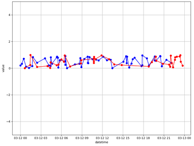
and I want to produce a time series line plot like this:
In python I would do it like this
#example on how to do it in python
import pandas as pd
import datetime, random
N = 100
datetime_rand = [datetime.datetime.now().replace(hour=0, minute=0, second=0, microsecond=0) + datetime.timedelta(seconds=random.randint(0, 86400)) for _ in range(N)]
df = pd.DataFrame( dict( datetime = datetime_rand, sampleID = np.random.choice(["A", "B"], N), value = rand(N)))
df = df.sort_values(by="datetime").reset_index()
#now we have this kind of dataframe
#   index            datetime sampleID  value
#0     69 2024-03-12 00:04:06        A  0.027
#1     96 2024-03-12 00:05:33        B  0.248
#2     16 2024-03-12 00:18:06        B  0.276
#3     81 2024-03-12 00:34:32        A  0.737
#4     27 2024-03-12 01:01:49        A  0.804
#...

#then I want to visuzalize the raw data with line plots:
for sampleID, group in df.groupby("sampleID"):
    if sampleID == "A": plotspec = "bo-"
    else: plotspec = "ro-"
    plot( group.datetime, group.value, plotspec)
and I want to do the same in JMP. The next step in my analysis workflow is to do some binning of the data based on the timestamp and visualize that data through parallel plots, but plotting the rawest form of the data with datetime as the x axis is oftentimes necessary.
- Tags:
- windows
Accepted Solutions
- Mark as New
- Bookmark
- Subscribe
- Mute
- Subscribe to RSS Feed
- Get Direct Link
- Report Inappropriate Content
Re: line plot for time series over many samples
In Graph Builder, drag Date time to the X axis, Value to the Y axis and Sample ID to the Overlay drop zone.
The right click on the graph and select Add=>Line
- Mark as New
- Bookmark
- Subscribe
- Mute
- Subscribe to RSS Feed
- Get Direct Link
- Report Inappropriate Content
Re: line plot for time series over many samples
Hi @asj,
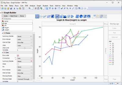
There is a simple way. Using Graph Builder from the Graph menu. Value on Y, Datetime on X and Sample ID in Overlay. The rest is a matter of the graph types select on the top (Control Click in PC/Shift Click on Mac on multiple types to get what you want). Something like this:
Will this work for you? There are more details in the Help Menu about graphing using Graph Builder. There are some graph types that are easy to do in Graph Builder that might take more work using Python.
Cheers,
Data Scientist, Life Sciences - Global Technical Enablement
JMP Statistical Discovery, LLC. - Denver, CO
Tel: +1-919-531-9927 ▪ Mobile: +1-303-378-7419 ▪ E-mail: chris.kirchberg@jmp.com
www.jmp.com
- Mark as New
- Bookmark
- Subscribe
- Mute
- Subscribe to RSS Feed
- Get Direct Link
- Report Inappropriate Content
Re: line plot for time series over many samples
@txnelson beat me to it again. :)
Data Scientist, Life Sciences - Global Technical Enablement
JMP Statistical Discovery, LLC. - Denver, CO
Tel: +1-919-531-9927 ▪ Mobile: +1-303-378-7419 ▪ E-mail: chris.kirchberg@jmp.com
www.jmp.com
- Mark as New
- Bookmark
- Subscribe
- Mute
- Subscribe to RSS Feed
- Get Direct Link
- Report Inappropriate Content
Re: line plot for time series over many samples
Thank you both @Chris_Kirchberg and @txnelson, exactly what I was looking for!
Recommended Articles
- © 2026 JMP Statistical Discovery LLC. All Rights Reserved.
- Terms of Use
- Privacy Statement
- Contact Us


