- JMP will suspend normal business operations for our Winter Holiday beginning on Wednesday, Dec. 24, 2025, at 5:00 p.m. ET (2:00 p.m. ET for JMP Accounts Receivable).
Regular business hours will resume at 9:00 a.m. EST on Friday, Jan. 2, 2026. - We’re retiring the File Exchange at the end of this year. The JMP Marketplace is now your destination for add-ins and extensions.
- Subscribe to RSS Feed
- Mark Topic as New
- Mark Topic as Read
- Float this Topic for Current User
- Bookmark
- Subscribe
- Mute
- Printer Friendly Page
Discussions
Solve problems, and share tips and tricks with other JMP users.- JMP User Community
- :
- Discussions
- :
- k-NN visualization in JMP
- Mark as New
- Bookmark
- Subscribe
- Mute
- Subscribe to RSS Feed
- Get Direct Link
- Report Inappropriate Content
k-NN visualization in JMP
Hi folks,
Longtime JMP Pro user here but fairly new to working with the k-Nearest Neighbors classification module. I'm working with a visible reflectance spectroscopy data set for a geological material classification (two-class) problem. I have a fairly well-optimized k-NN model at this point with a low misclassification rate on my test set. So far, so good. However, I am looking for a way to visually illustrate what k-NN is doing and how predictions are made. Essentially, I want to generate decision region plots as shown in the latter half of this post: https://towardsdatascience.com/knn-visualization-in-just-13-lines-of-code-32820d72c6b6 And yes, I am well-aware that the post explains exactly how to do that but I have zero coding experience and already have done all of the actual analysis in JMP. Suggestions most welcome; thanks!
- Mark as New
- Bookmark
- Subscribe
- Mute
- Subscribe to RSS Feed
- Get Direct Link
- Report Inappropriate Content
Re: k-NN visualization in JMP
Not the answer, but it might be helpful to visualise or explain nonetheless. Inspect and run the scripts in the table. Note that the generative Gaussian case is difficult, because it produces a high level of intermixing of the categories.
- Mark as New
- Bookmark
- Subscribe
- Mute
- Subscribe to RSS Feed
- Get Direct Link
- Report Inappropriate Content
Re: k-NN visualization in JMP
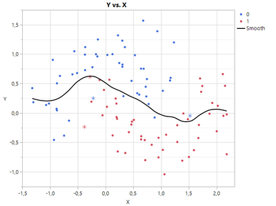
I'm not really familiar with KNN, but the first idea for vizualization I would have, is to give the wrongly predicted a different marker. See screenshot below. It is the u-shaped data, KNN with K=4 gave the best result.
- saved prediction formula
- made new formula to compare true class and predicted class
- use that formula for marker shape
There is also an efficient function for finding next neighbours, we could use that, to find e.g. the range of the wrong points and give it a different look. Perhaps this helps.
- Mark as New
- Bookmark
- Subscribe
- Mute
- Subscribe to RSS Feed
- Get Direct Link
- Report Inappropriate Content
Re: k-NN visualization in JMP
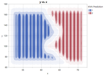
I've played around a bit,
- took the data from Big Class (weight and height as x and y, sex as class),
- made KNN analysis, saved Formula
- generated a grid in a separate table, and copied Formula to that grid to show "decision areas"
see screenshot. Could be prettier (it is due to data distribution etc.), but shows what is meant.
You could do this also interactively, If you don't want to code. Enclosed is the code for this example. Perhaps this can help.
Names Default To Here( 1 );

// Create a data table (x and y are height and weight from Big Class, class is sex)
dt_data= New Table( "dt_data",
	Add Rows( 40 ),
	New Column( "x", Numeric,
		"Continuous",
		Format( "Fixed Dec", 5, 0 ),
		Set Values(
			[59, 61, 55, 66, 52, 60, 61, 51, 60, 61, 56, 65, 63, 58, 59, 61, 62, 65, 63, 62,
			63, 64, 65, 64, 68, 64, 69, 62, 64, 67, 65, 66, 62, 66, 65, 60, 68, 62, 68, 70]
		),
		Set Display Width( 48 )
	),
	New Column("y", Numeric,
		"Continuous",
		Format( "Fixed Dec", 5, 0 ),
		Set Values(
			[95, 123, 74, 145, 64, 84, 128, 79, 112, 107, 67, 98, 105, 95, 79, 81, 91, 142,
			84, 85, 93, 99, 119, 92, 112, 99, 113, 92, 112, 128, 111, 105, 104, 106, 112,
			115, 128, 116, 134, 172]
		),
		Set Display Width( 48 )
	),
	New Column( "class", Numeric,
		"Nominal",
		Format( "Best", 12 ),
		Set Values(
			[1, 1, 1, 1, 1, 2, 2, 2, 1, 1, 1, 2, 2, 2, 2, 1, 1, 1, 1, 1, 2, 2, 2, 2, 2, 2, 2,
			1, 1, 2, 2, 2, 2, 2, 1, 1, 2, 1, 2, 2]
		)
	),

);

// Model class by x and y and save formula
knn_rep = dt_data << K Nearest Neighbors(
	Y( :class ),
	X( :x, :y ),
	K( 10 ),
	Set Random Seed( 42 )
);
knn_rep << xpath( "class" ) << Save Prediction Formula( 8 );
knn_rep << Close Window();

// Generate a grid data table to show the whole field
Summarize(
	dt_data,
	max_x = Max( :x ),
	min_x = Min( :x ),
	max_y = Max( :y ),
	min_y = Min( :y )
);
dx = 1;
get_limit = Function( {value},
	Round( value / dx ) * dx + If( value >= 0, 1, -1 ) * dx
);
dtx = As Table(
	(get_limit( min_x ) / dx :: get_limit( max_x ) / dx)` * dx,
	<<column names( {"x"} )
);
dty = As Table(
	(get_limit( min_y ) / dx :: get_limit( max_y ) / dx)` * dx,
	<<column names( {"y"} )
);
dt_grid = dtx << join( with( dty ), Cartesian join );
dt_grid << set name( "dt_grid" );
dt_grid << delete scripts( "Source" );
Close( dtx, nosave );
Close( dty, nosave );

// Copy Prediction Formula to grid table
knn_formula = Column( dt_data, "Predicted Formula class 8" ) << get formula;
dt_grid << New Column( "KNN Prediction", set formula( knn_formula ) );

// Save and run the script for showing decision region
dt_grid << Add Properties to Table(
	{New Script(
		"y vs. x",
		Graph Builder(
			Size( 528, 454 ),
			Show Control Panel( 0 ),
			Variables( X( :x ), Y( :y ), Overlay( :KNN Prediction ) ),
			Elements( Contour( X, Y, Legend( 9 ) ) )
		)
	)}
);
dt_grid << run script("y vs. x");
Recommended Articles
- © 2025 JMP Statistical Discovery LLC. All Rights Reserved.
- Terms of Use
- Privacy Statement
- Contact Us


