- JMP User Community
- :
- Discussions
- :
- Re: is there a way to color a contour plot with a category of data?
- Subscribe to RSS Feed
- Mark Topic as New
- Mark Topic as Read
- Float this Topic for Current User
- Bookmark
- Subscribe
- Printer Friendly Page
- Mark as New
- Bookmark
- Subscribe
- Mute
- Subscribe to RSS Feed
- Get Direct Link
- Report Inappropriate Content
is there a way to color a contour plot with a category of data?
I'm creating a contour plot with 3 groups of numerical data. I also have categories that these different data are grouped into. Is there any way to create a custom color scheme that follows the categories of data in the groups assigned so that I can see where the categories sit in this contour of the three numerical series?
- Mark as New
- Bookmark
- Subscribe
- Mute
- Subscribe to RSS Feed
- Get Direct Link
- Report Inappropriate Content
Re: is there a way to color a contour plot with a category of data?
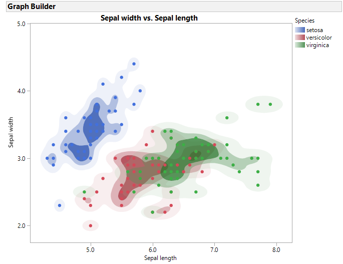
If I understand your question correctly, you could split the response by the categorical factor so you have a different response column for each category. Then when you create the contour plot for each response, you should get unique colors for each response column.
- Mark as New
- Bookmark
- Subscribe
- Mute
- Subscribe to RSS Feed
- Get Direct Link
- Report Inappropriate Content
Re: is there a way to color a contour plot with a category of data?
Maureen, I believe Cameron answered your question. If you open teh JMP sample data table Iris.jmp, there is a GraphBuilder Contour plot script that produces this graph
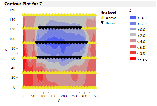
Below is and example of sample data LittlePond.jmp's contour plot with an added column called Sea leve, that is "Below" when z < 0 and "Above" when z >=0.

- © 2024 JMP Statistical Discovery LLC. All Rights Reserved.
- Terms of Use
- Privacy Statement
- About JMP
- JMP Software
- JMP User Community
- Contact

