- JMP will suspend normal business operations for our Winter Holiday beginning on Wednesday, Dec. 24, 2025, at 5:00 p.m. ET (2:00 p.m. ET for JMP Accounts Receivable).
Regular business hours will resume at 9:00 a.m. EST on Friday, Jan. 2, 2026. - We’re retiring the File Exchange at the end of this year. The JMP Marketplace is now your destination for add-ins and extensions.
- Subscribe to RSS Feed
- Mark Topic as New
- Mark Topic as Read
- Float this Topic for Current User
- Bookmark
- Subscribe
- Mute
- Printer Friendly Page
Discussions
Solve problems, and share tips and tricks with other JMP users.- JMP User Community
- :
- Discussions
- :
- how to create average data from several rows?
- Mark as New
- Bookmark
- Subscribe
- Mute
- Subscribe to RSS Feed
- Get Direct Link
- Report Inappropriate Content
how to create average data from several rows?
Hi, I have groups of mice, with tumours. Each group gets a specific treatment and tumour growth is measured daily. At the end of the experiment I have data for 3-4 groups, each group consisting of 4-5 mice, how do I create a graph of the data with one line for each group using the average daily measurements for the groups as the points on the lines?
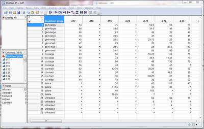
here is part of the table:
where there are four members to each treatment group (with their order changing randomly each day) and a set of measurements for each day (d20, d21, d22 etc)
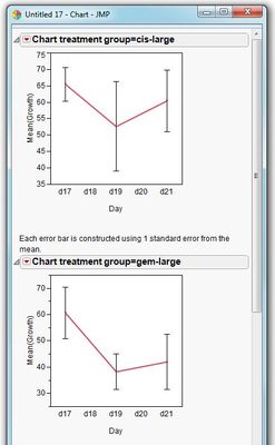
I need to plot the line for the averages (with error bars) like you can do in prism (my supervisor wants me to use jmp)
thanks for the help
Accepted Solutions
- Mark as New
- Bookmark
- Subscribe
- Mute
- Subscribe to RSS Feed
- Get Direct Link
- Report Inappropriate Content
how to create average data from several rows?
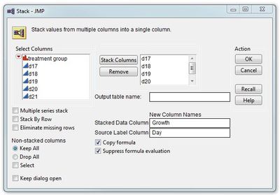
To perform analysis on your data, JMP needs the data organised 1 column per variable. So your first step is to restructure your data so that you have a single column containing all tumour growth data (and one column for day). To do this use the Stack command on the Tables menu and stack all the "d" columns:
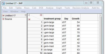
This will give you a table organised like this:
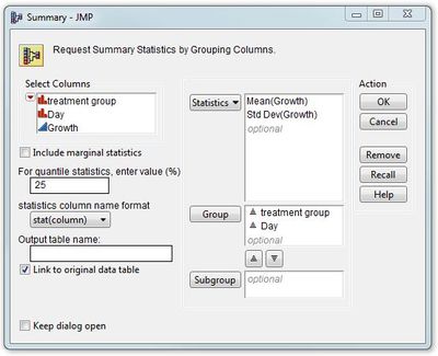
If you want to generate summary stats (means and standard deviations) for each group for each day you can use the Summary command on the Tables menu:
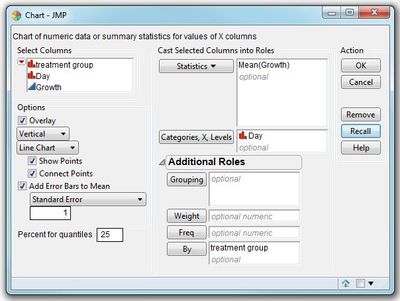
Alternatively, if you want to graph the data with error bars, the Chart option under Graphs will perform the graphical equivalent of the Summary command:
-Dave
Recommended Articles
- © 2026 JMP Statistical Discovery LLC. All Rights Reserved.
- Terms of Use
- Privacy Statement
- Contact Us
