cancel
Showing results for 
Show  only  | Search instead for 
Did you mean: 
Choose Language Hide Translation Bar
Gacem_Seyf
Level I

how to create Pareto plot like the following image ?

hello I'm bigginner in using Jmp , I need to create Pareto Plot with the t-value of effect  and the Bonferroni and t-value limits like the following image .

Pareto-chart-showing-effects-of-factors-above-and-below-the-Bonferroni-Limit-absolute.png

Thanks .

1 REPLY 1
jthi
Super User

Re: how to create Pareto plot like the following image ?

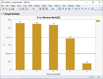
Creating bar chart in JMP with reference lines and labels is easy. It might be more difficult to figure out where you can get those specific t-values calculated. Good starting point on how to use JMP (in my opinion) is checking out the help documentation https://www.jmp.com/support/help/en/17.2/, there are also a lot if different videos in community.


This is just an example (I searched scripting index for Bonferroni and used the report the example script creates):
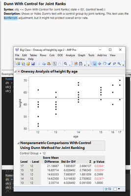
jthi_0-1711435308617.png

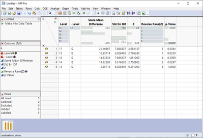
I can make the results into data table

jthi_1-1711435324651.png

Add some extra columns (rank), set labels (column and rows)
jthi_2-1711435525337.png

Create bar chart with reference lines
jthi_3-1711435551191.png


-Jarmo