- Due to inclement weather, JMP support response times may be slower than usual during the week of January 26.
To submit a request for support, please send email to support@jmp.com.
We appreciate your patience at this time. - Register to see how to import and prepare Excel data on Jan. 30 from 2 to 3 p.m. ET.
- Subscribe to RSS Feed
- Mark Topic as New
- Mark Topic as Read
- Float this Topic for Current User
- Bookmark
- Subscribe
- Mute
- Printer Friendly Page
Discussions
Solve problems, and share tips and tricks with other JMP users.- JMP User Community
- :
- Discussions
- :
- highligting the markers of particular rows in Bivariate plot
- Mark as New
- Bookmark
- Subscribe
- Mute
- Subscribe to RSS Feed
- Get Direct Link
- Report Inappropriate Content
highligting the markers of particular rows in Bivariate plot
Hi
Trying to highlighting the markers of particular rows in Bivariate plot.
I manuall created the plot and saved the to script window and manually selected 'Theme' column as row legend.
But the problem is I don't see those steps above in the script when I looked it!
Here is what I mean
dt = Open( "$sample_data/Hollywood Movies.jmp" );

dt = currentdatatable(); // Don't know I need this here anyway


Bivariate(
	Y( :Domestic Gross ),
	X( :Foreign Gross ),
	Fit Where( :Genre == "Action", Fit Line( {Line Color( {212, 73, 88} )} ) ),
	Fit Where(
		:Genre == "Adventure",
		Fit Line(
			{Line Color( {61, 174, 70} )},
			{Set α Level( 4.06068261874589e-315 )}
		)
	),
	Fit Where( :Genre == "Animation", Fit Line( {Line Color( {66, 112, 221} )} ) ),
	Fit Where( :Genre == "Comedy", Fit Line( {Line Color( {204, 121, 41} )} ) ),
	Fit Where( :Genre == "Drama", Fit Line( {Line Color( {40, 182, 143} )} ) ),
	Fit Where( :Genre == "Fantasy", Fit Line( {Line Color( {162, 43, 221} )} ) ),
	Fit Where( :Genre == "Horror", Fit Line( {Line Color( {196, 189, 43} )} ) ),
	Fit Where( :Genre == "Romance", Fit Line( {Line Color( {39, 174, 174} )} ) ),
	Fit Where( :Genre == "Thriller", Fit Line( {Line Color( {197, 41, 201} )} ) ),
	SendToReport( // What does this mean here ? Why we need this ?
		Dispatch( // What does this mean here ? why we need this ?
			{},
			"Bivar Plot",
			FrameBox,
			{Frame Size( 377, 299 ), Row Legend(
				Theme,
				Color( 1 ),
				Color Theme( "JMP Default" ),
				Marker( 1 ),
				Marker Theme( "Standard" ),
				Continuous Scale( 0 ),
				Reverse Scale( 0 ),
				Excluded Rows( 0 )
			)}
		)
	)
);
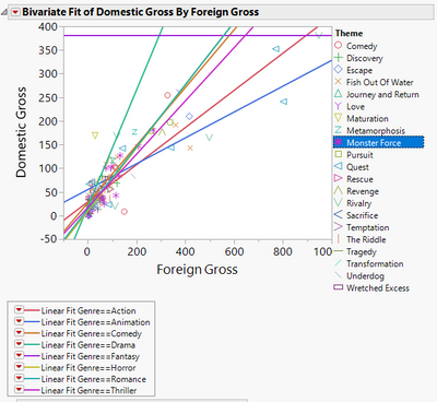
which creates
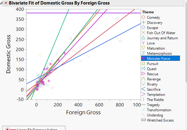
What I want to do is to control which column to be a row legend and highlight the rows in that column. Something like this
I'm sure this does not exist in the manual.
- Mark as New
- Bookmark
- Subscribe
- Mute
- Subscribe to RSS Feed
- Get Direct Link
- Report Inappropriate Content
Re: highligting the markers of particular rows in Bivariate plot
The highlighting of specific markers(points) on a plot and the subsequent fading of the remaining markers is actually linked to the data table, and which rows are selected in a data table. If you go to a data table that has a Bivariate scatter plot created from it's columns, and select one of the rows in the data table, the point in the bivariate graph will become highlighted, and all other points will become faded. This behavior, of selecting a row(s) in a data table, and the highlighting of that row(s) in all graphs associated with the data table, is one of the backbone principals of JMP. So, the behavior you are seeing, when you click on a specific legend in the graph, or on a group of points(markers) in a graph, is actually not indicating to the graph to highlight those points, but in reality, it is telling the data table to select specific rows in the data table, and it is then that action in the data table, that tells all of the related graphs to highlight the points in the graphs that represent the data from the selected rows. This behavior has been around JMP since it's beginning. Now, why did I take all of that time to tell you that. Well, your description of your not understanding why the highlighted data points are not captured in your saved script, hinted to me, that you are thinking that it is the graph that is highlighting the points(markers). But alas, it is the data table that controls the highlighting. That being, one way you can make the graph have the desired highlighting, is to select the rows in the data table that you need to select to make the highlighted markers, and then save the data table. The row selection in the data table will be saved, and when opened up, and the script for the graph is run, it will display the graph as desired. This typically is not the solution of choice. Three other methods for handling which markers are to be highlighted are usually better choices.
- Manually add the code to the script, that specifically selects the desired row(s);
- Create a new column of data type "rowstate", set up the data table selections, markers, etc. as you need them to be in order to display as you want the graph to be displayed, and then save the Rowstates, to the new rowstate column. Then, what you do is to add the statement in your saved script, that copies the desired rowstate values from the rowstate column back to the rowstates for the data table, and then generate the graph.
- Use a local data filter for the row selections. The local filter does not physically select rows in the data table. Instead, it provides a virtual selection environment for the specific platform, acting just like one had selected in the data table itself. The Local Data Filter is saved in a saved script.
I hope this makes sense. If it leaves you with more questions, please ask them.
- Mark as New
- Bookmark
- Subscribe
- Mute
- Subscribe to RSS Feed
- Get Direct Link
- Report Inappropriate Content
Re: highligting the markers of particular rows in Bivariate plot
Thanks for the long explanation. Very helpful indeed. I liked the part "that you are thinking that it is the graph that is highlighting the points(markers). But alas, it is the data table that controls the highlighting." This is an excellent explanation.
OTH, the question with item 2) how to do that? For you, with years of experience just a sec to put down into jsl but for me, it would take a week to find out what you really meant there or how to put in action. I wish you post the some script to demonstrate your thinking process so maybe others also benefit from it;)
- Mark as New
- Bookmark
- Subscribe
- Mute
- Subscribe to RSS Feed
- Get Direct Link
- Report Inappropriate Content
Re: highligting the markers of particular rows in Bivariate plot
Names Default To Here( 1 );
dt = New Table( "Example",
	Add Rows( 15 ),
	New Column( "sex",
		Character,
		"Nominal",
		Set Values(
			{"F", "F", "F", "F", "F", "M", "M", "M", "F", "F", "F", "M", "M", "M",
			"M"}
		)
	),
	New Column( "height",
		Numeric,
		"Continuous",
		Format( "Best", 10 ),
		Set Values( [59, 61, 55, 66, 52, 60, 61, 51, 60, 61, 56, 65, 63, 58, 59] )
	),
	New Column( "weight",
		Numeric,
		"Continuous",
		Format( "Best", 10 ),
		Set Values(
			[95, 123, 74, 145, 64, 84, 128, 79, 112, 107, 67, 98, 105, 95, 79]
		)
	),
	Set Row States(
		[192, 193, 193, 193, 193, 32833, 32833, 32832, 192, 192, 192, 32832, 32832,
		32832, 32832]
	)
);


// Here is the Bivariate Platform.  It will honor the rowstates
// I have provided some selections, etc. but you can change them
// to whatever selections you want
Bivariate(
	Y( :height ),
	X( :weight ),
	Fit Where( :sex == "F", Fit Line( {Line Color( "Medium Dark Red" )} ) ),
	Fit Where( :sex == "M", Fit Line( {Line Color( "Medium Dark Blue" )} ) )
);


// Here is the code to create the new rowstate column
// But it can easily be done manually by just creating a new
// column, and then going to the Col Info window, and setting the
// data type to Row State
dt << New Column( "The RowStates", rowstate );

// This is the command that copies the rowstates from the
// rowstate column, to the new column called The RowStates
// To do this interactively just go to the column panel and
// right click on the red star in front of the new column
// and select "Copy From Rowstates"
dt:The RowStates << copy from rowstates;
// dt:The RowStates << Hide(1);  // This will hide the column from view

// The rest is manual(interactive);
// Go to the red triangle on the Bivariate output and select
//      Save Script==>To Data Table
// Once it is saved, Go to the green triangle in front of the script that was just
// saved to the data table.  Right click on the green triangle and select Edit
// Now add the following line as the first line
//        :The RowStates << Copy to Row states;
// Make sure you remove the // from the front of the line
// Now, whenever you run the script, the row states from when you created the graph
// will be applied before the graph is createdRecommended Articles
- © 2026 JMP Statistical Discovery LLC. All Rights Reserved.
- Terms of Use
- Privacy Statement
- Contact Us


