I am new to graphing cancer rate data in JMP.
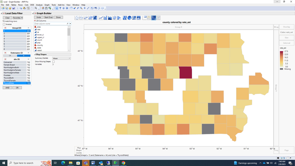
The rates on the map are values that I have created. The rates are not actual cancer rates for Iowa.
I have generated cancer rate data to map at the county level in JMP. I am dropping the generated rate variable into the color box to get a color gradient for the rates.
I have two rate levels that should be treated differently.
The levels are zero and missing.
The rate for the county is missing if there weren't any cases within the county. This is plotted on the map using a black fill and I am happy with this automatic action of JMP.
The rate for the county is 0 if they are suppressed due to patient confidentially concerns. So zero like missing should have a color of it's own.
I would also appreciate any suggestions on adding additional information to the map. For example:
Risk factors like obesity percentages at the county level, smoking percentages at the county level, etc.
Additional information like the confidence interval width for each of the rates at the county level. etc
