- Instantly extract effect sizes, F-ratios, and FDR-adjusted p-values from your models with the Calculate Effects Sizes extension, available now in the JMP Marketplace!
- New to JMP? Join us Sept. 23-24 for the Early User Edition of Discovery Summit, tailor-made for new users. Register now for free!
- Your voice matters! Tell us how you prefer to receive JMP updates, so we can tailor our communication to your needs. Take short survey.
- Subscribe to RSS Feed
- Mark Topic as New
- Mark Topic as Read
- Float this Topic for Current User
- Bookmark
- Subscribe
- Mute
- Printer Friendly Page
Discussions
Solve problems, and share tips and tricks with other JMP users.- JMP User Community
- :
- Discussions
- :
- Re: adding post-hoc groups to plots

- Mark as New
- Bookmark
- Subscribe
- Mute
- Subscribe to RSS Feed
- Get Direct Link
- Report Inappropriate Content
adding post-hoc groups to plots
Is it possible to add letters to plots to signify post-hoc (e.g., Tukey's HSD p<0.05) differences? What I normally do is use GraphBuilder to make a plot, copy it, paste it into Adobe Illustrator, and then manually add lowercase letters (a=highest, b=next highest.....f=lowest) to denote post-hoc differences (from having run the statistical model under "Fit model"). I am guessing this is the only way to go about doing this, but just thought I'd ask in the event that anyone had written a custom script that puts annotations (even just asterisks in simpler, 2-sample examples) above/adjacent to plot values. In this example, I inserted the post-hoc groups within columns.

Accepted Solutions

- Mark as New
- Bookmark
- Subscribe
- Mute
- Subscribe to RSS Feed
- Get Direct Link
- Report Inappropriate Content
Re: adding post-hoc groups to plots
You can definitely use caption boxes. Another idea would be to drag the column with the Tukey labels down to the X-axis and nest that column in the on the other x-axis column. Here's an example of a different graph of the same data where I used the Tukey letters in the X-axis nested in the "Groups" x-axis variable.

- Mark as New
- Bookmark
- Subscribe
- Mute
- Subscribe to RSS Feed
- Get Direct Link
- Report Inappropriate Content
Re: adding post-hoc groups to plots
Something I neglected earlier is adding labels to individual points by selecting the rows you want labeled and going to Rows > Label/Unlabel. This should enable you to do what you want in this graph. I basically recreated your example (except without the error bars), but I had to journal the plots 1 at a time because I needed to change the labels for each panel.
Here's what the final result looks like:


I'm attaching the journal file, but there's a frustrating bug where the custom line settings get messed up after saving and re-opening the journal. You'll probably notice all the lines will be dashed when you open it.
Data table script (again, cannot attach data table directly):
New Table( "Multipanel Example with Tukey labels",
	Add Rows( 4 ),
	Set Header Height( 59 ),
	New Script(
		"Growth",
		Graph Builder(
			Size( 518, 446 ),
			Show Control Panel( 0 ),
			Show Legend( 0 ),
			Variables(
				X( :Treatment ),
				Y( :Growth ),
				Overlay( :Temperature Regime )
			),
			Elements(
				Line( X, Y, Legend( 10 ) ),
				Points( X, Y, Legend( 11 ), Jitter( "None" ) )
			),
			SendToReport(
				Dispatch(
					{},
					"Growth",
					ScaleBox,
					{Format( "Fixed Dec", 12, 1 ), Min( 0.4 ), Max( 0.9 ),
					Inc( 0.1 ), Minor Ticks( 0 )}
				),
				Dispatch(
					{},
					"400",
					ScaleBox,
					{Legend Model(
						10,
						Properties(
							0,
							{Line Color( 0 ), Line Style( "Dotted" ),
							Fill Color( 0 )},
							Item ID( "1", 1 )
						),
						Properties(
							1,
							{Line Color( 0 ), Fill Color( 0 )},
							Item ID( "2", 1 )
						)
					), Legend Model(
						11,
						Properties(
							0,
							{Line Color( 0 ), Fill Color( 0 )},
							Item ID( "1", 1 )
						),
						Properties(
							1,
							{Line Color( 0 ), Fill Color( 0 )},
							Item ID( "2", 1 )
						)
					)}
				),
				Dispatch( {}, "graph title", TextEditBox, {Set Text( "" )} ),
				Dispatch( {}, "X title", TextEditBox, {Set Text( "" )} )
			)
		)
	),
	New Script(
		"chlorophyll",
		Graph Builder(
			Size( 518, 446 ),
			Show Control Panel( 0 ),
			Show Legend( 0 ),
			Variables(
				X( :Treatment ),
				Y( :chlorophyll a ),
				Overlay( :Temperature Regime )
			),
			Elements(
				Points( X, Y, Legend( 6 ), Jitter( "None" ) ),
				Line( X, Y, Legend( 7 ) )
			),
			SendToReport(
				Dispatch(
					{},
					"chlorophyll a",
					ScaleBox,
					{Format( "Fixed Dec", Use thousands separator( 1 ), 12, 0 ),
					Min( 0 ), Max( 8 ), Inc( 2 ), Minor Ticks( 0 )}
				),
				Dispatch(
					{},
					"400",
					ScaleBox,
					{Legend Model(
						6,
						Properties(
							0,
							{Line Color( 0 ), Fill Color( 0 )},
							Item ID( "1", 1 )
						),
						Properties(
							1,
							{Line Color( 0 ), Fill Color( 0 )},
							Item ID( "2", 1 )
						)
					), Legend Model(
						7,
						Properties(
							0,
							{Line Color( 0 ), Line Style( "Dotted" ),
							Fill Color( 0 )},
							Item ID( "1", 1 )
						),
						Properties(
							1,
							{Line Color( 0 ), Fill Color( 0 )},
							Item ID( "2", 1 )
						)
					)}
				),
				Dispatch( {}, "graph title", TextEditBox, {Set Text( "" )} ),
				Dispatch( {}, "X title", TextEditBox, {Set Text( "" )} ),
				Dispatch(
					{},
					"Graph Builder",
					FrameBox,
					{DispatchSeg(
						Marker Seg( "Marker (1)" ),
						label offset( {0, -8, -13}, {1, -12, 26} )
					), DispatchSeg(
						Marker Seg( "Marker (2)" ),
						label offset( {0, -5, 21}, {1, -14, -16} )
					)}
				)
			)
		)
	),
	New Script(
		"Symbiodinium density",
		Graph Builder(
			Size( 518, 446 ),
			Show Control Panel( 0 ),
			Show Legend( 0 ),
			Variables(
				X( :Treatment ),
				Y( :Symbiodinium density ),
				Overlay( :Temperature Regime )
			),
			Elements(
				Points( X, Y, Legend( 4 ), Jitter( "None" ) ),
				Line( X, Y, Legend( 5 ) )
			),
			SendToReport(
				Dispatch(
					{},
					"Symbiodinium density",
					ScaleBox,
					{Min( 1.5 ), Max( 4 ), Inc( 0.5 ), Minor Ticks( 0 )}
				),
				Dispatch(
					{},
					"400",
					ScaleBox,
					{Legend Model(
						4,
						Properties(
							0,
							{Line Color( 0 ), Fill Color( 0 )},
							Item ID( "1", 1 )
						),
						Properties(
							1,
							{Line Color( 0 ), Fill Color( 0 )},
							Item ID( "2", 1 )
						)
					), Legend Model(
						5,
						Properties(
							0,
							{Line Color( 0 ), Line Style( "Dotted" ),
							Fill Color( 0 )},
							Item ID( "1", 1 )
						),
						Properties(
							1,
							{Line Color( 0 ), Fill Color( 0 )},
							Item ID( "2", 1 )
						)
					)}
				),
				Dispatch( {}, "graph title", TextEditBox, {Set Text( "" )} ),
				Dispatch( {}, "X title", TextEditBox, {Set Text( "" )} ),
				Dispatch(
					{},
					"Graph Builder",
					FrameBox,
					{DispatchSeg(
						Marker Seg( "Marker (1)" ),
						label offset( {0, 2, 24}, {1, -3, -16} )
					), DispatchSeg(
						Marker Seg( "Marker (2)" ),
						label offset( {0, 3, -15}, {1, 1, 24} )
					)}
				)
			)
		)
	),
	New Script(
		"max dark-adapted",
		Graph Builder(
			Size( 518, 446 ),
			Show Control Panel( 0 ),
			Show Legend( 0 ),
			Variables(
				X( :Treatment ),
				Y( :Name( "max. dark-adapted quantum yield" ) ),
				Overlay( :Temperature Regime )
			),
			Elements(
				Points( X, Y, Legend( 3 ), Jitter( "None" ) ),
				Line( X, Y, Legend( 4 ) )
			),
			SendToReport(
				Dispatch(
					{},
					"max. dark-adapted quantum yield",
					ScaleBox,
					{Min( 0.72 ), Max( 0.77 ), Inc( 0.01 ), Minor Ticks( 1 )}
				),
				Dispatch(
					{},
					"400",
					ScaleBox,
					{Legend Model(
						3,
						Properties(
							0,
							{Line Color( 0 ), Fill Color( 0 )},
							Item ID( "1", 1 )
						),
						Properties(
							1,
							{Line Color( 0 ), Fill Color( 0 )},
							Item ID( "2", 1 )
						)
					), Legend Model(
						4,
						Properties(
							0,
							{Line Color( 0 ), Line Style( "Dotted" ),
							Fill Color( 0 )},
							Item ID( "1", 1 )
						),
						Properties(
							1,
							{Line Color( 0 ), Fill Color( 0 )},
							Item ID( "2", 1 )
						)
					)}
				),
				Dispatch( {}, "graph title", TextEditBox, {Set Text( "" )} ),
				Dispatch( {}, "X title", TextEditBox, {Set Text( "" )} ),
				Dispatch(
					{},
					"Graph Builder",
					FrameBox,
					{DispatchSeg(
						Marker Seg( "Marker (1)" ),
						label offset( {0, -4, -17}, {1, -6, -18} )
					), DispatchSeg(
						Marker Seg( "Marker (2)" ),
						label offset( {0, -7, -14}, {1, -4, -17} )
					)}
				)
			)
		)
	),
	New Column( "Treatment",
		Character,
		"Nominal",
		Set Property( "Value Ordering", {"upwelling", "non-upwelling"} ),
		Set Values( {"upwelling", "upwelling", "non-upwelling", "non-upwelling"} ),
		Set Display Width( 132 )
	),
	New Column( "Temperature Regime",
		Numeric,
		"Nominal",
		Format( "Best", 12 ),
		Set Values( [1, 2, 1, 2] )
	),
	New Column( "Growth",
		Numeric,
		"Continuous",
		Format( "Best", 12 ),
		Set Values( [0.78, 0.75, 0.68, 0.82] )
	),
	New Column( "Symbiodinium density",
		Numeric,
		"Continuous",
		Format( "Best", 12 ),
		Set Values( [2.8, 3.05, 3.45, 3.38] )
	),
	New Column( "Tukey Symbiodinium",
		Character,
		"Nominal",
		Set Values( {"B", "B", "A", "A"} )
	),
	New Column( "chlorophyll a",
		Numeric,
		"Continuous",
		Format( "Best", 12 ),
		Set Values( [7.2, 4.3, 5.5, 6.5] )
	),
	New Column( "Tukey chlorophyll",
		Character,
		"Nominal",
		Set Values( {"A", "C", "BC", "AB"} )
	),
	New Column( "max. dark-adapted quantum yield",
		Numeric,
		"Continuous",
		Format( "Best", 12 ),
		Set Values( [0.76, 0.749, 0.753, 0.739] ),
		Set Display Width( 148 )
	),
	New Column( "Tukey max",
		Character,
		"Nominal",
		Set Values( {"A", "B", "B", "C"} )
	),
	Set Row States( [32776, 248, 32776, 248] ),
	Set Label Columns( :Tukey max )
)- Mark as New
- Bookmark
- Subscribe
- Mute
- Subscribe to RSS Feed
- Get Direct Link
- Report Inappropriate Content
Re: adding post-hoc groups to plots
I think this is possible without too much work and no scripting. The basic idea is to create a data table from your Tukey connecting letters report and join those letters to your original data matching the group name to the Levels column from the Tukey table. Then, combine the columns with the letter groups by selecting them > right-click on any of the highlighted columns > New Formula Column > Concatenate (with Space or with Comma). Next, select the resulting column and use it for labels (Cols > Label/Unlabel).
Finally, make your plot in Graph Builder. After I made a bar chart, I was able to add error bars and labels as you showed using the Control Panel controls for Bar.

**Community is not allowing me to post the table ("The contents of the attachment doesn't match its file type"). Here's the script to reproduce it:
New Table( "ExamplePlotTukeyLabels",
	Add Rows( 17 ),
	New Script(
		"Source",
		Data Table( "Untitled 4" ) << Join(
			With( Data Table( "Untitled 6" ) ),
			By Matching Columns( :Groups = :Level ),
			Drop multiples( 0, 0 ),
			Include Nonmatches( 0, 0 ),
			Preserve main table order( 1 )
		)
	),
	New Script(
		"Make Into Data Table",
		Names Default To Here( 1 );
		platform = Current Data Table() << Oneway(
			Y( :Y ),
			X( :Groups ),
			All Pairs( 1 )
		);
		Wait( 0 );
		Report( platform )[Outline Box( "Oneway Analysis of Y By Groups" )][
		Outline Box( "Means Comparisons" )][
		Outline Box( "Comparisons for all pairs using Tukey-Kramer HSD" )][
		Outline Box( "Connecting Letters Report" )][Table Box( 1 )] <<
		Make Into Data Table;
		Report( platform ) << Close Window;
	),
	New Script(
		"Example with Tukey Levels",
		Graph Builder(
			Size( 518, 550 ),
			Show Control Panel( 0 ),
			Variables( X( :Groups ), Y( :Y ) ),
			Elements(
				Bar(
					X,
					Y,
					Legend( 4 ),
					Error Bars( "Standard Error" ),
					Label( "Label by Row" )
				)
			)
		)
	),
	New Column( "Groups",
		Character,
		"Nominal",
		Set Values(
			{"Group 1", "Group 1", "Group 1", "Group 1", "Group 1", "Group 2",
			"Group 2", "Group 2", "Group 2", "Group 2", "Group 3", "Group 3",
			"Group 3", "Group 3", "Group 3", "Group 4", "Group 4"}
		)
	),
	New Column( "Y",
		Numeric,
		"Continuous",
		Format( "Best", 12 ),
		Formula(
			Random Normal( 15, 3 ) + Col Mean( Random Normal( 0, 10 ), :Groups )
		),
		Suppress Eval
	),
	New Column( "Level",
		Character,
		"Nominal",
		Set Values(
			{"A", "A", "A", "A", "A", "B", "B", "B", "B", "B", "C", "C", "C", "C",
			"C", "D", "D"}
		)
	),
	New Column( "~Letter Column A",
		Character,
		"Nominal",
		Set Values(
			{"", "", "", "", "", "A", "A", "A", "A", "A", "", "", "", "", "", "A",
			"A"}
		)
	),
	New Column( "~Letter Column B",
		Character,
		"Nominal",
		Set Values(
			{"B", "B", "B", "B", "B", "", "", "", "", "", "B", "B", "B", "B", "B",
			"B", "B"}
		)
	),
	New Column( "Concatenate[~Le...etter Column B]",
		Character,
		"Nominal",
		Formula( :Name( "~Letter Column A" ) || " " || :Name( "~Letter Column B" ) )
	),
	New Column( "Mean",
		Numeric,
		"Continuous",
		Format( "Fixed Dec", 12, 6 ),
		Set Values(
			[12.8498772929854, 12.8498772929854, 12.8498772929854, 12.8498772929854,
			12.8498772929854, 19.105279210907, 19.105279210907, 19.105279210907,
			19.105279210907, 19.105279210907, 11.7021088825322, 11.7021088825322,
			11.7021088825322, 11.7021088825322, 11.7021088825322, 16.4722902997683,
			16.4722902997683]
		)
	),
	Set Label Columns( :Name( "Concatenate[~Le...etter Column B]" ) )
)
- Mark as New
- Bookmark
- Subscribe
- Mute
- Subscribe to RSS Feed
- Get Direct Link
- Report Inappropriate Content
Re: adding post-hoc groups to plots
Awesome! It worked. I don't know why I thought it would be so difficult. It's like you said: simply copy and paste the Tukey's letter groups into their own columns, set them as column labels, and then add then to the plot that way. The only issue I see is that I can't figure out how to do it for non-bar plots, as I don't see the "label" feature for those. Any ideas? Can the caption boxes be dragged over the icons in a line plot, for instance? Thanks again for your help.
- Mark as New
- Bookmark
- Subscribe
- Mute
- Subscribe to RSS Feed
- Get Direct Link
- Report Inappropriate Content
Re: adding post-hoc groups to plots
You can definitely use caption boxes. Another idea would be to drag the column with the Tukey labels down to the X-axis and nest that column in the on the other x-axis column. Here's an example of a different graph of the same data where I used the Tukey letters in the X-axis nested in the "Groups" x-axis variable.
- Mark as New
- Bookmark
- Subscribe
- Mute
- Subscribe to RSS Feed
- Get Direct Link
- Report Inappropriate Content
Re: adding post-hoc groups to plots
Great! Brilliant idea to just have the Tukey's groups at the bottom.
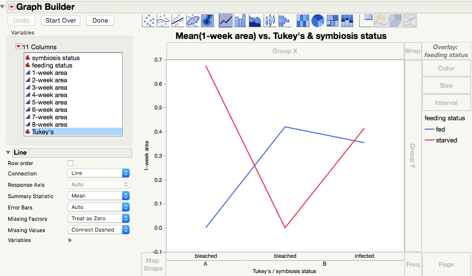
I'll have to think of how to go about doing this for interaction plots. As of now, I can only get it to make multiple listings of the treatment groups, one for each Tukey's group (see image.). In this example, there are two treatments, each with two groups, so there would ideally be only two groups on the x axis.
Strangely, I get an error message when trying to upload the JMP table, which is why I am providing the image instead.
- Mark as New
- Bookmark
- Subscribe
- Mute
- Subscribe to RSS Feed
- Get Direct Link
- Report Inappropriate Content
Re: adding post-hoc groups to plots
Could you upload a picture of what the plot you're envisioning might look like? I'm sure there's some way to twist JMP's arm into making it.
- Mark as New
- Bookmark
- Subscribe
- Mute
- Subscribe to RSS Feed
- Get Direct Link
- Report Inappropriate Content
Re: adding post-hoc groups to plots

- Mark as New
- Bookmark
- Subscribe
- Mute
- Subscribe to RSS Feed
- Get Direct Link
- Report Inappropriate Content
Re: adding post-hoc groups to plots
Something I neglected earlier is adding labels to individual points by selecting the rows you want labeled and going to Rows > Label/Unlabel. This should enable you to do what you want in this graph. I basically recreated your example (except without the error bars), but I had to journal the plots 1 at a time because I needed to change the labels for each panel.
Here's what the final result looks like:
I'm attaching the journal file, but there's a frustrating bug where the custom line settings get messed up after saving and re-opening the journal. You'll probably notice all the lines will be dashed when you open it.
Data table script (again, cannot attach data table directly):
New Table( "Multipanel Example with Tukey labels",
	Add Rows( 4 ),
	Set Header Height( 59 ),
	New Script(
		"Growth",
		Graph Builder(
			Size( 518, 446 ),
			Show Control Panel( 0 ),
			Show Legend( 0 ),
			Variables(
				X( :Treatment ),
				Y( :Growth ),
				Overlay( :Temperature Regime )
			),
			Elements(
				Line( X, Y, Legend( 10 ) ),
				Points( X, Y, Legend( 11 ), Jitter( "None" ) )
			),
			SendToReport(
				Dispatch(
					{},
					"Growth",
					ScaleBox,
					{Format( "Fixed Dec", 12, 1 ), Min( 0.4 ), Max( 0.9 ),
					Inc( 0.1 ), Minor Ticks( 0 )}
				),
				Dispatch(
					{},
					"400",
					ScaleBox,
					{Legend Model(
						10,
						Properties(
							0,
							{Line Color( 0 ), Line Style( "Dotted" ),
							Fill Color( 0 )},
							Item ID( "1", 1 )
						),
						Properties(
							1,
							{Line Color( 0 ), Fill Color( 0 )},
							Item ID( "2", 1 )
						)
					), Legend Model(
						11,
						Properties(
							0,
							{Line Color( 0 ), Fill Color( 0 )},
							Item ID( "1", 1 )
						),
						Properties(
							1,
							{Line Color( 0 ), Fill Color( 0 )},
							Item ID( "2", 1 )
						)
					)}
				),
				Dispatch( {}, "graph title", TextEditBox, {Set Text( "" )} ),
				Dispatch( {}, "X title", TextEditBox, {Set Text( "" )} )
			)
		)
	),
	New Script(
		"chlorophyll",
		Graph Builder(
			Size( 518, 446 ),
			Show Control Panel( 0 ),
			Show Legend( 0 ),
			Variables(
				X( :Treatment ),
				Y( :chlorophyll a ),
				Overlay( :Temperature Regime )
			),
			Elements(
				Points( X, Y, Legend( 6 ), Jitter( "None" ) ),
				Line( X, Y, Legend( 7 ) )
			),
			SendToReport(
				Dispatch(
					{},
					"chlorophyll a",
					ScaleBox,
					{Format( "Fixed Dec", Use thousands separator( 1 ), 12, 0 ),
					Min( 0 ), Max( 8 ), Inc( 2 ), Minor Ticks( 0 )}
				),
				Dispatch(
					{},
					"400",
					ScaleBox,
					{Legend Model(
						6,
						Properties(
							0,
							{Line Color( 0 ), Fill Color( 0 )},
							Item ID( "1", 1 )
						),
						Properties(
							1,
							{Line Color( 0 ), Fill Color( 0 )},
							Item ID( "2", 1 )
						)
					), Legend Model(
						7,
						Properties(
							0,
							{Line Color( 0 ), Line Style( "Dotted" ),
							Fill Color( 0 )},
							Item ID( "1", 1 )
						),
						Properties(
							1,
							{Line Color( 0 ), Fill Color( 0 )},
							Item ID( "2", 1 )
						)
					)}
				),
				Dispatch( {}, "graph title", TextEditBox, {Set Text( "" )} ),
				Dispatch( {}, "X title", TextEditBox, {Set Text( "" )} ),
				Dispatch(
					{},
					"Graph Builder",
					FrameBox,
					{DispatchSeg(
						Marker Seg( "Marker (1)" ),
						label offset( {0, -8, -13}, {1, -12, 26} )
					), DispatchSeg(
						Marker Seg( "Marker (2)" ),
						label offset( {0, -5, 21}, {1, -14, -16} )
					)}
				)
			)
		)
	),
	New Script(
		"Symbiodinium density",
		Graph Builder(
			Size( 518, 446 ),
			Show Control Panel( 0 ),
			Show Legend( 0 ),
			Variables(
				X( :Treatment ),
				Y( :Symbiodinium density ),
				Overlay( :Temperature Regime )
			),
			Elements(
				Points( X, Y, Legend( 4 ), Jitter( "None" ) ),
				Line( X, Y, Legend( 5 ) )
			),
			SendToReport(
				Dispatch(
					{},
					"Symbiodinium density",
					ScaleBox,
					{Min( 1.5 ), Max( 4 ), Inc( 0.5 ), Minor Ticks( 0 )}
				),
				Dispatch(
					{},
					"400",
					ScaleBox,
					{Legend Model(
						4,
						Properties(
							0,
							{Line Color( 0 ), Fill Color( 0 )},
							Item ID( "1", 1 )
						),
						Properties(
							1,
							{Line Color( 0 ), Fill Color( 0 )},
							Item ID( "2", 1 )
						)
					), Legend Model(
						5,
						Properties(
							0,
							{Line Color( 0 ), Line Style( "Dotted" ),
							Fill Color( 0 )},
							Item ID( "1", 1 )
						),
						Properties(
							1,
							{Line Color( 0 ), Fill Color( 0 )},
							Item ID( "2", 1 )
						)
					)}
				),
				Dispatch( {}, "graph title", TextEditBox, {Set Text( "" )} ),
				Dispatch( {}, "X title", TextEditBox, {Set Text( "" )} ),
				Dispatch(
					{},
					"Graph Builder",
					FrameBox,
					{DispatchSeg(
						Marker Seg( "Marker (1)" ),
						label offset( {0, 2, 24}, {1, -3, -16} )
					), DispatchSeg(
						Marker Seg( "Marker (2)" ),
						label offset( {0, 3, -15}, {1, 1, 24} )
					)}
				)
			)
		)
	),
	New Script(
		"max dark-adapted",
		Graph Builder(
			Size( 518, 446 ),
			Show Control Panel( 0 ),
			Show Legend( 0 ),
			Variables(
				X( :Treatment ),
				Y( :Name( "max. dark-adapted quantum yield" ) ),
				Overlay( :Temperature Regime )
			),
			Elements(
				Points( X, Y, Legend( 3 ), Jitter( "None" ) ),
				Line( X, Y, Legend( 4 ) )
			),
			SendToReport(
				Dispatch(
					{},
					"max. dark-adapted quantum yield",
					ScaleBox,
					{Min( 0.72 ), Max( 0.77 ), Inc( 0.01 ), Minor Ticks( 1 )}
				),
				Dispatch(
					{},
					"400",
					ScaleBox,
					{Legend Model(
						3,
						Properties(
							0,
							{Line Color( 0 ), Fill Color( 0 )},
							Item ID( "1", 1 )
						),
						Properties(
							1,
							{Line Color( 0 ), Fill Color( 0 )},
							Item ID( "2", 1 )
						)
					), Legend Model(
						4,
						Properties(
							0,
							{Line Color( 0 ), Line Style( "Dotted" ),
							Fill Color( 0 )},
							Item ID( "1", 1 )
						),
						Properties(
							1,
							{Line Color( 0 ), Fill Color( 0 )},
							Item ID( "2", 1 )
						)
					)}
				),
				Dispatch( {}, "graph title", TextEditBox, {Set Text( "" )} ),
				Dispatch( {}, "X title", TextEditBox, {Set Text( "" )} ),
				Dispatch(
					{},
					"Graph Builder",
					FrameBox,
					{DispatchSeg(
						Marker Seg( "Marker (1)" ),
						label offset( {0, -4, -17}, {1, -6, -18} )
					), DispatchSeg(
						Marker Seg( "Marker (2)" ),
						label offset( {0, -7, -14}, {1, -4, -17} )
					)}
				)
			)
		)
	),
	New Column( "Treatment",
		Character,
		"Nominal",
		Set Property( "Value Ordering", {"upwelling", "non-upwelling"} ),
		Set Values( {"upwelling", "upwelling", "non-upwelling", "non-upwelling"} ),
		Set Display Width( 132 )
	),
	New Column( "Temperature Regime",
		Numeric,
		"Nominal",
		Format( "Best", 12 ),
		Set Values( [1, 2, 1, 2] )
	),
	New Column( "Growth",
		Numeric,
		"Continuous",
		Format( "Best", 12 ),
		Set Values( [0.78, 0.75, 0.68, 0.82] )
	),
	New Column( "Symbiodinium density",
		Numeric,
		"Continuous",
		Format( "Best", 12 ),
		Set Values( [2.8, 3.05, 3.45, 3.38] )
	),
	New Column( "Tukey Symbiodinium",
		Character,
		"Nominal",
		Set Values( {"B", "B", "A", "A"} )
	),
	New Column( "chlorophyll a",
		Numeric,
		"Continuous",
		Format( "Best", 12 ),
		Set Values( [7.2, 4.3, 5.5, 6.5] )
	),
	New Column( "Tukey chlorophyll",
		Character,
		"Nominal",
		Set Values( {"A", "C", "BC", "AB"} )
	),
	New Column( "max. dark-adapted quantum yield",
		Numeric,
		"Continuous",
		Format( "Best", 12 ),
		Set Values( [0.76, 0.749, 0.753, 0.739] ),
		Set Display Width( 148 )
	),
	New Column( "Tukey max",
		Character,
		"Nominal",
		Set Values( {"A", "B", "B", "C"} )
	),
	Set Row States( [32776, 248, 32776, 248] ),
	Set Label Columns( :Tukey max )
)- Mark as New
- Bookmark
- Subscribe
- Mute
- Subscribe to RSS Feed
- Get Direct Link
- Report Inappropriate Content
Re: adding post-hoc groups to plots
Excellent! I never even thought to use the row and column labels, but it appears that they can be used with line graphs.
I may best a "need" for JMP develops that is an extension of this: When you use Graph Builder, you can have it plot summary statistics, such as mean and error bars. If there was another option below error bars for post-hoc group labels that would be awesome! But then again, it's not a big deal to copy and paste the means, std. devs., and post-hoc groups into another table and then use Graph Builder to plot out the summary data (rather than the raw data). Thanks again and hope this is useful to others.
Recommended Articles
- © 2026 JMP Statistical Discovery LLC. All Rights Reserved.
- Terms of Use
- Privacy Statement
- Contact Us