- Learn how to build custom Python data connectors and further customize JMP’s Data Connector Framework with the Python Data Connector Demo, available now in the JMP Marketplace!
- See how to move from signal modeling to system modeling at the first JMP Aerospace Analytics webinar. Register. June 18, 1 p.m. US Eastern Time.
- Subscribe to RSS Feed
- Mark Topic as New
- Mark Topic as Read
- Float this Topic for Current User
- Bookmark
- Subscribe
- Mute
- Printer Friendly Page
Discussions
Solve problems, and share tips and tricks with other JMP users.- JMP User Community
- :
- Discussions
- :
- X-axis format
- Mark as New
- Bookmark
- Subscribe
- Mute
- Subscribe to RSS Feed
- Get Direct Link
- Report Inappropriate Content
X-axis format
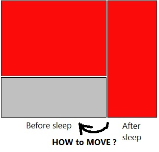
How to divide the X-axis into equal parts (SEE picture)?
P.S. X-axis is not interactive in the "Y by X platform"
Accepted Solutions

- Mark as New
- Bookmark
- Subscribe
- Mute
- Subscribe to RSS Feed
- Get Direct Link
- Report Inappropriate Content
Re: X-axis format
Hi @Ted,
Mosaic plots (which is the default visual you will get in Fit Y by X when you use a categorical X and categorical Y) do not divide the x-axis evenly unless there is an equal number of observations in each of the categories represented by the x-axis. You can see the documentation for mosaic plots here. There isn't a way to disable this scaling in Fit Y by X because it's a feature of the plot itself. And, it's a good thing! Because of that scaling, you can see the marginal distribution of your X-variable, which is quite useful to see in addition to the conditional distribution of Y for each X category.
If you absolutely need a plot that sizes the X-axis uniformly irrespective of the distribution of X, it won't be a mosaic plot. But, you can make such a plot in Graph > Graph Builder, by placing your Y variable in the Y Role, and your X variable not in the X-Role, but in the Group X role at the top. Then, toggle the mosaic plot at the top to make a mosaic-like plot.

I hope this helps,

- Mark as New
- Bookmark
- Subscribe
- Mute
- Subscribe to RSS Feed
- Get Direct Link
- Report Inappropriate Content
Re: X-axis format
Sorry - I was mistaken that you could turn off the proportional spacing in the Contingency platform. (I never wanted to turn it off.) I must be thinking of Oneway, another platform under Fit Y by X.
- Mark as New
- Bookmark
- Subscribe
- Mute
- Subscribe to RSS Feed
- Get Direct Link
- Report Inappropriate Content
Re: X-axis format
Hi @Ted,
Mosaic plots (which is the default visual you will get in Fit Y by X when you use a categorical X and categorical Y) do not divide the x-axis evenly unless there is an equal number of observations in each of the categories represented by the x-axis. You can see the documentation for mosaic plots here. There isn't a way to disable this scaling in Fit Y by X because it's a feature of the plot itself. And, it's a good thing! Because of that scaling, you can see the marginal distribution of your X-variable, which is quite useful to see in addition to the conditional distribution of Y for each X category.
If you absolutely need a plot that sizes the X-axis uniformly irrespective of the distribution of X, it won't be a mosaic plot. But, you can make such a plot in Graph > Graph Builder, by placing your Y variable in the Y Role, and your X variable not in the X-Role, but in the Group X role at the top. Then, toggle the mosaic plot at the top to make a mosaic-like plot.
I hope this helps,

- Mark as New
- Bookmark
- Subscribe
- Mute
- Subscribe to RSS Feed
- Get Direct Link
- Report Inappropriate Content
Re: X-axis format
Not sure if this is still an issue in the newer versions of JMP, but the problem I have is the following:
For the X by X contingency I can't adjust the y-axis which looks lousy for low frequency issues, so I go to the graph builder to use the mosaic. But there the X-axis can't be adjusted. Doing the Group X binning works ok but then I lose the built in chi-sq (I can solve it in x by x and then bring it back over but that's a little clunky). I don't really care if I do it graph builder or x by x but I need it somewhere where I can get a clean, easy to read graph to go with my chi-sq.
Maybe just make the y-axis scalable in the normal contingency plot?
Recommended Articles
- © 2026 JMP Statistical Discovery LLC. All Rights Reserved.
- Terms of Use
- Privacy Statement
- Contact Us