- New to JMP? Let the Data Analysis Director guide you through selecting an analysis task, an analysis goal, and a data type. Available now in the JMP Marketplace!
- See how to install JMP Marketplace extensions to customize and enhance JMP.
- Subscribe to RSS Feed
- Mark Topic as New
- Mark Topic as Read
- Float this Topic for Current User
- Bookmark
- Subscribe
- Mute
- Printer Friendly Page
Discussions
Solve problems, and share tips and tricks with other JMP users.- JMP User Community
- :
- Discussions
- :
- Re: X,Y scatter plot with coloured zones
- Mark as New
- Bookmark
- Subscribe
- Mute
- Subscribe to RSS Feed
- Get Direct Link
- Report Inappropriate Content
X,Y scatter plot with coloured zones
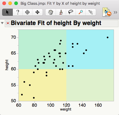
I am looking for a way to create a 2D scatter plot with 4 coloured zones for 4 rectangular quadrants of the plot area. This is to quickly see visually which zone each plotted point falls within. I could not find anything similar in JMP11, so any tips/hints scripts would be appreciated.
- Mark as New
- Bookmark
- Subscribe
- Mute
- Subscribe to RSS Feed
- Get Direct Link
- Report Inappropriate Content
Re: X,Y scatter plot with coloured zones
You can use a graphics script to do this (see for example: http://www.jmp.com/support/help/Adding_Scripts_to_Graphs.shtml for how to do this 'by hand').
If you want to do it programmatically, you can tinker with the script below to get it the way you want. Cut and paste the code into an editor window, then select 'Edit > Run Script').
NamesDefaultToHere(1);
// Example data
dt = NewTable("Scatter PLot",
NewColumn("x", Numeric, Continuous, Formula(RandomNormal())),
NewColumn("y", Numeric, Continuous, Formula(RandomNormal())),
AddRows(100);
);
// Bivariate plot
biv = dt << Bivariate(X(:x), Y(:y));
// Add graphics script for 'quadrants'
xVals = Column(dt, "x") << getValues;
xMid = Quantile(0.5, xVals);
xDel = Max(Abs(Max(xVals) - xMid), Abs(xMid - Min(xVals)));
xMin = xMid - 100*xDel;
xMax = xMid + 100*xDel;
yVals = Column(dt, "y") << getValues;
yMid = Quantile(0.5, yVals);
yDel = Max(Abs(Max(yVals) - yMid), Abs(yMid - Min(yVals)));
yMin = yMid - 100*yDel;
yMax = yMid + 100*yDel;
// Tempate expression to add graphics script
ags =
Expr(
Report(biv)[FrameBox(1)] <<
Add Graphics Script(
1,
Description( "Quadrants" ),
Transparency( 0.3 );
// Top left
Fill Color( "Red" );
Rect( xMinTBD, yMaxTBD, xMidTBD, yMidTBD, 1 );
// Top right
Fill Color( "Green" );
Rect( xMidTBD, yMaxTBD, xMaxTBD, yMidTBD, 1 );
// Bottom left
Fill Color( "Blue" );
Rect( xMinTBD, yMidTBD, xMidTBD, yMinTBD, 1 );
// Bottom right
Fill Color( "Black" );
Rect( xMidTBD, yMidTBD, xMaxTBD, yMinTBD, 1 );
);
);
// 'Bake in' values for this data to this expression
SubstituteInto(ags,
Expr(xMinTBD), xMin,
Expr(xMidTBD), xMid,
Expr(xMaxTBD), xMax,
Expr(yMinTBD), yMin,
Expr(yMidTBD), yMid,
Expr(yMaxTBD), yMax,
);
// Add the graphics script
ags;
- Mark as New
- Bookmark
- Subscribe
- Mute
- Subscribe to RSS Feed
- Get Direct Link
- Report Inappropriate Content
Re: X,Y scatter plot with coloured zones
Ian@JMP has a good idea.
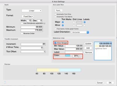
Another option in JMP 12 is to use the new color and range options in the Axis specification dialog to do this.
Double click on the axis and then use the Allow Ranges and Color options in the Reference Lines section.
-Jeff
Recommended Articles
- © 2026 JMP Statistical Discovery LLC. All Rights Reserved.
- Terms of Use
- Privacy Statement
- Contact Us


