- JMP will suspend normal business operations for our Winter Holiday beginning on Wednesday, Dec. 24, 2025, at 5:00 p.m. ET (2:00 p.m. ET for JMP Accounts Receivable).
Regular business hours will resume at 9:00 a.m. EST on Friday, Jan. 2, 2026. - We’re retiring the File Exchange at the end of this year. The JMP Marketplace is now your destination for add-ins and extensions.
- Subscribe to RSS Feed
- Mark Topic as New
- Mark Topic as Read
- Float this Topic for Current User
- Bookmark
- Subscribe
- Mute
- Printer Friendly Page
Discussions
Solve problems, and share tips and tricks with other JMP users.- JMP User Community
- :
- Discussions
- :
- Re: Using multiple filters in a dashboard to subset records and display new sele...
- Mark as New
- Bookmark
- Subscribe
- Mute
- Subscribe to RSS Feed
- Get Direct Link
- Report Inappropriate Content
Using multiple filters in a dashboard to subset records and display new selections on a map
Hi everyone,
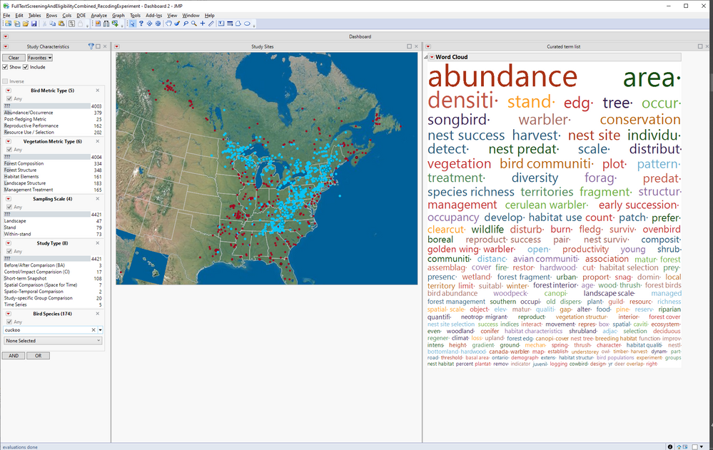
I've been working on a dashboard for a systematic literature review. I'm pretty happy with how things are working at this point, but I'm having trouble with a selection display issue that I can't seem to figure out. The main function of this dashboard is to search a database of about 4,000 publications, some of which have been coded for things like "metric type" or "study design", and some of which have been subjected to text analysis to generate term/keywords in a word cloud. When no selections have been made from the data filter or word cloud the dashboard looks like this...
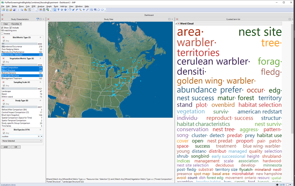
I'd like users to be able to subset records in two stages. First, using the local data filter and second using the word cloud. I think I actually have the selection part of this working, but selections are displayed differently depending on whether the local data filter or word cloud is used for selection. The way that selections are displayed using the word cloud makes the gradual narrowing of records that meet selection criteria difficult to see. I'd like the word cloud selections to display on the map the same way that selections using the local data filter affect the map display. I really like the five following behaviors associated with the local data filter: 1) search broadening (OR/any) options are available within levels of the same filter, 2) the search narrowing option (AND) is available across filters, 3) single or multiple selections can be made and/or unmade across all the filters using the control key, 4) when "show" is selected only the data points that meet filtering criteria are shown in the map (all other points disappear), and 5) when "include" is selected the word cloud updates each time changes are made to the local data filter. These combined functions do a great job mimicking a flexible boolean search, which works well for my user group. The image below shows the behavior of the map graphic and the word cloud when the local data filter has been used to subset records. I like this a lot. Notice how only a subset of the points from the image above are showing and how the word cloud has been updated to include only terms from the selected records.
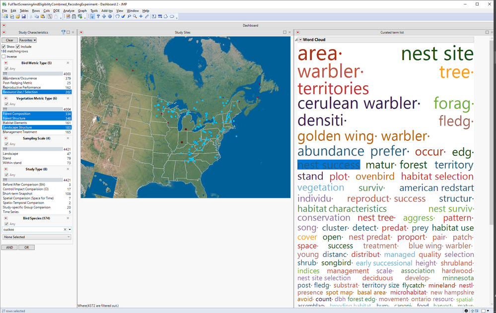
I can't seem to get similar behavior from the map when I use word cloud terms for selection (right clicking on them and choosing select rows). I'd like to have a word cloud selection further reduce the number of dots on the map. This would be like having a marker selection behavior like the "show" option in the local data filter somehow associated with the word cloud selection. Instead, I have only been able to get word cloud selections to use marker selection modes that are available via the right click menu for Graph>Marker Selection Mode menu on the map graphic (which doesn't include a "show only" option). I currently have this set to "selected outlined." It you look closely at the image below (and you may have to squint), the subset of the records that have already been selected using the data filter THAT ALSO have the term "nest success" are outlined. This is great. If I select multiple terms in the word cloud the outlined records increase the same way an OR/any option would work within the levels of a data filter. This is excellent! So, it seems like my desired selection behavior is working where word cloud selections behave like another AND condition after data filter selections. Unfortunately, this result is just really hard to SEE give the marker selection modes available on the map. The "outline selected" marker selection mode makes it difficult to see the difference between included and unincluded dots on the map, especially since it is inconsistent with the refresh pattern that users experience when adding or removing criteria from the local data filter (which either increases or decreases the number of dots on the map).
All of this seems like it could be fixed very easily if there was some way to select terms in the Word Cloud that would initiate the "show" marker selection mode on top of the selections that have already been made via the local data filter. Does anyone have an idea of how to do this? I've attached my data table in case anyone wants to look at it. There is a single data table script to generate the dashboard and separate scripts to generate the map and the word cloud on their own. Thank you in advance for any solutions the community may be able to provide.
Casey Lott
Accepted Solutions
- Mark as New
- Bookmark
- Subscribe
- Mute
- Subscribe to RSS Feed
- Get Direct Link
- Report Inappropriate Content
Re: Using multiple filters in a dashboard to subset records and display new selections on a map
Really cool dashboard!
Try if this improves the appearance of selections: In Preferences/Graphs set Marker Selection Mode to "Unselected faded" and Marker Selection Fade to 100%.
- Mark as New
- Bookmark
- Subscribe
- Mute
- Subscribe to RSS Feed
- Get Direct Link
- Report Inappropriate Content
Re: Using multiple filters in a dashboard to subset records and display new selections on a map
Thanks @ms for the great suggestion. I followed your directions and changed the drawing mode to outlined. The unselected points don't disappear, but the contrast between selected (blue, outlined) and unselected (very faded) is pretty effective visually. It would be cool if there were something like an "unselected disappear entirely" option, but this is a great solution in the absence of such an option. Thanks again. Casey
- Mark as New
- Bookmark
- Subscribe
- Mute
- Subscribe to RSS Feed
- Get Direct Link
- Report Inappropriate Content
Re: Using multiple filters in a dashboard to subset records and display new selections on a map
Hello @brady_brady
Even though I selected @ms suggestion as a solution, it's not exactly what I'm trying to do. What I'd really like to achieve is having records that were not selected in a word cloud disappear entirely from my map (rather than fade). I ran across one of your old posts (from 2016) on using a "Selected Column" https://community.jmp.com/t5/JMPer-Cable/Data-table-tools-part-2-Using-a-quot-Selected-quot-column/b... and I was wondering if there may be some way to use this approach. Again, my goal is to make unselected records (when the selection is made from a word cloud) disappear entirely in other graphical elements, like the map in the visualization discussed in this threat (similar to the way unselected records are handled in a data filter when the "show" box is checked). See my longer post about this for examples. I'm not sure if the "Selected column" formula could be used to set a Mode like this, but if so, that would be great. Thanks in advance for any help you might be able to provide.
- Mark as New
- Bookmark
- Subscribe
- Mute
- Subscribe to RSS Feed
- Get Direct Link
- Report Inappropriate Content
Re: Using multiple filters in a dashboard to subset records and display new selections on a map
Hi,
Yes, the Selected column should work to do what you want. Try this:
1) Add a column to your table, of nominal type, called "Selected", using the column formula "Selected(Row State())"
2) Add this column (with an AND) to your local data filter, and select the "1" level. **if needed, select a row in the table so the "1" level appears.
At this point I believe you'll have the behavior you want.
Cheers,
Brady
- Mark as New
- Bookmark
- Subscribe
- Mute
- Subscribe to RSS Feed
- Get Direct Link
- Report Inappropriate Content
Re: Using multiple filters in a dashboard to subset records and display new selections on a map
Hi @brady_brady ,
This almost worked. My dashboard has a local data filter and a word cloud. The formula worked to highlight all the rows in the table that I selected using the word cloud. However, when I select using the data filter, text is displayed within the data filter that says something like "361 records selected" (and these selections act within the dashboard), but the filtered rows are not selected in the table (thus, the Selected column doesn't see them as 1s). Any ideas why this might be? Perhaps there's a setting for the data filter that I'm not getting right?
Casey
- Mark as New
- Bookmark
- Subscribe
- Mute
- Subscribe to RSS Feed
- Get Direct Link
- Report Inappropriate Content
Re: Using multiple filters in a dashboard to subset records and display new selections on a map
Try a global data filter instead... something like the below may work for you. Use the "select" and "include" buttons on the filter... when using the filter itself, those will ensure data table rows are selected, and non-selected rows are excluded from the graph. When using the word cloud, the selection column you've got working will take care of this, as long as you have also added it to the filter.
Cheers,
Brady
Names Default To Here(1);
dt = open("$Sample_Data\Car Physical Data.jmp");
nw = new window("xx",
	hlb = hlistbox(
		df = dt <<data filter(),
		biv = bivariate(x(:displacement), y(:horsepower));

	)
)- Mark as New
- Bookmark
- Subscribe
- Mute
- Subscribe to RSS Feed
- Get Direct Link
- Report Inappropriate Content
Re: Using multiple filters in a dashboard to subset records and display new selections on a map
Hi @brady_brady I just came back to this dashboard and realized that I hadn't tried your solution yet. This time, when I added the Selected column to my local data filter as an AND clause (using the "Selected(Row State())" formula for that column, I got much closer to the exact behavior I was looking for. See the attached dashboard.
You can see how this works by selecting one or more of the bird species using the local filter. With these settings both the word cloud and the histograms redraw to reflect this selection.
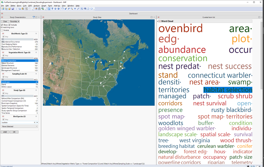
Next, select one or more of the bars in the histogram. Note: this results in a typical "unselected faded" response from the map, where instead of disappearing (which I'd prefer), the unselected points are now white. However, when I select "1" from the Selected column filter, which is now in the local data filter, these unselected faded dots disappear. An extra step, but the desired effect is achieved: points that are shown reflect both the species selection and any additional subsetting using the histogram filters.
One thing that is kind of nice about this is that selecting the "0" option from the "Selected" column filter in the local data table, clears the histogram selection (but not the species selection, which is cleared separately using the "clear" button on the data filter). So, using the clear button above the species list and selecting the "0" value for the Selected column filter (below the species list) has the effect of clearing all filters and showing all points again.
This process works the same way if the Word Cloud is used to select rows (instead of, or in addition to, the histogram bars). However, with the word cloud, you need to right click and "Select Rows" to apply the selection to the data table. Still, selecting the "0" value from the Selected filter clears out all Word Cloud and Histogram-based selections. NICE!
Thanks again, Brady, for this great solution. It allowed me to create the kind of interactivity I wanted. It would be really cool if this kind of multiple-filter interactivity could be built in to dashboards a little more easily. The attached dashboard works, but I can think of 4 improvements that would be nice to have built in to JMP (removing the need to use the Selected column filter):
1) It would be cool if the record selecting behavior that is achieved by the Select column formula could be applied across ALL graph-based objects, so that they can be used directly as additive filters without the hack of the "Selected" column filter.
2) It would be cool if the clearing selected records behavior could be achieved by simply clicking on a non-data value in a graph, rather than having to use the "0" value from the selected column data filter to clear selections. It would be great if both the record selection behavior (in number 1 above) and the de-selection behavior (described here) didn't require the use of the "Selected" column filter. It works great, but it's not totally intuitive and requires some explanation.
3) It would be great if one could select or de-select records using any individual graph, or combination of graphs, as described above. Currently, using the "0" value for the Selected column data filter clears selections from ALL graphs. It would be better to be able to do this one graph at a time.
4) It would be great if row selection could occur simply by clicking on a word in the Word Cloud, rather than having to right click and choose "Select Rows".
These are just some thoughts about potential improvements for filtering dashboards that make sense to me as a developer and user. I have no idea how practical any of them would be given the way interactivity in JMP works, but this combination of options seems like it would make both dashboard building and use more intuitive.
Thanks again,
Casey
Casey
Recommended Articles
- © 2025 JMP Statistical Discovery LLC. All Rights Reserved.
- Terms of Use
- Privacy Statement
- Contact Us


