- Subscribe to RSS Feed
- Mark Topic as New
- Mark Topic as Read
- Float this Topic for Current User
- Bookmark
- Subscribe
- Mute
- Printer Friendly Page
Discussions
Solve problems, and share tips and tricks with other JMP users.- JMP User Community
- :
- Discussions
- :
- Re: Using JSL to Plot Multiple Series on One Graph
- Mark as New
- Bookmark
- Subscribe
- Mute
- Subscribe to RSS Feed
- Get Direct Link
- Report Inappropriate Content
Using JSL to Plot Multiple Series on One Graph
Hello,
I want to plot multiple series as a function of the same variable on a graph.
For example, here is the type of data I want to plot:
|
y |
x1 |
x2 |
|
1 |
12 |
14 |
|
2 |
25 |
28 |
|
3 |
36 |
38 |
|
4 |
54 |
49 |
|
5 |
68 |
86 |
All I have found so far is a way to plot multiple series on different graphs but never multiple series on the same graph. I want to have checkboxes that allow me to select the series I want to plot and I want those series to show up on the same graph so that I can look at them together. Can someone help me to do this using a JSL script? Thank you,
Jordan
Accepted Solutions
- Mark as New
- Bookmark
- Subscribe
- Mute
- Subscribe to RSS Feed
- Get Direct Link
- Report Inappropriate Content
Re: Using JSL to Plot Multiple Series on One Graph
Does this really need to be in a script?
Using Graph Builder, I drag Y to the Y-zone.
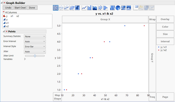
I select both X1 and X2 and drag to the X-zone. I turn off the smoother and this is my result:
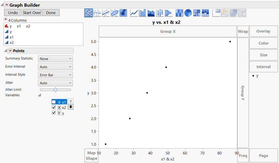
Now click the gray triangle next to variables. I can clear either X1 or X2 (they are check boxes) and the graph updates immediately. Clicking again would add that variable back to the plot. I think that the interactive functionality is already there.
- Mark as New
- Bookmark
- Subscribe
- Mute
- Subscribe to RSS Feed
- Get Direct Link
- Report Inappropriate Content
Re: Using JSL to Plot Multiple Series on One Graph
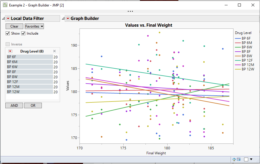
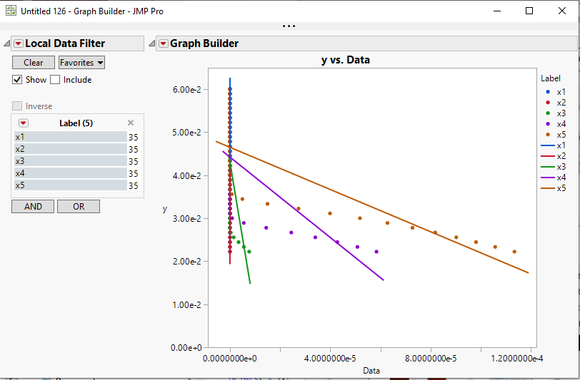
I am pretty sure that Dan understood your request, but I think he was checking out if being able to use a drag and drop scenario would meet your users needs, and thusly, eliminate the need to write and support some JSL application. I am making a similar but different proposal. JMP has a built in check box selector called a Data Filter or a Local Data Filter. It lets the user just click on the selection boxes, and change the makeup of the graph or analysis, etc. Below is an example of what such the simple application I put together looks like. I have attached a sample data table, that has an embedded script in it, that brings up the below Graph Builder example. This may be a route you may want to pursue.
- Mark as New
- Bookmark
- Subscribe
- Mute
- Subscribe to RSS Feed
- Get Direct Link
- Report Inappropriate Content
Re: Using JSL to Plot Multiple Series on One Graph
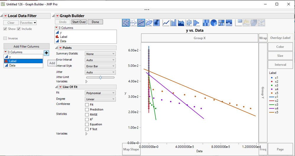
Let me walk you through the steps necessary to generate the chart I displayed in my last response.
- Open the data table you provided in your latest response. Table jmp_filter_help
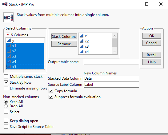
- The X columns need to be stacked to work properly with the Filter that is going to be used, so go to the pull down menus at the top of the data table and select Tables==Stack
- Select the 5 X columns as move them to the Stack Columns selection box and then click OK
- A new data table is displayed with all of the x columns stacked.
- Go to the pull down menus at the top of the stacked data table and select Graph==>Graph Builder
- In the Graph Builder display, drag the Y column to the Y drop area and the Data column to the X drop area .
- Click on the center of the graph and select Smoother==>Remove
- Drag the Label column to the Overlay drop area
- Go to the red triangle of the chart, and select Local Data Filter. In the Local Data Filter, select Label and click on the "+"
- Now, to add a line of fit, right click on the center of the graph and select Add==Line of Fit. Also, once the Lines of Fit are displayed, go to the Line of Fit control area and unselect Confidence Fit
- Go to the red triangle in the graph and select Local Data Filter. Select the Label column and click on the "+"
- Because you do not want the Y axis to change when selecting the different X's, uncheck the Include check box, and since the graph is now to a completed state, you can click on the Done button
You can now select the different X columns and the graph will change, but the Y axis remains the same
I hope this gets you to where you want to be
- Mark as New
- Bookmark
- Subscribe
- Mute
- Subscribe to RSS Feed
- Get Direct Link
- Report Inappropriate Content
Re: Using JSL to Plot Multiple Series on One Graph
Does this really need to be in a script?
Using Graph Builder, I drag Y to the Y-zone.
I select both X1 and X2 and drag to the X-zone. I turn off the smoother and this is my result:
Now click the gray triangle next to variables. I can clear either X1 or X2 (they are check boxes) and the graph updates immediately. Clicking again would add that variable back to the plot. I think that the interactive functionality is already there.
- Mark as New
- Bookmark
- Subscribe
- Mute
- Subscribe to RSS Feed
- Get Direct Link
- Report Inappropriate Content
Re: Using JSL to Plot Multiple Series on One Graph
Dan,
Thank you for your response. Maybe my example lead to misunderstanding. I will have not two, but about 15-20 different series that I would like to plot. I would rather not drag and drop but have a dialogue box with checkboxes allowing me to show any of these various series. Thank you again,
Jordan
- Mark as New
- Bookmark
- Subscribe
- Mute
- Subscribe to RSS Feed
- Get Direct Link
- Report Inappropriate Content
Re: Using JSL to Plot Multiple Series on One Graph
I am pretty sure that Dan understood your request, but I think he was checking out if being able to use a drag and drop scenario would meet your users needs, and thusly, eliminate the need to write and support some JSL application. I am making a similar but different proposal. JMP has a built in check box selector called a Data Filter or a Local Data Filter. It lets the user just click on the selection boxes, and change the makeup of the graph or analysis, etc. Below is an example of what such the simple application I put together looks like. I have attached a sample data table, that has an embedded script in it, that brings up the below Graph Builder example. This may be a route you may want to pursue.
- Mark as New
- Bookmark
- Subscribe
- Mute
- Subscribe to RSS Feed
- Get Direct Link
- Report Inappropriate Content
Re: Using JSL to Plot Multiple Series on One Graph
Thank you @txnelson,
This looks like something I would like to implement. I am not sure how to do that in my case. Every time I try to do what you did and add a filter, the filter does not look like what it did in your example. I will attach something to this reply. Are you able to help me create that filter such that the y-values will stay the same, but I can choose whichever of "x1" to "x5" I want to plot, where x=f(y)? Thank you,
Jordan
- Mark as New
- Bookmark
- Subscribe
- Mute
- Subscribe to RSS Feed
- Get Direct Link
- Report Inappropriate Content
Re: Using JSL to Plot Multiple Series on One Graph
Let me walk you through the steps necessary to generate the chart I displayed in my last response.
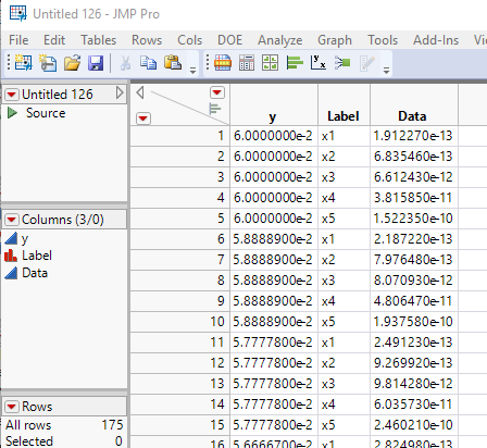
- Open the data table you provided in your latest response. Table jmp_filter_help
- The X columns need to be stacked to work properly with the Filter that is going to be used, so go to the pull down menus at the top of the data table and select Tables==Stack
- Select the 5 X columns as move them to the Stack Columns selection box and then click OK
- A new data table is displayed with all of the x columns stacked.
- Go to the pull down menus at the top of the stacked data table and select Graph==>Graph Builder
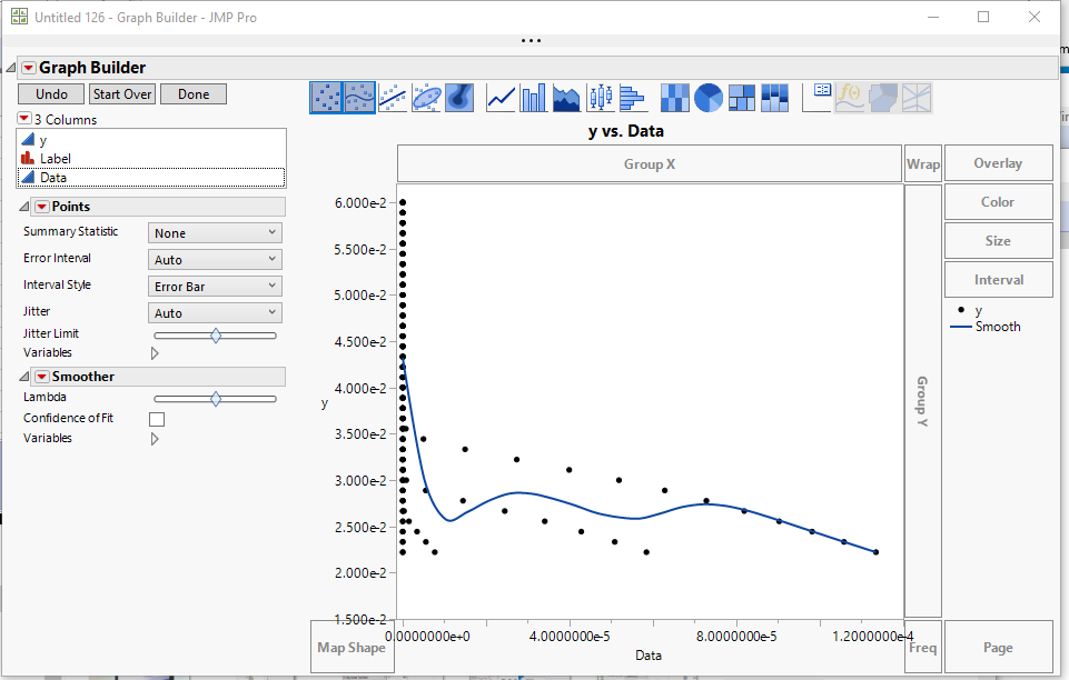
- In the Graph Builder display, drag the Y column to the Y drop area and the Data column to the X drop area .
- Click on the center of the graph and select Smoother==>Remove
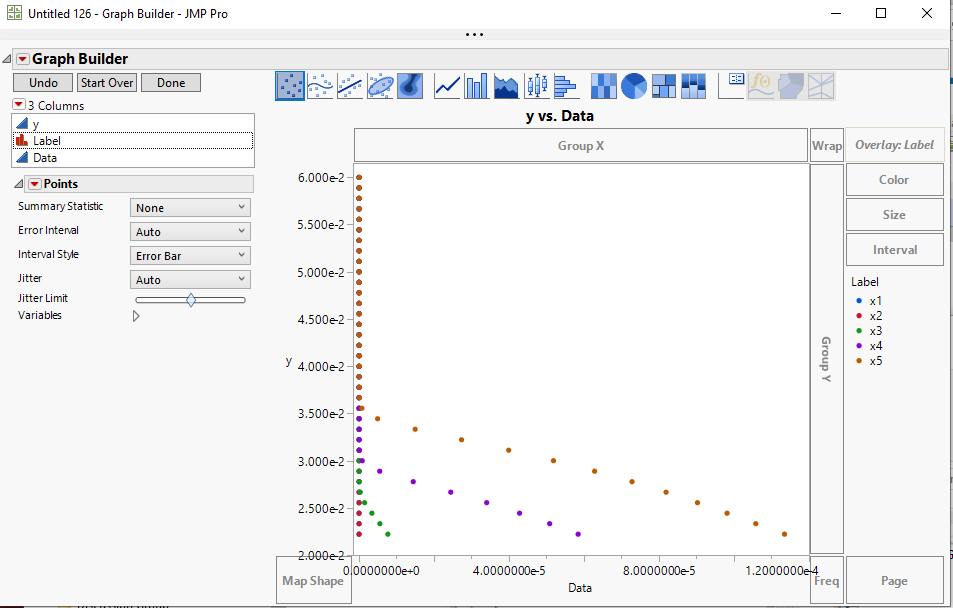
- Drag the Label column to the Overlay drop area
- Go to the red triangle of the chart, and select Local Data Filter. In the Local Data Filter, select Label and click on the "+"
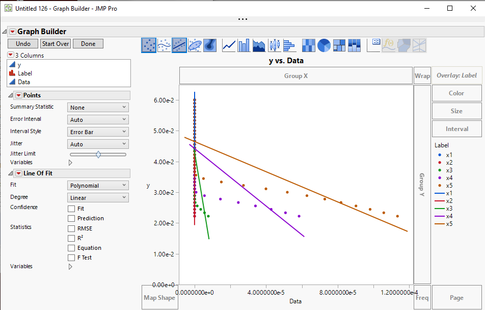
- Now, to add a line of fit, right click on the center of the graph and select Add==Line of Fit. Also, once the Lines of Fit are displayed, go to the Line of Fit control area and unselect Confidence Fit
- Go to the red triangle in the graph and select Local Data Filter. Select the Label column and click on the "+"
- Because you do not want the Y axis to change when selecting the different X's, uncheck the Include check box, and since the graph is now to a completed state, you can click on the Done button
You can now select the different X columns and the graph will change, but the Y axis remains the same
I hope this gets you to where you want to be
Recommended Articles
- © 2026 JMP Statistical Discovery LLC. All Rights Reserved.
- Terms of Use
- Privacy Statement
- Contact Us

