- New to JMP? Let the Data Analysis Director guide you through selecting an analysis task, an analysis goal, and a data type. Available now in the JMP Marketplace!
- See how to install JMP Marketplace extensions to customize and enhance JMP.
- Subscribe to RSS Feed
- Mark Topic as New
- Mark Topic as Read
- Float this Topic for Current User
- Bookmark
- Subscribe
- Mute
- Printer Friendly Page
Discussions
Solve problems, and share tips and tricks with other JMP users.- JMP User Community
- :
- Discussions
- :
- The x-axis unit is placed underneath the axis label in the life distribution pla...
- Mark as New
- Bookmark
- Subscribe
- Mute
- Subscribe to RSS Feed
- Get Direct Link
- Report Inappropriate Content
The x-axis unit is placed underneath the axis label in the life distribution platform
Using JMP17
For some reason the unit is placed underneath the axis label for some graphs in the life distribution platform. But when I tried to recreate this in the Big Class datatable it worked as expected. Anyone know what is going on here? Attached is my jmp file.
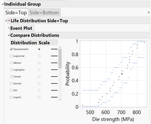
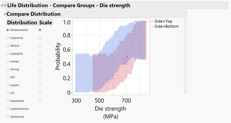
Only the "compare groups" graph appears to be affected; below screenshots are of the "individual group" graph and the "compare groups" graph of the distribution platform.
Left: the x-label as expected; the unit is placed in brackets behind the label. Right: the unit is placed underneath for some reason.

- Mark as New
- Bookmark
- Subscribe
- Mute
- Subscribe to RSS Feed
- Get Direct Link
- Report Inappropriate Content
Re: The x-axis unit is placed underneath the axis label in the life distribution platform
so, this might be a display bug. In that case, maybe send a note to support@JMP.com
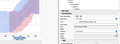
To fix this, click on the top left most GREY triangle and select Show Properties.
Click on the graph title in the graph. The property section related to that title will pop up on the right and you can edit the text.
Click on the units under the graph. The property section related to the units will pop up, delete the units.
There might be a better way to do this?
- Mark as New
- Bookmark
- Subscribe
- Mute
- Subscribe to RSS Feed
- Get Direct Link
- Report Inappropriate Content
Re: The x-axis unit is placed underneath the axis label in the life distribution platform
I also contacted support as per you suggestion.
I should really hope that there's a better way to do this than the manual editing. Pardon my frustration here but all my recent posts I've been getting reply's that come down to manual editing or scripts with hard-coded names in them. I want my colleagues to run a script on their data and have an output of graphs with a layout that I defined, which is what JMP advertises it can do. Nothing personal but I needed to vent a little on this.
- Mark as New
- Bookmark
- Subscribe
- Mute
- Subscribe to RSS Feed
- Get Direct Link
- Report Inappropriate Content
Re: The x-axis unit is placed underneath the axis label in the life distribution platform
Greetings @mvanderaa1 - JMP Support received your note and the Development team has already taken action to correct the spacing/display issues in the upcoming maintenance version of JMP. Thank you for reporting the issue.
Recommended Articles
- © 2026 JMP Statistical Discovery LLC. All Rights Reserved.
- Terms of Use
- Privacy Statement
- Contact Us


