- New to JMP? Let the Data Analysis Director guide you through selecting an analysis task, an analysis goal, and a data type. Available now in the JMP Marketplace!
- See how to install JMP Marketplace extensions to customize and enhance JMP.
- Subscribe to RSS Feed
- Mark Topic as New
- Mark Topic as Read
- Float this Topic for Current User
- Bookmark
- Subscribe
- Mute
- Printer Friendly Page
Discussions
Solve problems, and share tips and tricks with other JMP users.- JMP User Community
- :
- Discussions
- :
- Re: Ternary plot (with more than three components)
- Mark as New
- Bookmark
- Subscribe
- Mute
- Subscribe to RSS Feed
- Get Direct Link
- Report Inappropriate Content
Ternary plot (with more than three components)
Hi, how can I visualize aTernary plot (with more than three components) using color gradients to show the variation of the response
Accepted Solutions
- Mark as New
- Bookmark
- Subscribe
- Mute
- Subscribe to RSS Feed
- Get Direct Link
- Report Inappropriate Content
Re: Ternary plot (with more than three components)
Hi @hamza-moussa,
Welcome in the Community !
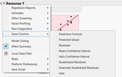
To visualize the variation of the (predicted) response in regards to the mixture factors, you have to model the response and save the Prediction Formula (from the "Fit Model" window, click on the red triangle, "Save Columns", "Prediction Formula") :
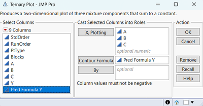
Then, in the menu "Graph", use the "Ternary plot" option, and specify your mixture factors as "X, plotting" and your prediction formula for your response as "Contour Formula" :
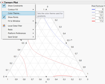
You'll get to the ternary plot, and from there, you can click on the red triangle and customize the graph :
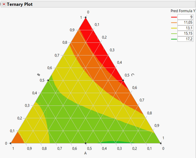
In this example, I changed the color theme to a chromatic red-orange/yellow-green them, and choose the option "Contour Fill", "Fill Above". I now have this graph that should be similar to what you are expecting :
You can also change the different levels/values for the prediction formula if you want to change the space between each individual levels.
The example is "Elongation of Yarn", from https://online.stat.psu.edu/stat503/lesson/11/11.3/11.3.3
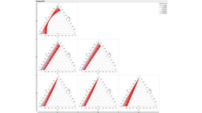
If you have more than 3 factors, no problem, JMP will create a grid showing each time 2 mixture factors and the last factor will be the sum of the remaining mixture factors :
I attached the datatable with the model script, prediction formula, and the ternary plot script so that you can have a look at it.
I hope this example will help you,
"It is not unusual for a well-designed experiment to analyze itself" (Box, Hunter and Hunter)
- Mark as New
- Bookmark
- Subscribe
- Mute
- Subscribe to RSS Feed
- Get Direct Link
- Report Inappropriate Content
Re: Ternary plot (with more than three components)
Thank you so much Mr. @Victor_G
- Mark as New
- Bookmark
- Subscribe
- Mute
- Subscribe to RSS Feed
- Get Direct Link
- Report Inappropriate Content
Re: Ternary plot (with more than three components)
can we do the same thing for Mixture profiler ?
- Mark as New
- Bookmark
- Subscribe
- Mute
- Subscribe to RSS Feed
- Get Direct Link
- Report Inappropriate Content
Re: Ternary plot (with more than three components)
Yes the Mixture Profiler is the perfect solution to visualizing ternary plots interactively when there are more than 3 variables.
- Mark as New
- Bookmark
- Subscribe
- Mute
- Subscribe to RSS Feed
- Get Direct Link
- Report Inappropriate Content
Re: Ternary plot (with more than three components)
Recommended Articles
- © 2026 JMP Statistical Discovery LLC. All Rights Reserved.
- Terms of Use
- Privacy Statement
- Contact Us

