- Learn how to build custom Python data connectors and further customize JMP’s Data Connector Framework with the Python Data Connector Demo, available now in the JMP Marketplace!
- See how to move from signal modeling to system modeling at the first JMP Aerospace Analytics webinar. Register. June 18, 1 p.m. US Eastern Time.
- Subscribe to RSS Feed
- Mark Topic as New
- Mark Topic as Read
- Float this Topic for Current User
- Bookmark
- Subscribe
- Mute
- Printer Friendly Page
Discussions
Solve problems, and share tips and tricks with other JMP users.- JMP User Community
- :
- Discussions
- :
- Surface plot with wrong response values

- Mark as New
- Bookmark
- Subscribe
- Mute
- Subscribe to RSS Feed
- Get Direct Link
- Report Inappropriate Content
Surface plot with wrong response values
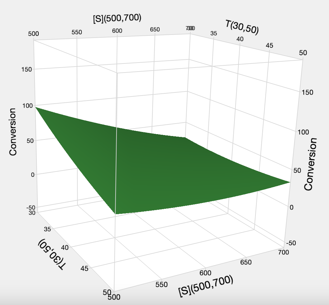
Hi, everyone. I hope someone can help me.
I am working with some RSM results, but everytime I create a graph JMP gives me values I don't have in my results. How can I adjust conversion axis to fit my results ? I don't mean to rescale, but to create the right graph ? (I'm using MacOS right now, but I tried on Windows and JMP versions 17 and 18)
Thank you in advance.


- Tags:
- macOS
Accepted Solutions

- Mark as New
- Bookmark
- Subscribe
- Mute
- Subscribe to RSS Feed
- Get Direct Link
- Report Inappropriate Content
Re: Surface plot with wrong response values
Hi @CriticalRatios1,
Welcome in the Community !
I'm not sure to have fully understand your problem, given the limited informations provided, but I may have some ideas that could help you :
- From what I see (smooth predicted surface profile), you're looking at the Surface Profiler of your predicted response. You can see what the surface profile of your response may look like depending on your factors and based on a model. Depending on the type and complexity of model, the interpolation may look smooth (in the case of linear regression model like you show) or more complex with non-linear models (like tree-based models, SVM, Neural Networks, etc...).
So you're not looking directly at your measured value, but at the predicted value from your model, hence you may see some deviations depending on the accuracy of model fitting. - You're seeing values that you don't have also because the range of the factors used in the graph T and S do not correspond to what you have in your datatable. You can use the "hand" icon when your mouse is on the graph axis in order to move the axes or rescale them, so that the axes correspond to the actual ranges of your data. If you expand the ranges (like in your case S goes from 400 to 800 instead of 500 to 700 in your data), then JMP will use the model created to extrapolate and predict the response values outside of the ranges used for model creation (with no guarantee that the model is still appropriate outside of the ranges studied).
- By default, the Surface Profiler/Plot only shows axes with the same correct factor ranges. You can try to reset the view Right-Click Menu Options (jmp.com) and/or save the response prediction formula to relaunch the Surface Plot in the original view in the Graph menu.
- If you would like to see the Surface plot of your actual points, you can also launch the Surface Plot from the graph menu, and use your factors and response in the columns to use. Set your Y response as the Point Response column, and you will get the actual response surface, but probably less smooth than in your snapshot, like this :

I hope these few ideas may help you in your situation.
If not, could you provide more explanations and a JMP table showing the problem ?
"It is not unusual for a well-designed experiment to analyze itself" (Box, Hunter and Hunter)
- Mark as New
- Bookmark
- Subscribe
- Mute
- Subscribe to RSS Feed
- Get Direct Link
- Report Inappropriate Content
Re: Surface plot with wrong response values
Hi @CriticalRatios1,
Welcome in the Community !
I'm not sure to have fully understand your problem, given the limited informations provided, but I may have some ideas that could help you :
- From what I see (smooth predicted surface profile), you're looking at the Surface Profiler of your predicted response. You can see what the surface profile of your response may look like depending on your factors and based on a model. Depending on the type and complexity of model, the interpolation may look smooth (in the case of linear regression model like you show) or more complex with non-linear models (like tree-based models, SVM, Neural Networks, etc...).
So you're not looking directly at your measured value, but at the predicted value from your model, hence you may see some deviations depending on the accuracy of model fitting. - You're seeing values that you don't have also because the range of the factors used in the graph T and S do not correspond to what you have in your datatable. You can use the "hand" icon when your mouse is on the graph axis in order to move the axes or rescale them, so that the axes correspond to the actual ranges of your data. If you expand the ranges (like in your case S goes from 400 to 800 instead of 500 to 700 in your data), then JMP will use the model created to extrapolate and predict the response values outside of the ranges used for model creation (with no guarantee that the model is still appropriate outside of the ranges studied).
- By default, the Surface Profiler/Plot only shows axes with the same correct factor ranges. You can try to reset the view Right-Click Menu Options (jmp.com) and/or save the response prediction formula to relaunch the Surface Plot in the original view in the Graph menu.
- If you would like to see the Surface plot of your actual points, you can also launch the Surface Plot from the graph menu, and use your factors and response in the columns to use. Set your Y response as the Point Response column, and you will get the actual response surface, but probably less smooth than in your snapshot, like this :
I hope these few ideas may help you in your situation.
If not, could you provide more explanations and a JMP table showing the problem ?
"It is not unusual for a well-designed experiment to analyze itself" (Box, Hunter and Hunter)
- Mark as New
- Bookmark
- Subscribe
- Mute
- Subscribe to RSS Feed
- Get Direct Link
- Report Inappropriate Content
Re: Surface plot with wrong response values
Thank you so much, Victor.
Indeed, changing the S and T actually worked. However, I find it a bit odd that even though I set the limit for substrate conversion to 100%, the predicted values still went above that, reaching up to 230%. In the graph I uploaded earlier, I set the temperature range to 20-60°C since that includes the axial points, and I wanted to see what happens within this range because I actually carried out those reactions. Looking back, I think I should have set this range from the start, but I was worried the software might ask me to perform an axial point below that temperature, which I couldn’t do. Unfortunately, I’ve just realized I could have approached it differently.
Recommended Articles
- © 2026 JMP Statistical Discovery LLC. All Rights Reserved.
- Terms of Use
- Privacy Statement
- Contact Us